Paschke Online
Designs Ink Publishing Article Archive and Reference Library
Articles by Chris A. Paschke, CPF GCF
"The Essence of Design: Color"
June 2000
How appropriate to be discussing the element of color during the issue that concentrates on mat design. Yes, there is color in moulding but it is the mat border that most often determines the emotional feel or sets the mood of a framed piece of artwork. And color is often responsible. Whether traditional or contemporary, Victorian or Asian, the colors that are within the art itself coupled with the stylings of a customer's home furnishings will together guide the selection of the right colors, that will also work with the art to best enhance and protect it.
The Nature of Color
Color elicits the greatest emotional and expressive response of all the design elements. It arouses the most universal appreciation and the one to which we are most sensitive. It directly and immediately stimulates an emotional reaction, and the viewer never needs to rationalize that response. Pleasing color rhythms and harmonies satisfy our aesthetic desires, for we are naturally drawn to certain color combinations while rejecting others.
Color Theories
In order to understand the element of color in framing design and the power of its creative uses we need to understand the basics of color theory. There are numerous theories surrounding the principles of color whether speaking of light, digitals or pigment, which often result in confusion. With the onset of computerization and digital imaging, many of the theories behind colors and color mixing have been challenged. Historically there have been two basic theories, additive color theory (which is color in relation to light), and subtractive color theory (color in relation to pigment).
There are three colors considered to be primaries in all theories. In light they are red, green, blue (RGB); in printing and digital imaging they are cyan, magenta, yellow (CMY); and in pigment they are red, yellow, blue. In all cases these are colors from which all other colors within their spectrums may be derived. Primary colors cannot be made any other way, they just are.
Additive color theory is that in relation to light. When speaking of light it is the absorption of all wavelengths and reflection of a particular wavelength that allows us to visualize a color. In order to see a red apple all other wavelengths of light are absorbed into the apple, reflecting only the red waves, so we see it as red. It is an additive color theory. The basic concept of the additive color theory of light is based on three primaries of red, green, blue (diagram 1) which when overlapped as three spotlights create secondary colors of yellow, cyan, magenta. The combination of all three when overlapped result in white space or white light, meaning the absorption of all colors or the presence of all light wavelengths.
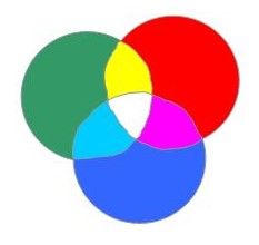 Diagram 1: Additive Color Theory (Light)
When overlapped, the three primaries (red, green, blue) create secondaries (yellow, cyan, magenta). All six combined create white, the presence of all color. All the colors in light are present and absorbed.
Subtractive color theory is color in relation to pigment, or reflected light (digital imaging). In this theory the process is reversed, which is more familiar to us. The primary colors in digital printing are cyan, magenta, yellow (diagram 2) rather than red, yellow, blue. When overlapped they do not add color but subtract light wavelengths we do not see. The eye detects color by registering the reflected wavelength of a given color. Pigmented white contains and reflects all color wavelengths so the eye registers white or the presence of all colors. Pigmented black absorbs all of the light wavelengths and reflects none, hence no color is visibly detectable. The resulting secondary colors appear like pigmented primaries or the secondaries in diagram 1. When all six colors are overlapped the result is black, or the absence of all color.
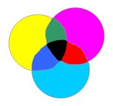 Diagram 2: Subtractive Color Theory (Digital Pigment)
Closer to the concept of primaries in pigment are cyan, magenta, yellow, which create secondaries, red, green, blue when blemded. All six combined do not add color, but subtract all wavelengths, creating black.
Subtractive Theory and Framing
Subtractive color theory is also the standard for pigments and framing. Colors obtained and produced by pigments react very differently than those by light. The remaining discussion in this article will concentrate upon the color theory originally developed by Herbert Ives in the eighteenth century.
Unlike light waves, no amount of color mixing of paint will ever produce white. There are three primary pigment colors red, yellow, blue (diagram 3) that when mixed together create black, muddy gray or brown. All pigmented colors when mixed in proper proportions will create some form of middle gray. This version of the subtractive color principle is what we learned as children in school.
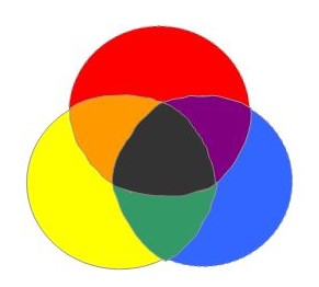 Diagram 3: Subtractive Color Theory (Artist Pigment)
Herbert Ives devised the color wheel based on primary pigmented colors (red, yellow, blue) with secondaries (orange, green, purple). When three primaries, three secondaries, or all six are blended, the result is muddy gray, brown, or black.
Properties of Color
Every color has three basic color properties: hue, value, and intensity. Hue refers specifically to the position of a color in the spectrum. The hue of a color will change only when mixed with another pure color, for it remains a spectrum color.
The value of a color is the quantity of light that a color actually reflects, hence its apparent lightness or darkness. The value of an pure color is varied when a spectrum color is mixed with a neutral. Neutrals are surface tones which do not reflect any single wavelength of light but rather all of them at once. No single color is then noticed, but rather a general sense of light or dark such as white, gray or black. The addition of white creates a tint, adding gray a tone, and the addition of black creates a shade.
Intensity, or chroma, is the quality of light (not the quantity as in color value) in a specific color as pigments are mixed together. This quality translates into the specific brightness or dullness of a color. You cannot change the value of a color by tinting, toning, or shading it without changing the intensity also.
Understanding Color Schemes
Color schemes are the use of colors in patterns according to their placement an the color wheel (diagram 4). Related color schemes are those that are relatively quiet, and restful. Strong contrasts and high intensities are avoided here. Monochromatic colors are those of only one hue (color). Any one color from the wheel presented as a tint, tone or shade would all be of the same color family. Analogous colors are three to five colors that touch each other on the wheel: red, red-violet, violet.
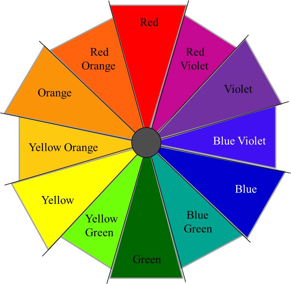 Diagram 4
Contrasting color schemes are those utilizing portions of the entire wheel, and are used often in framing. Complementary colors are those opposite each other on the wheel: red/green, yellow/purple, blue/violet. Double-complementary colors are one of two colors next to the complement and its opposite: orange/red-orange to blue/blue-green. Split-complementary colors are the two colors either side of the direct complement of a color on the wheel: red, yellow-green, blue-green. Triads are any three colors on the wheel spaced evenly apart: red, yellow, blue. Tetrads are any four colors evenly spaced on the wheel: red, yellow-orange, green, blue-violet.
Color In Framing
In framing, color is used to accent or harmonize with the art to assist in creating an overall mood, visual effect or response through the use of colored mat boards, moulding, fabrics and surface design. Color should never be used solely for its own character or emotive reaction, but always in relation to the image or object being framed.
As mentioned in April's discussion of line, many principles of design are ultimately woven together into successful unified designs. This remains quite evident when color is integrated into a double matted project where different colored mats are used. This readily becomes the use of two design principles, line and color, for any narrow inner liner mat will in essence be creating line (photo 1).
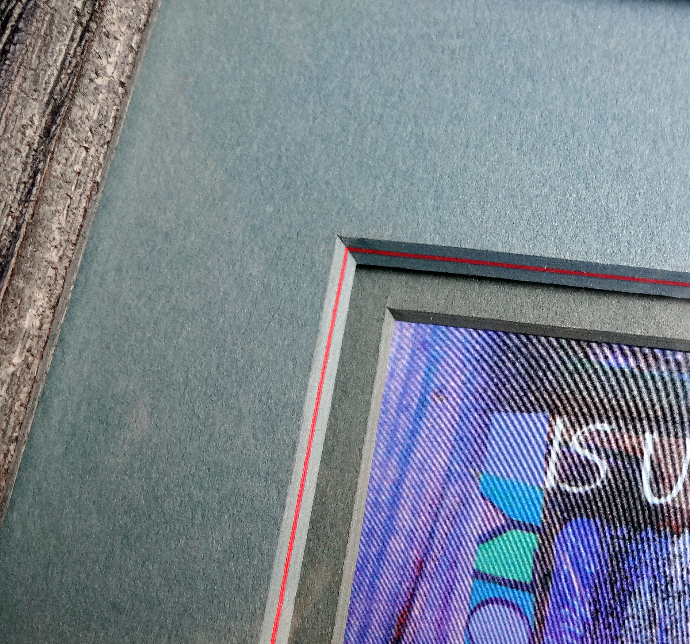 Photo 1
Once the givens are established, the most common use of color as an element is with an accented or contrasting liner mat. Both line and color are used here, in the red pin striped (blue-green) tiered top mat against the gray-green liner mat.
Last month the basic "given" design was established as a single mat with a rectangular opening and traditional wood frame. The mat can be any monochromatic color base, not necessarily a neutral, but as soon as a second color is introduced regardless of whether it's a liner mat, panel design or contrasting creative metal or wood moulding, then color must be counted as an additional principle used in the total presentation. The goal is to limit the use of elements and principles to a total of no more than three to five. Use of more than one color will not count as more than one additional element (photo 2).
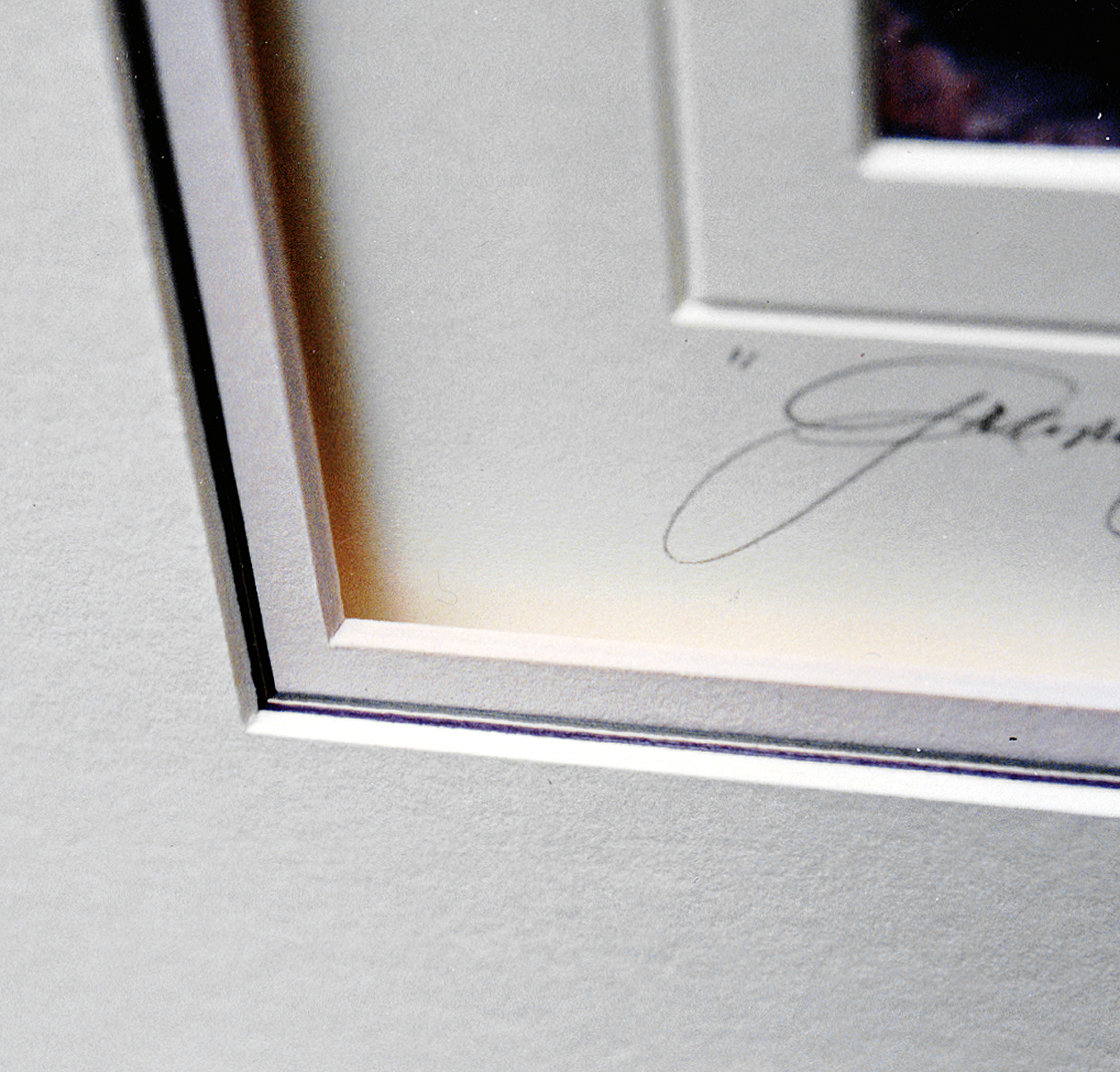 Photo 2
The undertiered stripes of black, sand, and gray against the pink liner mat will still only count as one use of color and line each, a total of two elements.
The Emotion of Color
A large use of design comes from the use of color in an emotional or psychological way by somewhat manipulating the viewer. Warm colors such as red, orange and gold are considered emotionally stimulating, passionate and often appeal to the senses like a sunset or fire. Warm colors also generally advance, meaning a double matted picture will pull a red liner out towards the viewer away from the image while a cooler mauve or blue liner will recede into the picture (photo 3). Use of color as an element may occur within the matting or the frame. The bright metal moulding upper left makes a large statement and even if the same color had not be used with the mats this moulding would remain a dominant use of color over-riding the given (photo 4).
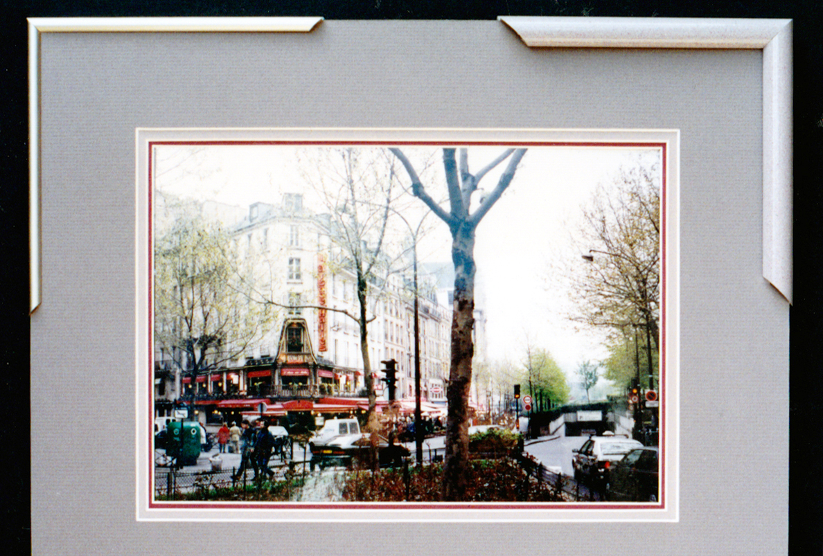 Photo 3
The mauve mouldings need not be counted as another element since they remain subdued and more subtle. The ⅓" liner mat still moves out toward the viewer while the cooler ¼" middle mat seems to recede. The red in the photo is also drawn forward, maintaining a visual movement.
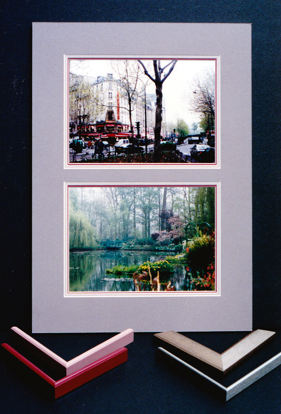 Photo 4
The eye catching red metal moulding draws the innermost liner mat out and also makes a bold statement. Even if no red matting was used, the moulding would be counted as an element beyond the traditional given.
Cool colors are often equated to air, sky and water, are much more passive, isolated, relaxing and open in nature and as mentioned will visually sink or recede to the back ground more. In interior design, a good example of color to control a situation would be using soft, light, cool colors for furniture fabrics and carpets to enlarge the feeling of a small room, the same goes for framing images and objects.
Note the samples of matted calligraphy. Although the lettering and placement are identical in each the color of the paper creates an optical illusion of them being different in size, plus the paper has a tendency to attempt to move in front of and behind the lettering (photo 5). The darker paper dwarfs the lettering more making it the framer's problem to open up the image in a visual way. In the diamond shaped free form design the upper dark bark paper mat open the art, while in contrast, the lower light colored rice paper mat closes it in.
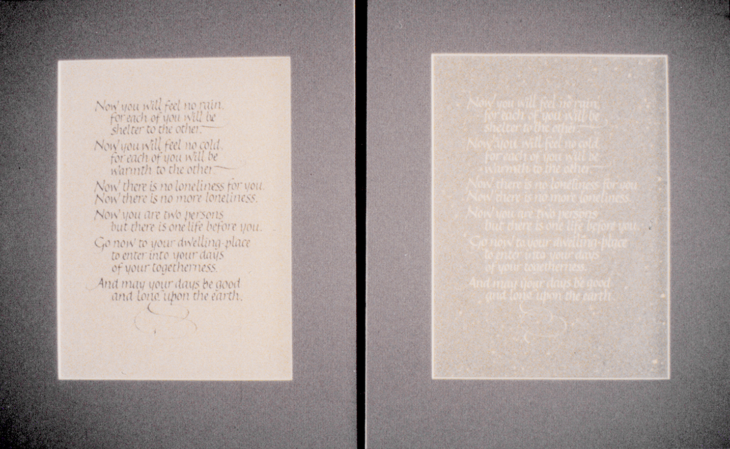 Photo 5
The color of the paper and lettering impacts the optical space. The lettering visually pulls forward when darker and receded when lighter, making the two pieces feel different in size and placement, even though they are identical.
Simultaneous Contrast
It is important to mention that surrounding colors may also alter the degree of warm and cool colors. Whenever two different color tones come into contrast with each other, as in the liners of a double mat or surface panel design, the contrast will intensify the differences between them. This is most recognizable with colors directly contrasting in hue but also occurs if colors have a specific relationship. For example, if a yellow-green liner is topped with a green mat the liner will appear more yellow than if it were topped with a yellow mat making it appear greener. This occurs often with metallic golds (red based vs. yellow based) and neutrals tinted or toned from a base red, yellow or blue primary. Be very careful with matboard and moulding selection not to unintentionally mix different bases.
The intensity (brightness) and value may also vary in relation to the proximity of additional colors. A grayed blue (blue tone) appears brighter against a gray, but the same color looks grayer against blue. Also a warm color will always appear warmer against a cool and vice-versa.
Color as a Design Tool
Color has a number of fairly specific purposes in design. Obviously, emotions may be stimulated by the use of color, and warmth or coolness may be created, but there is more. I've already stated never to use color for its own sake, but always to use it as a tool for creating a total feeling.
Considerations for using color as a tool:
- Color gives special quality to a pictorial field, creating interest through a counterbalance of forward/backward eye movement between the frame and inner art.
- Color creates a mood which may reinforce, stimulate or symbolize ideas represented in the framed art.
- Color is a vehicle for a framer's interpretive expression. This will often be a collaboration between the framer and the client in relation the item being framed.
- Color attracts and directs the viewers attention by giving organization and totality to a composition, this will be discussed further in Part Ten: Emphasis and Placement.
- Color accomplishes aesthetic appeal by a system of well ordered color relationships as found in conjunction with the color wheel.
All color has hue, value and intensity and anytime color is integrated into a framing design in any way it becomes an element of design, which must be counted.
Color in Summary
When using color in relation to framing it is important to interrelate, interweave and balance the selected colors. Warmth and coolness, subtlety and brashness, lightness and darkness are all potential applications and they must work together toward a unified whole. A single stroke of color contrast such as a bold ⅛" liner mat may make the difference between a mediocre design and a masterpiece. A sandstone hand painted panel design (texture) with accented —" French stripes may transform a crude or boring design into a distinguished presentation (photo 7). This panel design showcases three elements of line, color and texture...the last one being the topic for my August column on THE ESSENCE OF DESIGN.
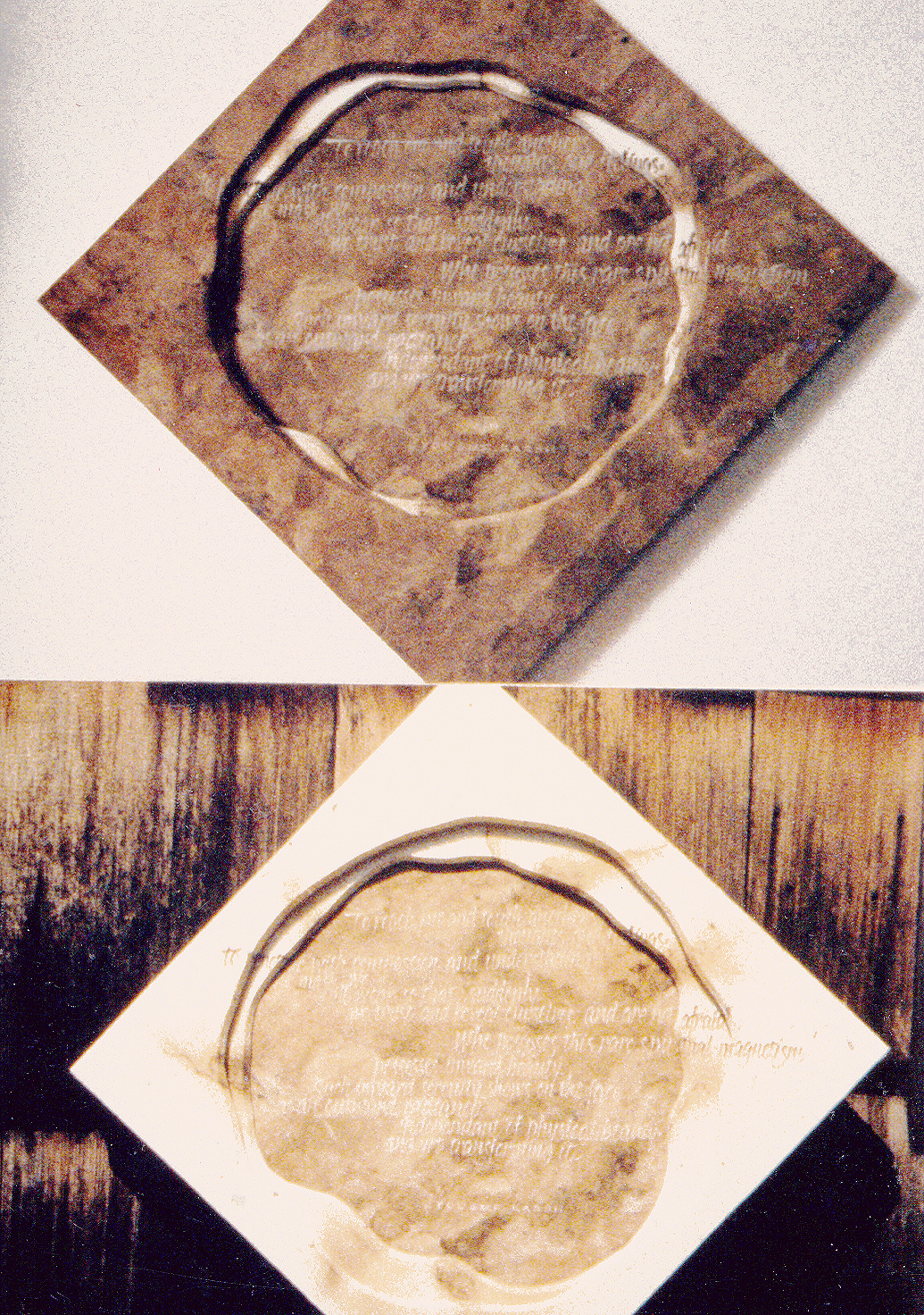 Photo 6
The matching bark paper outer mat opens the image, while, in contrast, the lower light colored rice paper outer mat confines and restricts it.
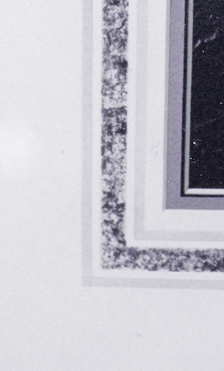 Photo 7
This hand-painted surface panel design integrates line and color on the top white mat with a supportive color liner mat of blue-gray, which counts as two elements. But the added texture of the panel introduces a third element, for a total of three elements.
Physicists tell us about the make-up of color composition, psychologists explain how the human eye perceives a given color and color stylists tell us how color affects us physically and emotionally. It is up to framing designer to then assimilate all of this information and sell it to the client in the most dynamic and price effective solution possible.
END
Copyright © 2000 Chris A Paschke
For more articles on mounting basics look under the mounting section in Articles by Subject.
Additional information on all types of mounting is found in:
The Mounting and Laminating Handbook, Second Edition, 2002,
The Mounting And Laminating Handbook, Third Edition, 2008 and
Creative Mounting, Wrapping, And Laminating, 2000 will teach you everything you need to know about getting the most from your dry mount equipment and materials as an innovative frame designer.
All books are available from Designs Ink Publishing through this website.
Chris A Paschke, CPF GCF
Designs Ink
Designs Ink Publishing
785 Tucker Road, Suite G-183
Tehachapi, CA 93561
P 661-821-2188
chris@designsinkart.com
 Diagram 1: Additive Color Theory (Light)
 Diagram 2: Subtractive Color Theory (Digital Pigment)
 Diagram 3: Subtractive Color Theory (Artist Pigment)
 Diagram 4
 Photo 1
 Photo 2
 Photo 3
 Photo 4
 Photo 5
 Photo 6
 Photo 7