 Photo 1
Intellectual unity is easily achieved as long as the units work together to tell a complete story. Unfortunately all the elements are here but this design tells no story.
The ultimate pulling together of a work of art or framing design, which creates a quality of oneness, is known as UNITY. It is perhaps the closest thing to a rule that exists in both fine art and all aspects of design. Unity implies that a congruity or fusion exists among the individual elements and they are in harmony as a result of careful and deliberate planning.
By definition, unity means to make into or become a single unit. The various individual elements in a design must all appear intentional and interrelated or the basic design will fall apart. A viewer will always subconsciously look for organization within a design, something that feels comforting and familiar. So when there is a sense of coherent unity it will naturally also be a successful design.
Visual vs. Intellectual Unity
One's initial response to a successful frame design is a feeling of visual unity in that the whole dominates over the individual parts. Each selected element (line, color, texture...) has a meaning and impacts the total presentation. Visual unity denotes a harmony or oneness between the chosen elements that is apparent to the viewer. No one thing stands alone or demands visual attention meaning it takes all the included collectibles to tell the story.
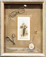
Intellectual unity illustrates a common theme or central idea. A shadowbox showcasing Grandpa's pocket watch, glasses and photograph represent the concept of common theme using elements from the same person or event in an attempt at unity (photo 1). A unified theme, however, does not necessarily produce a unified design. — Unfortunately this layout feels scattered, disjointed and definitely not very unified. Thus, visual unity and intellectual unity are two separate and individual issues which must not be confused and should always be considered.
Photo 1
Intellectual unity is easily achieved as long as the units work together to tell a complete story. Unfortunately all the elements are here but this design tells no story.
In photo 2 Grandma's silver purse, corsage and photo do tell more of a complete story of her flapper years and the design is much more complete and unified. Use of a common theme, especially in boxes, is a strong basis for good frame design, a great starting point. But it is essential that the chosen elements from line, color, texture, shape, intensity and space be controlled, organized and integrated in order to establish the desired visual unity. This is managed and manipulated through the binding qualities of the remaining principles of organization of proportion, emphasis, balance and rhythm.
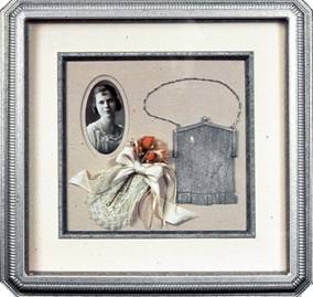 Photo 2
Grandma's purse, flowers and photo seem to tell a story about her flapper years and present a nicely unified design.
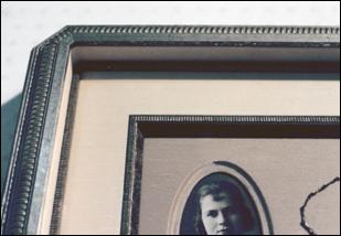 Photo 2A
The beautifully constructed box is very period and is unified in both style and story.
Four Ways to Achieve Unity
Though unity may be achieved in many ways, there are four basic concepts which remain the easiest to integrate unity into a successful design. First, limit the number of elements used in a framing design to 3-5. Enforcing design concentration by integrating only a few specific principles nearly always ensures some degree of oneness.
The second is through proximity. It's not merely enough to have personal possessions of Grandpa's randomly scattered within a frame, they must somehow relate to each other. Try establishing a visual unity by manipulating the elements of space, placement and emphasis to create a visual flow.
Repetition of elements would be the third way to develop the feeling of unity. Remember that once the use of an element has been established, reusing it still counts only as one element. A similarity in size (multiple openings cut the same dimensions), shape (echoing the round or oval in a pair of glasses), or color (picking up the sepia tones in an aged photo) will definitely help tie things together.
Establishing a harmony of the parts is the fourth unifying method. The design components should all share something in common. Design harmony may be achieved by tailoring use of the chosen elements to reflect specific categories such as a particular type of art (botanical, art Deco, Impressionist...), or historical period (Elizabethan, Louis XIV...), this is also called style.
Selected mouldings readily reinforce establishment of a mood, color, and often specific period of any given design. This establishes both visual and intellectual unity through a consistency of period, style and ultimately creates harmony.
Unity and Variety
Variety may be the spice of life, but it is also the counterpart to unity. Too much unity through consistency and similarity may be deadening or boring. Adversely, if variety gets out of control through too much contrast, unity also suffers. If repeating specifically chosen colors, textures and shapes helps establish unity (photo 3), then modifying or isolating those same elements might create more variety through contrast. Use of contrast should be tasteful and subtle, yet make a noticeable (not jarring) statement.
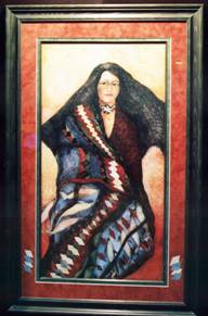 Photo 3
Visual unity is attempted in this design by reintroducing elements from the Indian blanket in the portrait in the lower edges of the mat border.
Unity in photo 3 is attempted by reintroducing the elements of color and shape through the blue and white diamonds in the lower mat border. The rust colored background in the lower ⅓rd of the artwork is also echoed. The diamonds were minimized by repeating only four on either side maintaining isolated or limited contrast. It would have been more dominant if the shapes had been placed at the lower left corner running from the draped blanket onto the mat. Either solution represents an integration and use of visual unity through color, shape and in the second concept perhaps placement or emphasis.
Last month I mentioned that rhythm/repetition can produce both variety and unity. Emphasis, balance and rhythm all work together towards unifying a good framing design. The unity created through repetition of a button framed along side an identical button may be good, but is not nearly as interesting as unity created through a contrasting variety of a button framed with a buttonhole. Thus, mirror images may be slightly too academic to be visually stimulating and perhaps border on repetitious monotony, they are too literal.
Always remember, no frame design is the solution to a problem, it is only a solution. This was evidenced by the myriad of design presentations at this years PPFA Chicago print competition last July. One photograph, one theme, thirty variations as a solution. Some were successfully unified while others attempted to showcase perhaps too many design ideas.
Unity through Color
Color probably has the most variation when it comes to using it for unity, because of the endless opportunities for color relationships (see "Part Three: Color", PFM March 1994). There are two basic ways of organizing colors for unity. Unity through color hues would target analogous colors or any two colors adjacent to a key color on a color wheel. They perhaps reflect an ink color from the art in a surface mat or panel design (photo 4). Unity through color contrast or those directly opposite on wheel, might utilize complementary colors in a liner mat or painted bevel.
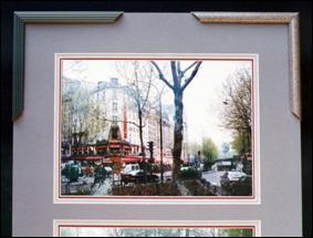 Photo 4
Unity through the use of warm analogous colors enhances this French photo. The moulding options will either unify the colors from the tree and dark windows (left corner) or will harmonize with the middle mauve mat and the texture of the sunless afternoon haze (right corner).
Unity through color was attempted by selecting analogous colors from within the photo for the surface and middle liner mats. The red ⅛" bottom liner is both a direct color echo from the trim on the French store front and a complimentary color to the green foliage surrounding it. It also unifies the design by using analogous, warm colors in all of the mats selected.
If the same triple mat of ⅛", ¼" and 2" used all mauve mats, it would lose the variety and visual interest by establishing monotony. Though all the colors would be represented within the photo, and in unified harmony, it would show no interesting contrasts.
Unity and the Other Principles
Balance, emphasis, and rhythm are all integral in creating the necessary unity any design should be striving for. Complete unity is not gained by merely limiting the number of elements, objects or ideas within a frame, it is the result of a powerful oneness. This vital interaction between the building block elements and the structural factors, ultimately all the principles, is fundamental in good design. Everything happens for a reason and nothing is left to chance.
Only one principle is truly essential to any successful work of art or design...UNITY. No work can function aesthetically without the unity that relates its parts and harmonizes its elements into a total composition. Unity is achieved by utilizing opposing forces or contrasts by bringing them into harmony through transition. Specifically these forces include the basic elements and their interrelationships.
Variety is the most obvious of the design principles in Nature, for its essence is contrast. Shapes contrast between green leaves and green grass just as colors and shapes are contrasted between leaves and branches. In art, variety results from use of basic elements in both structure and layout of a design. Variety and unity are interdependent. They rely on each other to establish a balance between chaos from excessive variety and monotony from excessive unity.
Design Integrity
The quality that makes a design a unique expression of its time and creator is integrity, a quality or state of being whole. Unity in an artist's conception is what makes it personal and original. Unity in a frame design includes everything from using appropriate materials, as in conservation framing, to the interpretive way in which a framing layout is presented.
All of the elements (materials worked with) and factors (the way in which elements are combined) make up the principles of design. Together they form an aesthetic framework and palette essential for successful designing. All may interact and/or be independent according to their presentation and function.
So, where do we go from here? Armed with the past twelve months of "everything you needed to know about design, but were afraid to ask", you have no excuse but to create only wonderful, unified, well designed pieces. This is by no means a conclusion to a series, it is only the beginning. In subsequent issues I will present and analyze an assortment of frame designs, one per month, showcasing design strengths and weaknesses, based on the principles explored.
There are framing competitions to be won and customers to wow! As an admitted "framing designer" you can showcase your imagination and ability, establish a specialized niche for yourself as an innovator in design, and possibly capitalize on creative press releases. There truly is gold in them thar hills and it isn't only in the 24K leafed moulding...but in every successful frame designer's pocket.
END
Copyright © 1994 Chris A Paschke
For more articles on mounting basics look under the mounting section in Articles by Subject.
Additional information on all types of mounting is found in:
The Mounting and Laminating Handbook, Second Edition, 2002,
The Mounting And Laminating Handbook, Third Edition, 2008 and
Creative Mounting, Wrapping, And Laminating, 2000 will teach you everything you need to know about getting the most from your dry mount equipment and materials as an innovative frame designer.
All books are available from Designs Ink Publishing through this website.
Chris A Paschke, CPF GCF
Designs Ink
Designs Ink Publishing
785 Tucker Road, Suite G-183
Tehachapi, CA 93561
P 661-821-2188
chris@designsinkart.com