 Photo 1
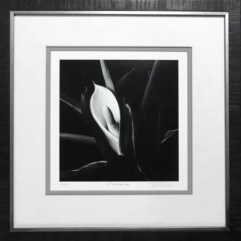
This square format Hasselblad photo of a flower was shot and darkroom developed on traditional fiber base paper by Jim Tucker, Fine Art Photographer, Tehachapi CA.
A white or black mat with a black frame is no longer gospel, and sticking to early design trends has become an individual choice rather than a concrete rule. Even purist collectors have begun to see the value in a frame with a little more style, texture or color variation over the basic stem. The Hasselblad photo of the flower on the cover—courtesy of Jim Tucker, photographer, Tehachapi CA—is one in his series of fine art photos that are darkroom developed in the traditional manner, but the final framing showcases a contemporary twist on the old school design.
Photo 1
This square format Hasselblad photo of a flower was shot and darkroom developed on traditional fiber base paper by Jim Tucker, Fine Art Photographer, Tehachapi CA.
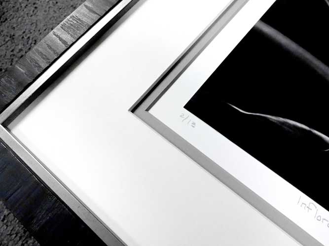 Photo 2
The square format Hasselblad was double matted with Antique White top mat, Ostrich Gray bottom mat, 4-ply rag spacer between, allowing ½” perimeter mount board allowing for LE#, title and signature, LJ Petite II Ebony frame and UV glazing.
Bauhaus, was an art school in Germany from 1919 to 1933 that combined craftsmanship, architecture and fine arts. The Bauhaus style promoted the concept of all arts coming together and became one of the most influential movements in modern design, art, architecture, graphic design, interior design, industrial design, and typography. The design innovations commonly associated with Bauhaus are radically simplified forms, rationality and functionality, and the idea that mass-production can maintain individual artistic spirit.
Three of the concepts started at the Bauhaus—1) form follows function; 2) be imaginative but never let it detract from your message; and, 3) reduce your design to its most essential elements—are essentially where the framing concepts for B&W photography were born. This translates into photo design as: 1) select a frame that is strong enough to support the package, but small enough to blend; 2) be creative but always keep the photo dominant; and, 3) select a mat, glass and frame to do the job.
Throughout history frame design for B&W photos has been a white mat and simple black stem frame based on the theory that stark non-design will never get in the way of the beauty of the photographic image, very Bauhaus. This is also supported by the early limitations of rag board, mat colors, or moulding profiles. And frame design frequently clings old traditions, such as the practice of mounting 8x10and 11x14hand developed images to white or black 16x20board for display, critique or competition.
Photo Framing Basics
All photos require a mat or spacer to separate them from glazing and to give the eye a space to pause while being drawn into the photo. Museum board is 100% cotton—best for long term display—and is the mat board of choice for the preservation of photos both in storage and on display.
Selecting only single 4-ply, bright white, mat and a narrow black frame limits photo frame design. (photo 3) Consider double 4-ply, single 8-ply, the combination of a 4-ply and 8-ply, or spacers. Multiple mats allow for design variation on B&W photos. Tie the bottom mat color with the frame color, if more neutral than black, then use neutrals picking up the whites and grays in the photo for middle and top mats to create a more contemporary feel. Also a wider 4to 6border of white or off-white looks sleek and contemporary in a gallery grouping.
 Photo 3
Bright white mat and black frame can be visually distracting by drawing the away from the photo. Tucker's signature had also been covered by the original design.
Frames today may be narrow or wide; wood or metal; black, white or other neutral color. Even the Ansel Adams Gallery in Yosemite National Park, CA offers Adams lithographic B&W prints matted in white with narrow Nielsen metal frames of contrast gray, champagne and matte black. The key is to keep visual focus on the photo.
Museum Preferences
The metal frame was developed in 1968 and since then has been used in museums and galleries because of its simplicity, aesthetically pleasing design, and archival nature. It does not require rabbet sealing to protect photo emulsions from the acids in wood mouldings and may be easily reused. The Museum of Modern Art New York, The Art Institute of Chicago, and San Francisco Museum of Modern Art regularly display photos in aluminum, acrylic, brass, and painted, varnished, stained or lacquered wood, often in the same exhibit. This practice is not new, it has been common since the 1970s.
Just as the frames vary, mats may be seen with even borders, weighted bottoms, Asian proportions, narrow to wide, white and color, all in the same exhibition. Museums showcase collections and quite often t he unifying element is frame width.
Framing for Galleries
Galleries are not museums and their goal is to make sales. Galleries that require wide white mat(s) and thin black frame are striving for setting the artwork off from the wall and highlighting it without detracting from the photo. By providing a colorless background for the photo, high end galleries are creating a uniform clean consistency to an exhibition allowing the collector to focus totally on the inner image. Selecting the same design element for each piece—mat color (warm white), mat thickness (8-ply), mat width (6"), frame (narrow black metal Arthaus)—helps present the photo in a consistent way, even if the white seems stark and impersonal.
Proper design proportions of moulding width to mat border to image are not cast in stone. A ½ smooth black stem or ¼" metal may be perfect for an 11x14photo, while a 1¼ lightly textured pewter Ferrosa requires a much larger image to maintain proper proportion. At a photo show in Georgia, an interested photo collector commented on the beauty of the texture and soft tones of an LJ Foundry frame on a large B&W photo. Then there's a photo gallery in California that will not display any photo that isn't framed with white mat and narrow black frame.
Contemporary frame design integrates the photo and the framing. Rather than multiple mats of the same color, two or three are based on image colors. Bottom line is to know your gallery and their anticipated clientele. Using high end contemporary frame design in a rural country town will never sell. Likewise contemporary textural frames and triple mats with spacers in colors other than white may not appeal to true collectors.
Tucker
Jim Tucker is a fine art photographer in Tehachapi, CA who shoots textural abstractions and landscapes using rolls of film he then develops in his darkroom. This allows him to modify his B&W tones when creating his finished print. He then mounts them prior to bringing them to his framer. Tucker came to me after seeing samples of my frame designs at a recent lecture and exhibition. He was preparing for his show at a local gallery and previously had six of his pieces framed in traditional white mat, black frame styling. After my lecture he brought me those originals to reframe as well as six more for the show looking for less — collector and more — consumer friendly framing design. His object was to appeal to the home décor concept and ultimately sell pieces at the show.
Since we were reframing six and framing six anew I was able to purchase in bulk and cut materials to minimize board and glass waste. Because of the bulk buying I was also able to offer him package pricing. Tucker mounts all his own photos to 11"x14" using 4-ply boards and a small mechanical press. The original framing was 11x14so when we enlarged the frame size to allow for a signature/title space around his photo the mount boards were too small for the new 12½"x15½" frames. (photo 4).
 Photo 4
Twelve pieces were reframed in an updated more contemporary style for Tucker's local exhibition. The signature and title are now visible and the image more saleable in this market.
A simple sink mount was required to properly hold the pre-mounted photo in place. Since the rabbet is rather shallow, a 4-ply backing was sized and prepared with 4-ply strips adhered to the surrounding edges to fill the void. The new backing is flange hinged long side to the window mat unit. The completed mount is simple and reversible. (photo 5)
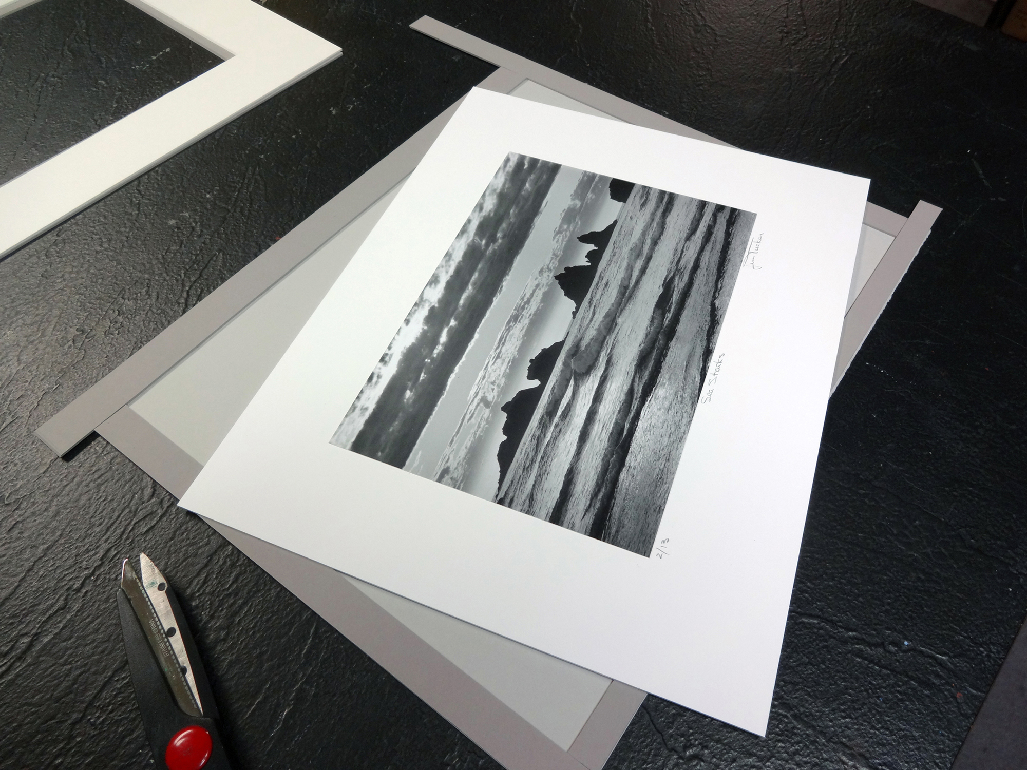 Photo 5
The photos were previously mounted by Tucker to 11"x14" 4-ply boards so they needed to be sink mounted to be enlarged for the new 12½"x15½" frames.
The new design has a more saleable appearance for his market here, and the softer, neutral mat colors allow for them to fit better into a greater range of homes. The Larson-Juhl Petite II Ebony frame (photo 6) has a texture to it and soft, warm black finish that replicates the cloud striations and wave patterns within Tucker—s photos, working well on a wide variety of images.
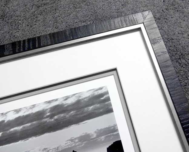 Photo 6
Bright white mat and black stem frame were replaced with double mat, spacer and textured frame with pewter lip. The moulding pattern reintroduces the cloud striations and waves.
Mat color—tint (c+white), shade (c+black) or tone (c+gray)—should be based on the color base of the tones of black and white in the actual photo, very few B&W photos are truly black or white. Always match color families within neutrals, blue base cool white should match blue-gray and the cool shadows in the photo. Likewise warm brown-gray and yellow base crème will demand the same color matching mats to photo. (photo 7) Bright white mats can create glare around the image that can detract from the eye's ability to discern detail, where off-white, warm and antique white may allow greater integration. (photo 8)
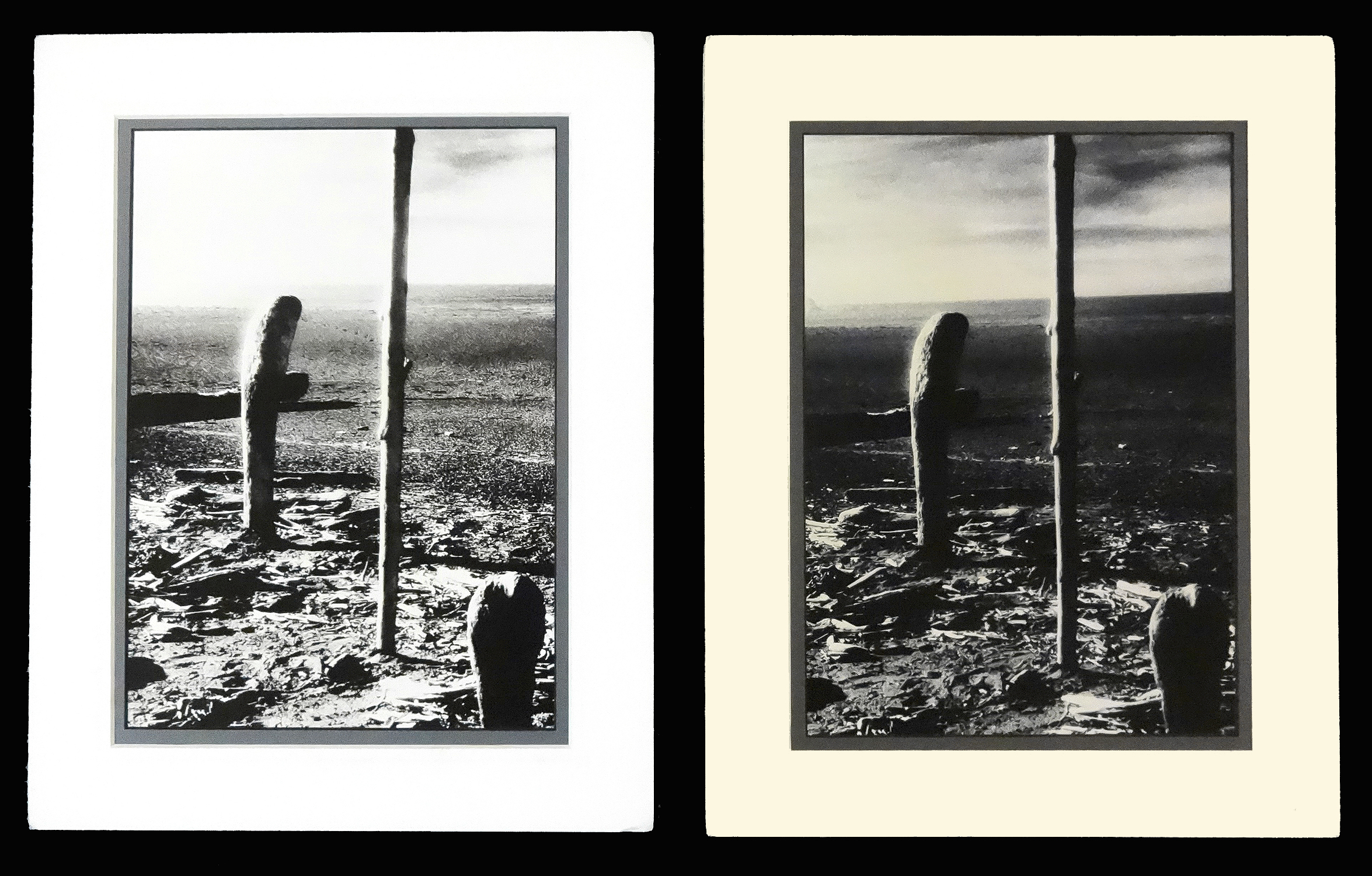 Photo 7
These two darkroom developed, fiber base photos are opposite ends of the color scale, one cool blue-gray with bright white highlights (L) the other warm brown-gray with crème highlights (R). Photo Trinidad Driftwood courtesy of Gwen Walker Strahan, fine art photographer, Walker Strahan Gallery, Redding, CA.
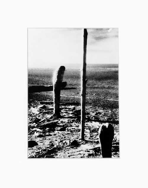 Photo 8
A wider 3"-4" white rag mat expands the image but also tends to darken it. The mat matches the highlights in the photo but is still overpowering.
A wider 3"-4" white rag mat—that matches the photo highlights—will visually expand the image, but can also make it appear darker. A black mat will close in, wash out or discolor an image, so a more neutral warm or cool gray might be a better choice. (photo 9) A 2½" neutral, cool gray, black core mat matches the gray tones in the shadows which naturally drawing the eye into the image darks. And the black bevel integrates with the darkest shadows. A triple mat of cool blue-gray black core, pearl white, blue-gray not only matches the photo colors, but also replicates the linear highlights along the edges of the driftwood. (photo 10)
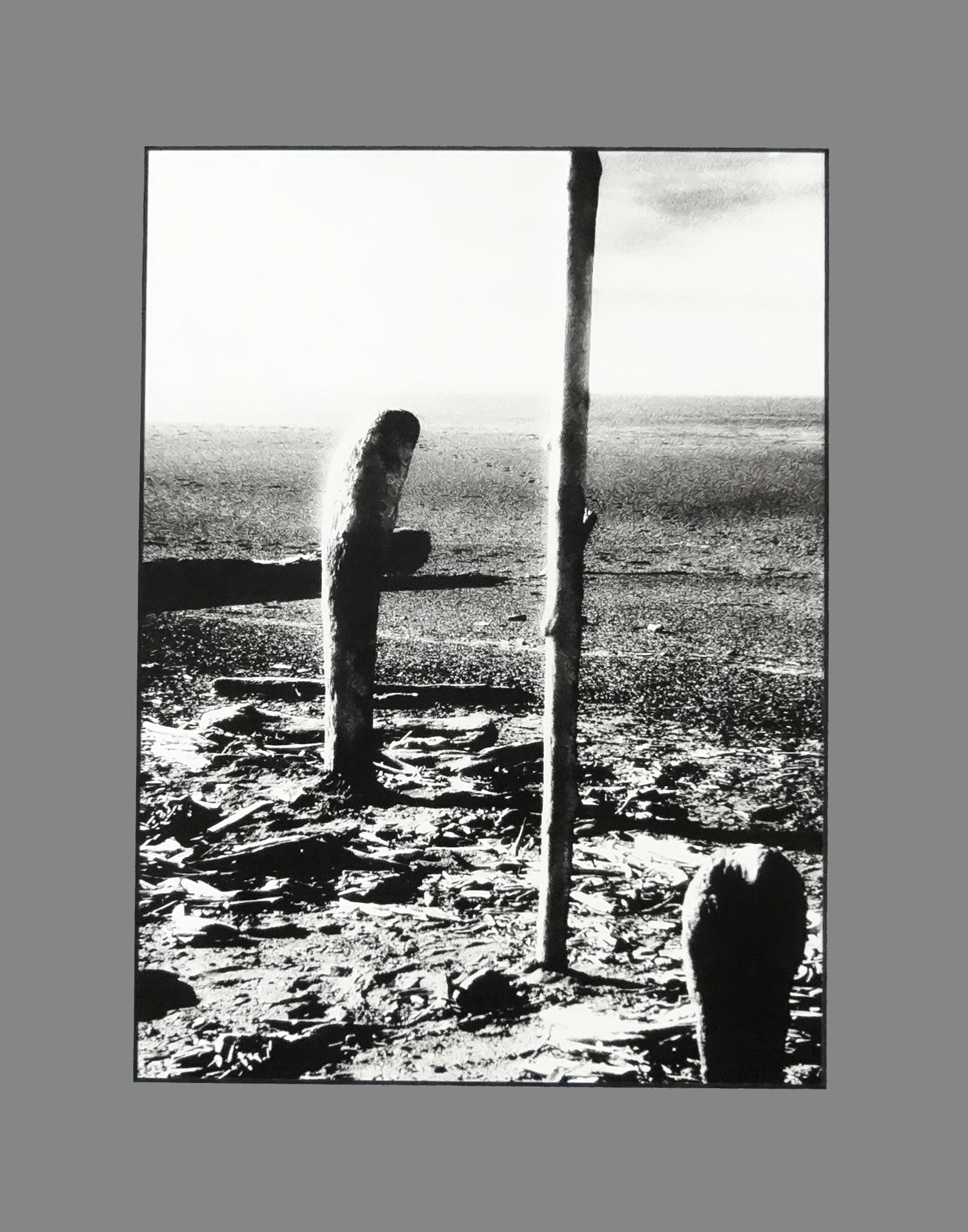 Photo 9
A 2" neutral blue-gray black core matches the gray tones in the shadows which naturally drawing the eye into the image darks. The black bevel draws into the darkest shadows.
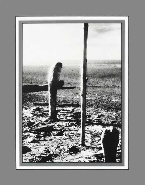 Photo 10
A triple mat of black core cool gray, pearl white, cool gray not only matches the colors but also replicates the linear highlights along the edges of the driftwood.
Design Unity
Unity in framing design is when the frame, mats, and mat decoration (if applicable) all work together to best enhance and protect the image. The photo must always remain the dominant element and perfect framing design should be noticed but never too much, and only because it goes so well with the art. It should gently guide the eye from the frame into the image, yet allow it to wander to see how well the selected lines, colors and textures all showcase the photo. Black and white may be what was historically done, but with all the subtle variations of board colors and moulding the softer approach is more contemporary and inviting.
Use of white or off-white mats helps to unify a gallery or museum exhibition of assorted framed pieces. Selecting the same mat color, same mat design, same frame, or same exterior size will all unify while still allowing for singular variety.
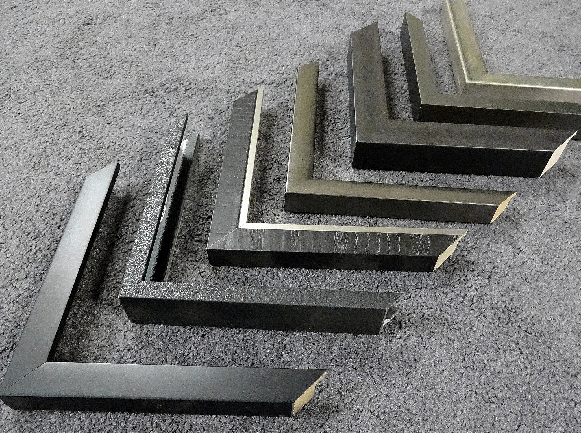 Photo 11
(L to R) Omega Black Stem is a traditional profile, while Nielsen Arthaus; Larson-Juhl Petite II Ebony, LJ Ferrosa, LJ Foundry; Designer Moulding Brushed Grey Pewter; and Studio Plata Smokey Green are all suggestions for thinking outside the black frame.
Final Frame
Every moulding company has their basic black, white, gray and wood grain stem profiles suited to photos making frame selection easier than in decades past. By embracing the design elements of texture, color and repetition and then selecting a profile that reflects the gray tones or pattern within the image will help bring photo framing into the 21st century. (photo 11) Textured metal mouldings such as Bauhaus inspired Nielsen Arthaus; Designer Moulding Brushed Gray Pewter; Larson-Juhl Petite II Ebony, Ferrosa, and Foundry lines; and Studio Plata are all suggestions for thinking outside the black frame and adapt very well to photos.
END
Copyright © 2015 Chris A Paschke
Resources
http://larsonjuhl.com — Ansley, Petite II, Ferrosa, Foundry, Nielsen
http://studiomoulding.com — Plata, Studio Black, Matt Gray, Matt White, Natural Wood
https://www.nbframing.com/ — Nielsen 15, 22, 33, 34, 117
http://omegamoulding.com — Moderne, Accord, Eastman, Midnight
http://designermoulding.com — assorted metal mouldings
Bibliography
Keefe, Laurence E., The Life of a Photograph. Stoneham: Butterworth Publishers, 1990.
Wilhelm, Henry Gilmer, The Permanence and Care of Color Photographs. Grinnell: Preservation Publishing Co., 1993
Omega 79771 - Black stem
Nielsen 117-E542 Wrought Iron
Larson-Juhl 334138 Petite II Ebony
Larson-Juhl 235252 Ferrosa Pewter
Larson-Juhl 332902 Foundry Iron
Designer Moulding 29-x17 Brushed Grey Pewter
Studio Moulding 41808 Plata Silver with Smokey Green Patina
For more articles on mounting basics look under the mounting section in Articles by Subject.
Additional information on all types of mounting is found in:
The Mounting and Laminating Handbook, Second Edition, 2002,
The Mounting And Laminating Handbook, Third Edition, 2008 and
Creative Mounting, Wrapping, And Laminating, 2000 will teach you everything you need to know about getting the most from your dry mount equipment and materials as an innovative frame designer.
All books are available from Designs Ink Publishing through this website.
Chris A Paschke, CPF GCF
Designs Ink
Designs Ink Publishing
785 Tucker Road, Suite G-183
Tehachapi, CA 93561
P 661-821-2188
chris@designsinkart.com