 Photo 1
Design doesn't just happen, it needs to be created, and framing design is no different. Though a great deal of design may be instinctual and even subliminal having a solid foundation of the structural guidelines of design can be a great help. When a design doesn't feel like it's working well—it probably isn't. But always remember that there are always a wide variety of designs that would work and there will always be more than one perfect design. This is why designs created for the same art image, as at the PPFA International PRINT Framing Competition, dramatically varies when it comes to the design finalists. Individual framers all have individual tastes, and what works for one may never work for another.
The principles, or fundamentals, of design are the sum of both the elements and factors, and it must be stressed that no element or factor ever works alone. In order for there to be a truly unified design they must all meld into one cohesive well planned and perfectly executed presentation. That means that everything in any design is there for a reason, and that nothing is happenstance.
Elements and factors are individualized and categorized only for identification and analysis, in order to best understand them, their potential in framing, and their interaction with each other in creating a complete design. These principles are the same ones used by artists in the production of their artwork, but they have been modified to translate into the world of picture framing. As an artist uses them to produce a masterpiece in pigment, so a framer will produce a masterpiece of framing design.
The Elements
There are six individual elements that together comprise the whole of a well-organized framing design. The elements are considered the psychological portion of a design—those that an artist, designer or framer has control over. They are interpretive and often instinctive for a good designer which some might call 'having an eye' but is more of a feeling when everything works together. This would present itself as knowing when a particular moulding and mat combination is the right combination and works.
The six basic elements are line, color, texture, shape, intensity, and space. Rhythm is sometimes included in this list but more commonly is referred to under factors as it's more of a technique than a tool. Either way rhythm/repetition is a very important principle that should never be neglected and is routinely seen in well unified designs and art. These are considered the building blocks which will create the final presentation. In framing, these elements are present in the appearance and visual feel of moulding, matboard, fabric, paint, pigment, decorative paper, deep bevels, fillets, glazing and artwork. It is the choices made during the design process using these elements that either work together or are discordant in the final presentation
Identifying Elements
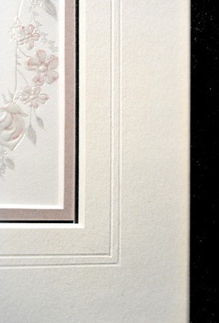
Line is identified most often by use of multiple mats or mat decoration. The cut of a rectangular bevel creates a visible line regardless of solid core museum board, BriteCore, black or paper mat; all establish the use of line. Line is represented by anything from a white bevel, metallic accent strip, to some color debossed decoration. Once the line contours it becomes a shape. (photo 1)
Photo 1
Color is the character of a surface resulting from light wavelength to vision used to accent or harmonize with artwork creating an overall mood, visual effect or response through the use of colored matboard, moulding, fabrics and surface design. Color should never be used solely for its own character—to match the sofa or carpet—or emotive reaction, but always in relation to the image or object being framed.
Texture is the character of materials creating a visual look, mood and richness determined by physical structure. Intermixing textures attempts to stimulate a viewer's emotional response and may support the theme, such as lace for weddings, flannel for babies, and leather for masculine imagery.
Shape is any element that is used to determine or give form. The shape itself is considered a positive area. The shape surrounding it is considered the negative area. These are most commonly known as positive and negative space, yet they are indeed created by the presence or void of shapes. It is a defined area that stands out from areas surrounding it due to a defined or implied boundary of value, color or texture. Shape can be windows of outer or inner mat openings, or actual outer frame construction. Never add shapes purely for decorative reasons or space filler. (photo 2)
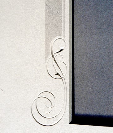 Photo 2
Intensity in art relates to color brightness, and is the visual energy of emotion evoking strong reactions of mood through highlight and shadow. (photo 3) In framing intensity refers to the highlights and shadows created by use of inner fillets, lifters and spacers and creative applications such as glass etching, deep bevels, and stacked mouldings. The result becomes a stressing of the decorative effects, by ignoring conventional light sources or neglecting the representation of light altogether until it naturally occurs within the frame.
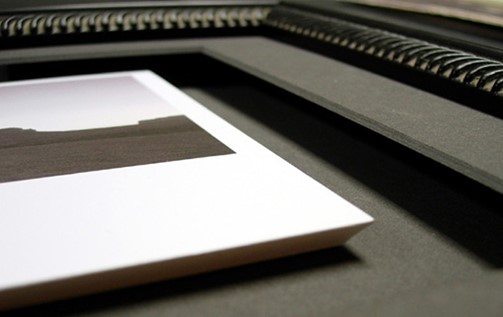 Photo 3
Space is the area within, around, above, below or between items to accent by use of positives and negatives both outside and within the frame. Space defines as a measurable distance between pre-established points with two-dimensional space involving only length and width; three-dimensional space adds depth. It is used in wall groupings, shadowboxes and/or as extensive negative areas around the art.
The border widths in photo 4 were dictated by the size of the original etching and the client's desire for a smaller inner accent fillet. The exterior narrow top mat echoes the inner fillet/liner mat visual, while also breaking up the flat negative wide borders. Without the top narrow addition the space felt like a void.
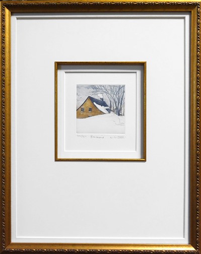 Photo 4
The Factors
The basic factors of balance, proportion, emphasis, and rhythm are the mortar that holds the above building block elements together. They are guidelines developed to assist in creating more harmonized designs and are the physical organizers that can make or break a design even when perfect colors and textures have been selected. If the balance or proportion of the presentation is off the design will not hold together, hence no unity. Additional factors of style (see unity) and scale (see proportion) are sometimes included with factors and may be strongly represented in a given design.
Identifying Factors
Balance is the feeling of equality as weight, attention or attraction to other parts within the frame, and is identified as symmetry, asymmetry, and radial balance. The visual weight of symmetrical balance is perfectly even on each side of an imaginary center line. Wedding invitations and announcements are often good examples of this. Asymmetrical balance creates tension through contrast with no mirror images by arranging elements that visually balance the design. (photo 5) Radial balance radiates from one centralized focal point, like a nautilus shell or wagon wheel.
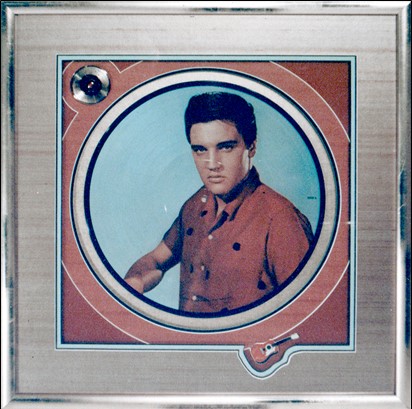 Photo 5
Proportion is the relationship between parts. It relates to the size and scale within a frame and deals with the ratios of one part to another such as border widths, mat and frame widths. (photo 6) Controlling the widths of frame, fillet, mats, mat reveals, and space surrounding art are all proportion. Varying widths maintains interest, while same widths can negatively distract. Scale strongly relates to proportion and is usually most noticed when misused.
 Photo 6
This would be an identifiable issue if a small 5 x 7" Hawaiian vacation photo was matted with a floral fabric of oversized hibiscus flowers. Even if the location reference is relevant, the scale would be very wrong. Though there are no hard and fast rules for proportion but a few basic suggestions include don't crowd; vary the widths of materials selected; and no item should overpower another for dominance, otherwise the presentation will be in conflict.
Emphasis is the physical positioning of elements as visual concentration or focal point within the frame to indicate what is meant to be dominant, thus controlling viewer's eye movement. Emphasis may be achieved numerous ways including color intensity, darkening or lightening contrast, line convergence, or simple repetition. Reactions such as peacefulness, agitation, playfulness, and confusion, may all be stimulated by visual arrangements within a frame.
Rhythm—also identified as repetition—is the use of marks, colors, lines or shapes echoed as accents, patterns, and colors from within the art reintroduced through similar details in fillets, moulding pattern, mat carving, and other surface decoration. Rhythm is a very strong element because of its living connections to heartbeats, breathing, days, seasons, etc.
Unity is achieved by the resolution of conflicting elements and factors within a frame allowing the design to be in harmony with the art, giving the design has a sense of completion. Style/Period determines the correct era or scheme of the art, and should never be an afterthought. It needs to be an integral part of the design discussion and selection of all materials, colors and moulding. Placing a Victorian portrait in a contemporary abstract expressionist inspired frame would be an incorrect use of period and likely could never feel truly unified.
Final Harmony
The elements of any design are the materials of the designer; the factors establish the methods by which these materials are used. Just as it is true that shape and space flow in and out of each other; that texture can be the result of highlights and shadows of line and color; all the principles should work together for a unified whole. If any are isolated then one may dominate the other and the design could be lost. Remember that if you don’t need to use a design element, don’t use it, and holding your elements and factors to a total of 3-5 is often a sound practice.
END
Copyright © 2019 Chris A Paschke
Bibliography
Bevlin, Marjorie Elliott. DESIGN THROUGH DISCOVERY. New York: Holt Rinehart Winston, 1984.
Binyon, Lauren. THE FLIGHT OF THE DRAGON. London: Brown Knight & Truscott Group, 1972.
Collier, Graham. FORM, SPACE AND VISION.
Faulkner, Ray, et al. ART TODAY. New York: Holt Rinehart Winston, Inc., 5th Ed., 1969.
Graves, Maitland. ART OF COLOR DESIGN. 1951.
Itten, Johannes. THE ELEMENTS OF COLOR. New York: Reinhold, 1970.
Leland, Nita. THE CREATIVE ARTIST. Cincinnati: North Light Books, 1990.
Mayer, Ralph. A DICTIONARY OF TERMS AND TECHNIQUES. New York: Thomas Y. Crowell Co., 1969.
Ocvirk, Otto G., et al. ART FUNDAMENTALS THEORY AND PRACTICE, Sec Ed. Dubuque, Iowa: Wm. C. Brown Co., 1969.
Prohaska, Roy. BASIC COURSE IN DESIGN. 1980.
Siebert, Lori, et al. MAKING A GOOD LAYOUT. Cincinnati: North Light Books, 1992.
Wills, F.H.. FUNDAMENTALS OF LAYOUT. New York: Dover Publishing, 1965.
Wong, Wucius. PRINCIPLES OF COLOR DESIGN. New York: Van Nostrand Reinhold, 1987.
Wong, Wucius. PRINCIPLES OF TWO-DIMENSIONAL DESIGN. New York: Van Nostrand Reinhold, 1972.
For more articles on mounting basics look under the mounting section in Articles by Subject.
Additional information on all types of mounting is found in:
The Mounting and Laminating Handbook, Second Edition, 2002,
The Mounting And Laminating Handbook, Third Edition, 2008 and
Creative Mounting, Wrapping, And Laminating, 2000 will teach you everything you need to know about getting the most from your dry mount equipment and materials as an innovative frame designer.
All books are available from Designs Ink Publishing through this website.
Chris A Paschke, CPF GCF
Designs Ink
Designs Ink Publishing
840 Tucker Road, Suite H-190
Tehachapi, CA 93561
P 661-821-2188
chris@designsinkart.com