 Photo 1
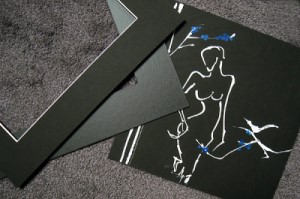
(L to R) A surface tiered white bevel mat, a heat-set laminate over black mat board reverse bevel cut, and the original 10x10" white line art.
When is a mat not just a mat? When the framing design calls for the mat to match the fine art paper or the art just needs that little something extra like a mounted decorative paper or heat-set vinyl laminate. With all the colors and manufacturers of mat board available, it's almost absurd to think there may still be a white, cream, or black that does not match the color base of the art…but it still happens.
A pair of monoline figurative originals was painted with opaque white gouache (watercolor) on 90# Stonehenge black paper using tiny ⅛" dots of primary red and blue contemporary flowers as accents. The final design-after many tries-needed the black art background to remain dominant, so black mats and frame were chosen. Mat borders were kept narrow, with the top mat designed as a 2" mat and the liner at 2¼" because of the small 10"x10" dimensions of the original art, the vast field of black, and the selection of a contemporary black Nielsen 24421 brushed black metal frame. The black top mat needed a white bevel to reintroduce the white lines in the art as a visual rhythm and repetition in the mat design, and the liner mat needed to have a matching tone but contrasting surface (Photo 1).
Photo 1
(L to R) A surface tiered white bevel mat, a heat-set laminate over black mat board reverse bevel cut, and the original 10x10" white line art.
Matching Blacks
Although perfectly matching color hues and tones are generally not necessary—nor desired—when selecting mats, a mismatched neutral can be a real problem. Such was the case with this Matted Mount Designs Mastering Mounting by Chris A. Paschke CPF, GCF, CMG design. Of the white beveled boards available, Alphamat Artcare Jet Black was slightly blue, Ivory Black was too yellow, Crescent Raven Black was also too yellow, plus I wanted a 100 percent cotton rag. The best solution was to create an in-house surfacetiered mat by mounting a sheet of Stonehenge Black to 4-ply #8654 Pure White Alpharag using pure film adhesive and a heat press (Photo 2).
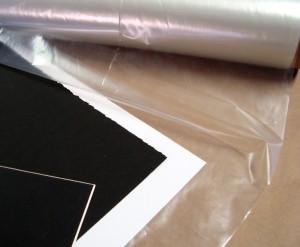 Photo 2
Drytac Flobond film adhesive is used to bond a sheet of Black Stonehenge art paper to Pure White 8654. The lower left corner shows a fall-out from a previous project
Surface-Tiered Mat
Papers have been mounted to the surface of mat boards for decades, but the design concept of tiered matting was not truly launched until the mid 1980's. Tiered mats consist of mounting together decorative papers and mat boards to create stripes at the top of, within, or at the bottom of a window bevel.
Heavyweight, handmade, imported papers are often used for mixed media, pastel, watercolor, ink, and drawing make wonderful, interesting mat board surface papers.
Surface tiering involves the mounting of decorative papers to the top of an existing mat board. Heavy colored machine-made papers are used to mount behind and between boards for other tiered matting techniques. Under tiering is the mounting of colored art papers to the back of a mat board to alter the lower bevel edge color. Pin striping is the mounting layers of colored art papers between color core mats to create contrasting hairlines within the bevel, and bevel banding involves mounting contrasting colored-core 4-ply boards together to create wide bands of colors within the bevel. These wider stripes make a much bolder statement and can easily increase bevel depth to 8, 10, 12, or 16 ply. The addition of any boards or papers increases bevel depth and in some cases may not be cut in a CMC.
(For more information on tiered matting, see Chapter 4 of Creative Mounting, Wrapping And Laminating by Chris A Paschke, CPF, GCF. Available at the PFM bookstore.)
Mounting
Although pressure-sensitive mounting may be used, heat bonding in a dry mount or hot vacuum press using pure adhesive between each layer is best. Pure film adhesive is preferred because it bonds clear, creating no additional tissue layering. Since tiered matting often uses materials that are considered conservation quality, choosing selected adhesives that correspond to their neutrality should also be considered. All tiered matting materials and projects may be either cold or hot bonded and may be considered either decorative or conservation quality depending on the selected materials.
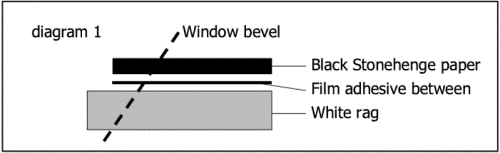
In this case a single sheet was to be added to the face of Alpharag, increasing it only to 5- or 6-ply. The resulting top black mat board matches the original art perfectly. The paper, board, and adhesive should be sized about 1" larger than the desired mat blank. Pre-dry the board and paper if you are using a mechanical press and stack the rag mat, adhesive, and art paper (bottom to top) and cover with release paper (Diagram 1). Dry mount 3 to 5 minutes at 190° to 200°F degrees, remove and cool it under a weight. Resize the mat blank to the correct outside dimensions, then mark and cut the window.
The Liner Mat
For decades mat surface papers have been available as smooth and lightly textured, but generally the surface sheen did not vary much. In "Resurfacing Laminated Mats" (Mastering Mounting, February 2009), I reintroduced the concept of contemporary laminated mats as an alternative design for art that called for mats but no glazing. Though laminated mats were created to fill the specific need of tolerating water, scuff, and scratch resistance, they may also be enclosed in a glassed design as long as the laminate is spaced away from the glazing.
Any mat design is stimulated by the requirements of the project. This particular project seemed to call for two things: matching the color base of the black fine art paper and creating a liner mat with visual contrast and intrigue. A black rag mat with a smooth satin-matte, matte, or ultra matte finish might be perfect. It would slightly alter the reflective quality of the surface while maintaining the same black tone (Photo 3).
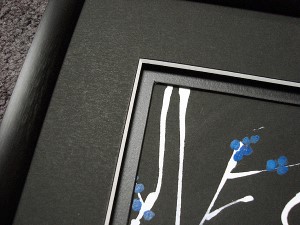 Photo 3
Nielsen 24421 brushed metal Specialty Frame, Stonehenge black paper over Bainbridge 8654 Pure White Alpharag, and Drytac ArtShield Mattex (satin-matte) on black mat.
Laminating
In the early 80's vinyl film was developed for use specifically within the framing and wall decor industries as a surface coating for protecting, enhancing, or displaying a two-dimensional image. Vinyl films were developed specifically for use within a heat press and featured a removable release paper backing.
Surface—also called overlaminate—films are used predominantly in the framing industry as a protective film applied to the surface of paper art or photographs as a glazing substitute by use of mechanical or hot vacuum press. It is a nonreversible alternative to glass and is washable, durable, permanent, lightweight, nonbreakable, will not fingerprint, UV resistant, and nonporous after bonding. These permanent films bond as they reach activation temperature and come in an assortment of finishes and textures.
Vinyl film can also be used as a mat board surface enhancement to alter the look and texture of window mats (see "Resurfacing Mat Boards," February 2009). When used to resurface and alter the appearance of a mat board, it is mounted using the same step-by-step process as if it were being placed on a poster image or photo. Size the uncut window blank, apply the film board, cover with overlay sponge foam, and mount in 185°F to 215°F press for 5 to 10 minutes. Make certain the film is totally bonded and clear when removed from the press and that there are no tiny dots remaining. Silvering (the dots) is a sign of not having been in the press either long enough or under enough pressure.
Impact and Versatility
The liner mat window was cut as a reverse bevel to eliminate any visible bevel edge, even though the board was a solid core. Since the mat colors match, the white line bevel stands out to enhance the monoline in the art, and there is visual contrast to set the black Stonehenge paper of the art apart from the top mat by altering the surface of the liner mat. The addition of a ³⁄₁₆" black foam spacer between the two mats added depth, intensity, and impact while also helping draw the viewer into the image even more (Photo 4). The final design creates a complete, unified appearance that nicely enhances the contemporary image, "A Little Birdie Told Me" (Photo 5).
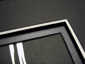 Photo 4
Adding a ³⁄₁₆" black foam spacer between the mats creates added dimension and visually helps draw the viewer into the art.
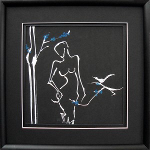 Photo 5
This completed sample is a 10x10" original monoline gouache on black paper. The narrower mat design, contrasting mat surfaces, and white bevel all help integrate with the art and draw the viewer in. "A Little Birdie Told Me" is art shown courtesy of Chris Paschke and is available as note cards and prints and original at www.DesignsInkArt.com.
It took many tries to settle on a versatile design for the White Line Series of "Girlfriends" and "Florals" (Photo 6). The powerful black background and high contrast white line work made all designs feel inadequate or not contemporary enough to work with the art. When I finally developed the design package described in this column, I found a wonderfully versatile design that still allowed each original to feel unique and special. Though seemingly bold, this design has turned out to be perfect, and the white line bevel of the top mat achieves the same dramatic effect with every piece of the series, allowing them to be displayed as a single, pair, set of three, row of five, or nine up (Photo 7).
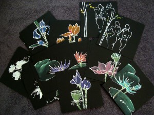 Photo 6
The White Line series of more than 30 pieces needed a versatile frame design that would enhance every piece in the line equally. This design has turned out perfectly
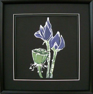 Photo 7
The white line achieves the same result with “Purple Lotus” as in the featured artwork.
END
Copyright © 2010 Chris A Paschke
For more articles on mounting basics look under the mounting section in Articles by Subject.
Additional information on all types of mounting is found in:
The Mounting and Laminating Handbook, Second Edition, 2002,
The Mounting And Laminating Handbook, Third Edition, 2008 and
Creative Mounting, Wrapping, And Laminating, 2000 will teach you everything you need to know about getting the most from your dry mount equipment and materials as an innovative frame designer.
All books are available from Designs Ink Publishing through this website.
Chris A Paschke, CPF GCF
Designs Ink
Designs Ink Publishing
840 Tucker Road, Suite H-190
Tehachapi, CA 93561
P 661-821-2188
chris@designsinkart.com