 Diagram 2
Vertical balance is determined by height and weight at the bottom.
Balance is probably the strongest unifying principle. It is the feeling of equality in weight, attention or attraction to other various visual elements within a pictorial field or frame. It sometimes defines as the mathematical relationship of parts to one another within the whole. It becomes a means of accomplishing an organic unity and may be categorized as either STRUCTURAL or VISUAL.
Balance is necessary for survival in life. Inhaling is balanced by exhaling, and activity is balanced by sleep. Structural balance is identified by the actual equilibrium of an object. Equilibrium establishes coherence, a comfortable feeling. A building without structural equilibrium or balance would be unable to support it own weight.
Visual balance is the perception of, or psychological reaction to the illusion of equilibrium. If visual balance is missing, we (the audience) feel uneasy. Any composition where all prominent shapes and masses are on one side would appear lopsided unless the opposing side had adequate visual interest to compensate. Like the above building, a framing job lacking in visual balance would also fall apart.
Other elements such as space, line or color can be used to counter-balance and tie together a frame design. The proportion of fillet to mat to moulding; the colors and proportions of top, middle and bottom liner mats; or the placement and focal point emphasis may all make or break balance within a frame.
Structural Balance
At a basic level, structural balance is based upon the physical nature of items in space arranged with respect to a central point or axis. Horizontal structural balance is simple to understand as a central pivot point and cross beam. We've been familiar with the seesaw or teeter-tauter since childhood. Balance is from side to side with the pivot or dividing line at vertical center.
Vertical balance, within the structural range, is also based upon the physical stability of an object or building. Its determining factor hinges upon the relationship of the height of an object to its weight at the bottom (diagram 2). A tall ship mast is balanced by the boat width at the bottom, while a flagpole is set into concrete for adding weight stability.
Diagram 2
Vertical balance is determined by height and weight at the bottom.
Radial balance is when the weight is distributed around a central point, as two or more forces identical in strength and character circulate around it. Simple everyday examples would be the spokes of a wheel or a daisy. This often creates a circular movement adding another dimension to somewhat static symmetry (diagram 3). Photo 1 clearly illustrates this concept in a frame design.
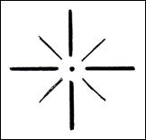 Diagram 3
Radial balance is achieved when equal forces move in all directions creating a circular motion.
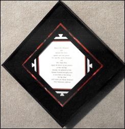 Photo 1
Radial balance moves in all directions in this design by Dwyer's Framing Gallery, Whitefish MT, creating circular eye movement and unity.
Visual Balance
Visual balance is concerned with the aesthetic quality of balance. It is not a matter of whether it will fall over or not as much as whether it gives the impression of being well proportioned and aesthetically pleasing, and able to stand alone. Horizontal, vertical and radial relationships are based on our general understanding of the laws of physics as seen in our day to day lives. Visual balance is achieved through visual judgments on the part of the artist, frame designer and viewer.
Symmetry
Symmetry is the most basic and therefore easiest form of visual balance to understand. There is an imaginary axis or line through the center of an image which divides it either horizontally or vertically into two identical halves (diagram 1). It is for all intents and purposes a mirror image. Identical repetition of this type, also called "pure" symmetry may appear static, lifeless and too monotonous for prolonged audience attention.
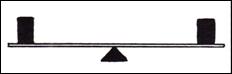 Diagram 1
Perfect symmetry balances items on either side of a central axis.
Since art is rarely a mirror image, most art falls under the cloak of APPROXIMATE SYMMETRY. It relieves the monotony of pure symmetry by slightly varying the two sides of the axis to hold viewer attention. The sides are similar enough to stimulate the feeling of exactness, but remain sufficiently varied to prevent visual monotony (photo 2).
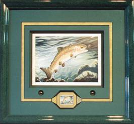 Photo 2
Though the framing is symmetrical on both the right and left sides of the axis, the overall presentation represents approximate symmetry because the two halves are not a mirror image.
Courtesy of Dwyer's Framing Gallery.
Asymmetry
Asymmetrical balance is attained when visual units on either side of a vertical or horizontal axis are not identical, but are placed in positions within the frame so as to create a "felt" equilibrium. Any time a weight is changed on one side, an adjustment must be made to compensate on the other. A heavier child must sit closer to the pivot of a seesaw to compensate for a lighter child on the opposite end (diagram 4). Forms of the same visual weight are counterbalanced by being placed at unequal distances from the center.
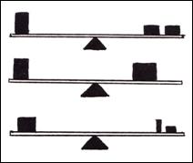 Diagram 4
Asymmetrical visual balance is achieved when there is a "felt" equilibrium. Forms, shapes, colors…must be shifted to counterbalance the opposite side.
Visual weight is not always seen as mass, for it may appear as a balance of contradictory forces. Small strong colors may be easily countered by a large empty or negative space (photo 3). All of the elements may be used to achieve asymmetrical balance in a framing design. Texture may balance shape, color may balance size, and proportion may balance color and line. Understanding the elements or building blocks of design definitely helps construct a balanced wall...or frame design.
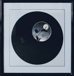 Photo 3
Placing a vertical axis at the center illustrates the visual balance achieved as offset asymmetry. The small circular print (upper right) is counterbalanced with the vast dark negative space and glass etched birds lower left.
Courtesy of Dwyer's Framing Gallery.
Position is critical in successful use of balance. Two shapes of equal stature placed too near an outer border may create too much tension and the overall design may appear heavy or out of balance (photo 4). Elements used for focal point, as discussed in "Part nine: Emphasis", must be placed to contribute to the total balance of all involved picture parts. Too much stress sets everything out of balance.
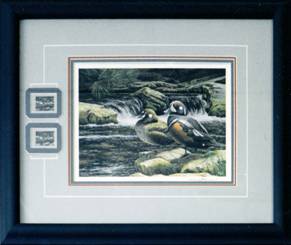 Photo 4
The close proximity of the duck stamps to the left border creates visual stress and extreme focal point concentration. By adding another ¼" – ½" of outer mat beyond the left edge of the stamp window may have relieved the stress and improved the proportion.
Symmetry in Opposition
It's really quite simple. Balance depends upon a central axis or focal point, horizontal or vertical, around which weight or tension must be equally distributed. In framing and picture making, balance refers to the felt or implied equilibrium between all parts. Artists and frame designers alike are forced to balance their designs horizontally, vertically, radically, diagonally...in all directions and positions simultaneously (diagram 5).
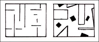 Diagram 5
When balance is achieved in all directions (horizontal, vertical, radial, diagonal) the design is in perfect harmony.
If an object is clearly balanced, it creates a sense of security and comfort, but if it is TOO obviously balanced, it could become boring. A traditionally cut, bottom weighted, double mat, centered, in neutral colors with no additional surface design may be a safe and predictable balanced frame design. So, why is it perhaps a less impressive design than the same image framed with a small mat carving, a calligraphic nameplate or double offset corners cut on only the top of the mat window? Both designs protect and enhance the art, but one is probably more stimulating. If symmetry is calm and repose, then asymmetry is dynamic and active.
There are times when out of balance could suggest visual motion, a controlled stress, like bleeding a surface design off the edge of the frame. It stimulates the eye, plays with focal point and creates additional intrigue. It often challenges us to solve a problem, think about the frame design and ultimately the entire image. It can be a very powerful design element, when well done.
It's rare an artist or framer consciously applies any design principles as he/she works. Rather it emerges as the work progresses. During stages four and five of the design process (production and clarification) we should be evaluating both consciously and subconsciously our use of the design principles. Very often we instinctively use the elements correctly with our own interpretive flare. They merely become our own personal form of designing checks and BALANCES!
Hear the beat and feel the rhythm...next month design explores Part Eleven: Rhythm.
END
Copyright © 1994 Chris A Paschke
For more articles on mounting basics look under the mounting section in Articles by Subject.
Additional information on all types of mounting is found in:
The Mounting and Laminating Handbook, Second Edition, 2002,
The Mounting And Laminating Handbook, Third Edition, 2008 and
Creative Mounting, Wrapping, And Laminating, 2000 will teach you everything you need to know about getting the most from your dry mount equipment and materials as an innovative frame designer.
All books are available from Designs Ink Publishing through this website.
Chris A Paschke, CPF GCF
Designs Ink
Designs Ink Publishing
840 Tucker Road, Suite H-190
Tehachapi, CA 93561
P 661-821-2188
chris@designsinkart.com