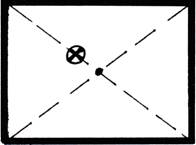
 Diagram 1
The natural focal point is left and just high of center.
Emphasis is a concentration or establishment of centrality, otherwise defined as a high point or climax. In every successful composition of music, book or art, something must dominate. Emphasis might be the dominant beat in a musical rhythm, the character which most holds our attention in a book, or the point to which our eye is first drawn within a frame.
Emphasis in design is achieved by use of the many base elements including line, color, texture, shape and proportion. It utilizes physical positioning to control visual concentration within the space of a frame. As framers we are enlisted to create an environment for a piece of artwork, photo or object, to protect it. As designers we work towards visually enhancing and showcasing it in a unified manner while never detracting from or overpowering the art by drawing the eye away from it.
Achieving Emphasis
All works must have a "center of interest".— Without an obvious visual dominant point of focus, the human eye will naturally settle just slightly above left of center to begin to observe an image (diagram 1). This location is generally where the most important figure, any critical action or the most vibrant color in a painting will appear. But, any marked contrast will create emphasis. The design factors of proportion, balance, rhythm and emphasis are all extremely interdependent and all play off each other in a well executed design.
 Diagram 1
The natural focal point is left and just high of center.
All designs will showcase some type of emphasis no matter how subdued. Any mark on a solid surface becomes a focal point. When more than one single spot is showcased there becomes a hierarchy of focus. In visual design, there are supporting colors and shapes which dramatize and/or direct the eye. Since no two people are alike, the focal emphasis will often vary from viewer to viewer. No singular framing design is the only solution to a framing project, it is merely one solution to the design problem.
Focal Point
When approaching framing design from a technical layout standpoint never forget the focus must remain on the artwork, and great care should be taken to control the viewer's eye by directing the focus or focal point within the frame. In order to best explain the concept of controlling the eye we must begin at the beginning and consider emotional reactions to visual stimulus.
Direction and Eye Movement
Look at the four circular examples (diagram 2) and try to determine the direction the wedge is moving. The first brings the eye into the circle with the ultimate focus at the center point, the second is moving to the right drawing the eye away with it. The third wedge is diving down into the center with rather extreme concentration, while the last is falling from the center allowing the eye to drop from the image altogether.
Thus the two most centralized and positive visual movements will be the first and third, and therefore the most successful. The idea is to hold the viewer's eye within the frame of the picture and not to pull it from the image and dash it onto the outer wall. The ribbon of the featured gold medal is laid to signify the wedge moving into or dropping from the frame center. otice your eye movement as you study the samples (photo 1).
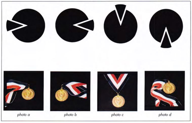 Diagram 2
The wedges create movement illustrating the directions the eye may be drawn.
Photo 1
The emphasis and focal point change when movement is altered by placement of the ribbon.
It is acceptable to create a visual hesitation as the eye moves into the artwork from the matting and framing. By utilizing v-grooves, French lines , tiered matting or painted bevels; this visual pause may reinforce other selected design elements, as long as they don't overpower the art. Circling the eye or dropping it off of the edge are also acceptable as long as something, such as a shape, color or flowing design ultimately draws the eye back into the frame.
Emotional Reactions
A viewer's emotions may be stimulated, almost controlled, by the movement or flow of the eye as an image is observed. Reactions such as restfulness, peacefulness, agitation and playfulness may be stimulated by visual arrangements or placement within a frame. Quite simply, some eye movements are emotionally more disturbing or soothing than others.
Allowing the eye to search the outer edges of a decorated, painted or specialty mat; uniquely cut frame; or multiple opening design can give a designer the power to evoke excitement and intrigue through visual stimulus.
Placement of surface accents and designs—as simple as a calligraphic surname or offset mat corner—can easily bounce the eye from point to point. This motion can create more unsettling responses depending upon the actual direction the eye moves. Through use of the graphic images in diagram 3 let's explore this concept.
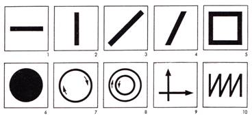 Diagram 3
A viewer's emotions are stimulated by eye movement and interest depending on placement of the focal point within a frame.
A casual viewing of the horizontal line in box #1, allows for peaceful movement of the viewer's eye from left to right, stimulating a passive and quiet response. So the visual eye movement of a traditional landscape in a no frills traditional, single matted, horizontal framing presentation would also evoke a gentle response.
A diagonal moving from upper right to lower left, box #3, is not as comfortably familiar so the emotion evoked is more unsettling and dynamic. It makes a stronger visual statement and may be more difficult to successfully execute. This type of design might suggest a counter balanced image to stabilize and comfort the eye, such as the double v-groove around the exterior of the mat as in photo 2. The emphasis in this case remains the print lower left, accented by the vast use of negative space surrounding it, and held by the use of line at the perimeter.
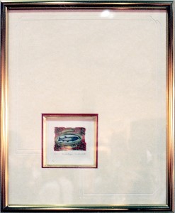 Photo 2
Now consider a continuous circular movement of the eye as in box #7. This creates a somewhat natural movement reflects the positive continuity of growth and comfort and is not at all unsettling. A multiple opening mat using progressive chronological portraits would reinforce the clockwise flow of the eye through the rotation of the outer portraits. The emphasis would remain the larger dominant central oval. (photo 3)
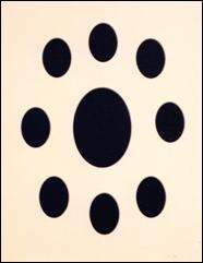 Photo 3
This common portrait design easily illustrates the circular motion of the eye, while maintaining visual focus on the larger central oval.
The outward visual motion off the frame in two directions as shown in box #11, might be exemplified by the faux glass etched mirror in photo 4. This particular example stabilizes the etching bleed to the edge of the frame by overlapping the flower at the left corner. This entire project was designed to be hung at a diagonal also stimulating an extreme of movement.
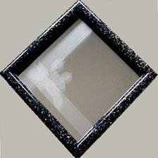 Photo 4
This accent mirror piece—highlighted by faux glass etching laminate—shows use of casting the eye out of the fame with the edge to edge strips while pulling it back in with the mirror and intrigue of the reflections.
The eye will generally begin at the flower, flow up and out of the frame only to be caught and pulled back into the frame at the lower edge then moving back up to the flower ready to complete the circle again. This particular design also controls the eye by creating a continuous cyclical pattern while initially appearing to throw the viewer out of the frame. More eye movement, more emotional response. But the emphasis remains the flower of course. This design would be even more stimulating when you consider the added intrigue of the background mirror reflecting the viewer.
Emphasis through placement and focal point is the principle that will attract and hold a viewer's attention while touching their subliminal nerves and stimulating an emotional response. This can be a powerful tool when utilized successfully, yet quite when misunderstood.
END
Copyright © 1994 Chris A Paschke
For more articles on mounting basics look under the mounting section in Articles by Subject.
Additional information on all types of mounting is found in:
The Mounting and Laminating Handbook, Second Edition, 2002,
The Mounting And Laminating Handbook, Third Edition, 2008 and
Creative Mounting, Wrapping, And Laminating, 2000 will teach you everything you need to know about getting the most from your dry mount equipment and materials as an innovative frame designer.
All books are available from Designs Ink Publishing through this website.
Chris A Paschke, CPF GCF
Designs Ink
Designs Ink Publishing
785 Tucker Road, Suite G-183
Tehachapi, CA 93561
P 661-821-2188
chris@designsinkart.com