 Photo 1
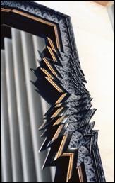
This detail of the side moulding from a large mirror exemplifies the drama of intensity. Highlights, shadows, reflections are all perfect examples of use of this element.
Art is concerned with creation of a work that will arouse an aesthetic response. What we perceive with the eyes in paint, sculpture, drawing, prints, photos...indeed framing, may result in our feeling of delight, admiration, shock, rapture, intrigue or disinterest.
Webster's dictionary defines intensity as "the relationship of one part or detail in a picture to another with respect to lightness and darkness". It is the 'visual energy of emotion' evoking viewer reaction, mood, depth and involvement. Therefore in framing, intensity often relates to strong creative applications and design statements. Glass etching, deep bevel wrapping, stacked mouldings, perhaps nearly any framing presentation somewhat out of the ordinary...might all be samples of intensity at work.
Intensity and value are rather esoteric terms most often equated with the discussion of color, yet this is really only limited accuracy. When relating to the more complete meaning of "intensity" we must also note additional terms such as tone, brightness and shade, all far beyond the simple realm of color.
Intensity and Light
Intensity is measured by the "quality" of light or the specific brightness or dullness of an image. The value of an image is measured by the "quantity" of light that it reflects, hence its apparent lightness or darkness often related to as highlights and shadows. A shadow is a dark area created on a surface when another form is placed so as to prevent light from falling on it. Adversely, a highlight is an area or shape which receives the greatest amount of light. So, value and intensity are partnered as the more dramatic of the elements. They are the ones that seem to set the stage for visual impact and are frequently used to evoke feelings.
Highlighted values are pleasant, shadowed lower values are more dramatic, and extreme contrasts are often quite visually stimulating. The somewhat aggressive combinations of miters used in the assembly of the featured mirror frame in the photo, clearly illustrate extreme value contrasts both by the frame shape itself and the mirror it houses (photo 1). Use of extremes in intensity not only attract attention but may be exciting, powerful and strong. As a mirror, this sample only uses intensity as a design element, but making as strong a statement as it does would have likely overpowered most other artwork.
Photo 1
This detail of the side moulding from a large mirror exemplifies the drama of intensity. Highlights, shadows, reflections are all perfect examples of use of this element.
Impact of other Elements
All design elements must exhibit some form of contrast in order to be visible, a viewer's attention may be grasped by extremely high or low image values, but contrasts or visual surprises are much more interesting and eye-catching. Value, when translated into line may be as simple as a single ruling pen line or as animated as a decorative Brian Wolf carving. A merger or cluster of v-grooved lines or fillet lined cutouts may produce shapes. The multiple layers of the matboard feature a quiet use of intensity, subtle highlights, shadows and added depth (photo 2).
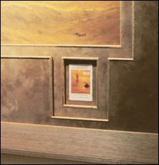 Photo 2
The fillet-lined shapes created to showcase the stamp are a quiet example of intensity. The multiple layering creates highlights and shadows associated with the element in framing.
This Arquati show piece illustrates shape, line, color, texture and intensity.
Though value is relative and is affected by all other elements, it is most often linked with color. The existence of color is entirely dependent on the presence of value. For example, yellow is lighter than violet, but it may be modified to be nearly equal in "visual impact". Weaknesses in designs utilizing color value are easily identified by examining black & white photos of the completed project to reveal a lack of contrast.
Expressive Uses
Light and shadow exist in Nature as a by-product of strictly physical laws. The artist/designer must adjust them in order to create an interesting visual language. The result becomes a stressing of the decorative effects (during framing) ignoring conventional light sources and/or neglecting the representation of light altogether until it naturally occurs within the frame.
By mounting a doily onto a centrally floated piece of glass, the shadows cast by both the spaced mats and the doily exemplify these decorative effects (photo 3). The resulting effects of light (highlights and shadows) must be taken into consideration based upon their contribution to the total visual framing presentation. Light is most often what will establish intensity/value as a valid design element in any given framing project.
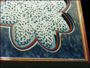 Photo 3
This is an excellent example of value and intensity through highlight and shadow using spacers and floated glass.
This detail image from Circle Master Company features design elements of line, color, texture, shape and intensity.
Intensity as Depth
One of the easiest ways to establish a dramatic interaction between highlight and shadow is to use spacers or deep bevel designing. The very placement of an item within a deep box setting creates the use of intensity regardless of the mood it establishes. The soft fabric mat and fillet combination used in the object box by Larson-Juhl for the antique necklace incorporates the elements of line, texture, color and intensity. Notice the natural shadows created by the deep mat covered sides of the box and the odd shapes of the necklace itself (photo 4).
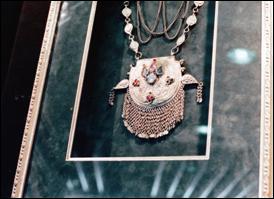 Photo 4
The antique necklace is framed in a deep shadowbox using colored and textured suede mat, backing and sides with an accent fillet.
Notice the natural shadows along the left and right cast from the top mat to the bottom and surrounding the art.
Another varied style of deep bevel designing utilizes the intensity of shadow and value contrasts to highlight the natural deckle of a heavy paper casting (photo 5). Shadows play from beneath the art creating a value difference accenting the visual impact. The painted 4ply bevel top mat and dry-pigment tinted, wrinkle/wrapped, deep bevel liner also utilizes line, texture, color and intensity as showcased above...but in two extremely different presentations.
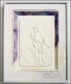 Photo 5
This 5-layer deep wrinkle wrapped foamboard mat is another example of intensity. The sampler shows the layers and creation that is used in the booth at Seal Products.
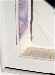 Photo 5a
The elements of line, color, texture, and intensity (depth) are shown.
Identifying Intensity
Remember, the series of five basic steps in the design process are definition, creativity, analysis, production, and clarification. Once the item has been labeled "fine art" or "decorative art" during the definition stage, only then can the creativity stage be activated. The purpose of framing fine art is to preserve, enhance and protect the art, while framing decorative art allows for greater carte blanche. If a truly creative approach has been chosen, and intensity becomes an element, the procedures must be approved during analysis to insure proper handling. (photo 6)
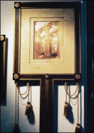 Photo 6
Another Arquati booth sample features texture, shape, intensity and rhythm. Although shape is an integral part of photos 1 and 6 they are very different in impact.
Creative framers will most often identify intensity as a somewhat organic participant in framing or pictorial organization. Often it will be an element that is not considered as a notable or countable one until the clarification stage at the completion of the entire design, almost an afterthought. As an element, intensity will not leap to mind as texture or color do, but it greatly affects the overall dramatics within a 2-dimensional or 3-dimensional presentation.
A good designer uses his/her elements instinctively as the tools they were meant to be. Intensity is a multi-purpose tool utilizing light, shadow, contrast and depth to help establish an overall mood and produce a spatial unity. The success of a framing design will largely be based upon the effectiveness in which the designer has made intensity and value serve these functions.
See you next month with "Part Seven: Space".
END
Copyright © 1994 Chris A Paschke
For more articles on mounting basics look under the mounting section in Articles by Subject.
Additional information on all types of mounting is found in:
The Mounting and Laminating Handbook, Second Edition, 2002,
The Mounting And Laminating Handbook, Third Edition, 2008 and
Creative Mounting, Wrapping, And Laminating, 2000 will teach you everything you need to know about getting the most from your dry mount equipment and materials as an innovative frame designer.
All books are available from Designs Ink Publishing through this website.
Chris A Paschke, CPF GCF
Designs Ink
Designs Ink Publishing
840 Tucker Road, Suite H-190
Tehachapi, CA 93561
P 661-821-2188
chris@designsinkart.com