Paschke Online
Designs Ink Publishing Article Archive and Reference Library
Articles by Chris A. Paschke, CPF GCF
"The Design Process: Proportion"
August 1994
The "elements" of line, color, texture, shape, intensity, and space are all the ingredients or building blocks with which the artist or designer works. The "factors" of proportion, emphasis, balance, rhythm and unity are the recipe or directions for assembling them into an aesthetic and successful design. Together the elements and factors form the "principles of the design process".
It is important to understand the integration of the first group of elements in order to grasp the second group. Try to remember, it's the application and interrelationship of the individual elements that make up the factors. For that reason it becomes more difficult to isolate and count the factors as easily as the previously discussed elements.
Don't forget the `givens' in a design. When considering the factors, it is given there will be proportion, emphasis, balance...of some kind. It will only become a countable design principle in framing when something unusual or extremely eye-catching is integrated.
Proportion is what makes our world recognizable. It is the amount of visible sky vs. land or forest vs. desert. A mountainside may be charred by fire but we still recognize the mountain because of its proximity to surrounding landmarks. Thus proportion is the relationship between parts.
Proportion and Ratio
Proportion defines as the relationship, dimension or magnitude determining how much space an item occupies and how large or small it is in relation to its surrounding area. It deals with the ratios of one part to another which is why it is most often categorized as a factor rather than a basic element. In framing, this translates into the actual frameable image size plus the outer dimensions of the mat and completed frame.
Ratio implies a comparison, and in art is often expressed through a comparison of size, number, position and space. An artist must fit all of the pieces together so a design feels comfortable. In turn, all the pieces of a framing design puzzle must fit together comfortably in order for it to be successful.
Successful `fitting' of the principles requires personal judgment on the part of the artist or framing designer. There are no real rules for presenting framed art with the correct mat widths or with the correct proportions. Some framers have a natural eye for identifying a design that fits, and this is often why some designs appear much more successful than others.
Mathematical Proportions
Proportion may also be explained as a mathematical relationship of parts to the whole as established by the greeks through the golden mean. This theory provides for continuous halving of distances to ensure proper and comfortable proportions. Everything always relates mathematically to everything else, it's predictable and dependable.
Another familiar relationship of proportion is based upon the DaVinci's drawing of the human body creating a perfect circle through its proportional relationship of arm stretch, stance and body height. How can this then be translated into proportional relationships in framing?
Framing Proportions
The most common use of recognizable proportion is noted in mat border widths and ratios of mat to fillet to moulding. Though there are no hard and fast rules, and the most important phrase to remember is "don't crowd". As in the previous discussion of mathematical proportion, design is often most dependable when proven guidelines are followed. The easiest tool for controlling use of proportion is to remember to vary widths of materials selected. Never design the mat to echo the same width of the moulding or an inner fillet to mirror the liner mat width beneath it (photo 1). Whenever panel designing, regardless of the media, be it dry pigments, ruling pen lines, v-grooves or glass etching, always consider variation in widths. Don't repeat the same spacing between decorative elements unless a specific viewer reaction is attempted.
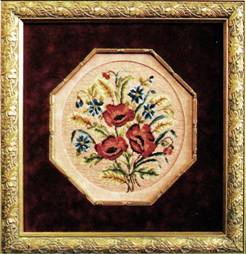 Photo 1
The distances between the inner circle opening mat, octagon fillet, fabric mat borders, and moulding width all vary slightly. The fabric has no large scale pattern to fight with the moulding, fillet or needleart.
Courtesy of Larson-Juhl.
Mat Borders
The concept of weighting the bottom of a mat originated during the period of time when art was hung very high on 12'-15' walls at a rather extreme angle. Widening the bottom border compensates for the sightline problem and the optical illusion of the same size bottom border appearing narrower.
Safe and somewhat standard guidelines for mat designing in relation to proportion often include the top mat being widest of the mats used; the wider the fillet the wider the mat; art size should not necessarily predetermine mat borders; decorative corner cuts often eliminate weighted bottoms; and vary the widths of successive liner mats (photo 2).
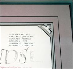 Photo 2
To contrast the decorative corner cuts the mat liners were kept the same width. The v-groove was moved out toward the frame to visually shift the eye and vary the top mat proportions.
Line, color, shape and proportion are used here.
Contemporary mats commonly have weighted bottoms of ¼"-½" depending upon the overall size of the frame and the rabbet lip width. 20th century designs often showcase 2-½" to 4" double mats with ¼" weighted bottoms and a ¼" liner. Perhaps this should be considered the given when dealing with proportion as a countable principle. Unusual liner widths demand proportion to be a counted principle as in "Blue Bayou" framed by Dwyer's Framing Gallery (photo 3). Problem projects like this cibachrome photograph of Gwen Walker-Strahan's required much wider mat proportions to allow for the signature. Use of line and color through an undertiered top mat and liner and exaggerated proportions adds up to three countable principles (photos 4).
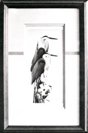 Photo 3
The unusual width of the top and bottom liner mat proportions accent the vertical, using contemporary Asian proportions. The horizontal color inlay stabilizes and unifies the design.
Line, color, and proportion make up this design.
Courtesy of Ray Dwyer.
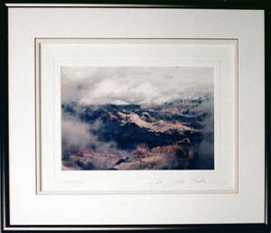 Photo 4
The inner mat signature required a wider border. The v-groove museum rag mat was topped with an under tiered double rag mat.
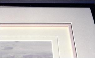 Photo 4a
No two spaces from moulding to photo measure the same width, allowing for flexible proportions.
Line, color, proportion and intensity (depth) were used.
Proportion and Scale
All principles in design interact and support each other. They are separated only to study and better understand them. Proportion and scale are both related to size, and it is often easy to confuse them. Proportion is a matter of size relationships within a given project or entity, while scale refers to the actual size of the entity.
In framing it is important to understand scale in relation to proportion. Large patterns, even monochromatic moiré, may look delicate framing a window as drapery, but might overpower a small fabric wrapped mat. Large floral patterns will appear much larger when contained within a smaller, confined space such as a shadow box. The pattern and scale of the flowers won't change in a confined space, but the proportions of the pattern to the space will appear different. Don't overdesign!
Summary
Proportion is the relationship between the parts while scale refers to the actual size of items gauged against a constant. Allowing adequate room within a frame for mat borders, fillets and panel designs is only half of the proportion issue. Less is more when it comes to designing with textures and prints, for proportions may readily change when scale becomes an issue.
END
Copyright © 1994 Chris A Paschke
For more articles on mounting basics look under the mounting section in Articles by Subject.
Additional information on all types of mounting is found in:
The Mounting and Laminating Handbook, Second Edition, 2002,
The Mounting And Laminating Handbook, Third Edition, 2008 and
Creative Mounting, Wrapping, And Laminating, 2000 will teach you everything you need to know about getting the most from your dry mount equipment and materials as an innovative frame designer.
All books are available from Designs Ink Publishing through this website.
Chris A Paschke, CPF GCF
Designs Ink
Designs Ink Publishing
785 Tucker Road, Suite G-183
Tehachapi, CA 93561
P 661-821-2188
chris@designsinkart.com
 Photo 1
 Photo 2
 Photo 3
 Photo 4
 Photo 4a