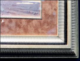
 Photo 1
Metered repetition is shown here in a traditional and basic moulding design: as outer moulding, liners, and fillets.
Rhythm is the underlying principle of the universe, like a heartbeat, breathing or the cycle of the days into seasons. It derives from a Greek term meaning "to flow" and defines as a continuance or flow which is accomplished by repetition or regulated visual units.
It is the use of measured accents, patterns, colors, space etc. to create a whole. If portions of the whole are visually recalled or reproduced in a rhythmic manner the design will often appear together, well thought out and unified. Reintroducing similar patterns within different areas of a frame also creates a unified feeling through rhythm, called repetition (see the framed "birds" pg 58, August 1994, PFM).
If repeating specifically chosen colors, textures and shapes helps establish unity, then modifying or isolating those same elements might create more variety through contrast. Thus rhythm can produce both variety and unity. Emphasis, balance and rhythm all work together towards unifying a well executed framing design.
There are a number of rhythmic categories or types found in Nature. Repetition is found in a heartbeat, alteration with the ebb and flow of the tides and progression as the gentle growth of a tree trunk into branches.
Repetition
The metric, mathematical beat of repetition uses the same visual element a number of times within the same composition. It is a recurrence, measure, such as meter, tempo or beat exemplified by walking, dancing or hammering.
The most basic repetitive moulding design will show a very distinct metered carving (photo 1). Rhythm is also shown by the repetitive use of the same moulding pattern in varying weights, widths and colors as a progressive repetition between the outer moulding and fillet.
 Photo 1
Metered repetition is shown here in a traditional and basic moulding design: as outer moulding, liners, and fillets.
Use of the same visual elements within the design of a particular moulding, establishes its MOTIF. The motif is only one accent in an entire system of accents. A "beaded" fillet is an example of a familiar motif, for it establishes a very regulated visual beat. The small inner circular flower and leaf image (photo 2) is repeated at spaced intervals along the moulding to establish a particular motif. Motifs are not one single part; they are always part of a larger whole.
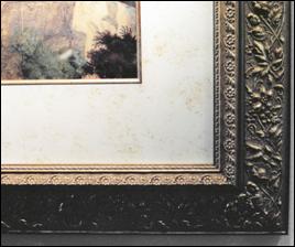 Photo 2
The inner floral motif is created by the small circular flower and leaf set. The entire moulding has a particular pattern replicated in the frame.
Pattern uses line, shape, color, texture...to guide and direct underlying design structure. It establishes a harmonious relationship between individual parts which become similar or repetitive in character (photo 3). The moulding reflects the specific pattern established in the actually framed artwork, which leads the eye from one accent to another.
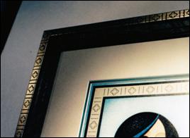 Photo 3
An example of alternating rhythm is established through the flower and double line design. This allows for greater visual interest by contrast, while unity is achieved through repetition from the art in the moulding.
Courtesy of Arquati.
Repetition and rhythm are inseparable. Rhythm is the direct result of repetition, while repetition is a method used to emphasize visual units in a marked pattern. It is by far the easiest way to achieve flow and unity. By its very insistence, repetition demands visual attention through focal point Emphasis, and no matter how briefly, allows the eye to pause or hesitate an a specific detail for further examination.
Use of repetition does not always mean exact duplication, but rather a close similarity. Slight variations will add interest to a pattern which could quite easily become visually boring.
Alteration
The use of spatial repetition can create an alternating rhythm. It establishes a recognizable repetition but with a bit of a syncopated beat, in the case of framing design, one with a visual accent instead. The stylized flower in photo 3 repeats the same flower motif, but because of the parallel line dividers between the flowers it becomes an example of a slightly varied or alternating repetition.
Progression
A sequential change during repetition as with the size variation of the tree trunk into the branches establishes progression. Sizes can grow, shapes can evolve from round to octagonal, colors can gradually fade from gray to green. These are all framing uses of a progressive repetition.
A good example of progressive repetition is seen in photo 4 designed by Dwyer's Framing Gallery. Line, color, space, and shape are supported by a good understanding of rhythm, as graduated circles visually draw the eye down into the smallest inner circle of the moon within the print.
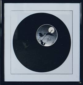 Photo 4
Rhythmic progression is found here as the moon in the artwork is echoed by increasingly larger circles. Although the v-grooved square creates tension as well as a transition from circle to square, it echoes the tension between the moon and mat.
Visual concentration remains on the image.
Dominance
Dynamic use of rhythm and repetition are frequently found in successful framing designs. Each portion of the design (frame, mats, colors...) must hold its proper portion of visual dominance, emphasis or attention. To get the viewers attention a featured portion needs to be in contrast with its surrounding area. (photo 5) The odd shape of the mat opening in mirrors the embossed kimono shape within the print. This dominating image becomes a high interest point of emphasis in the design. Repetition is used again in the added bamboo pieces.
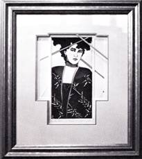 Photo 5
This successful Larson-Juhl design features line, color, shape, and space supported by balanced proportion, strong visual emphasis and a specific simple repetitive shape.
If it weren't for the eye contact between the woman in the art and the viewer, which remains the strongest focal point, the repetition of the kimono shape may have become too overwhelming for the print. Lack of rhythmic order or a weakness in establishing dominance can leave the viewer floundering for meaning in a design.
Types of Rhythm
Too much repetition is also visually fatiguing and chaotic. Rhythm may be simple or complex in nature. Simple rhythm involves repeating only one measure within a frame. That does not mean it cannot remain a dominant visual element. Composite rhythm uses two or more recurring measures which exist simultaneously or a complex variation with a particular accent. This is the most common type of rhythm found in framing design.
Inlaid moulding emulates the patchwork concept behind the little heart in photo 6. Laminating films are used to continue the patchwork pattern in the floor of the poster in photo 7. Both of these are examples of using simple rhythm to repeat only one portion of a motif for continuity and emphasis. Both are strong design statements using repetition with a great deal of visual focus while only an example of simple rhythm.
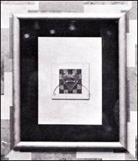 Photo 6
Use of the patchwork moulding reflects the pattern behind the heart, though simple it shows rhythm and repetition.
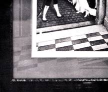 Photo 7
The patchwork laminating film creating the extension of the tile floor in the art illustrates rhythm.
Composite rhythm is shown in the more complex imaging of the texture, color and arched motif of the columns replicated in the elaborately created mat work in photo 8. This design by Arquati Moulding successfully uses color, texture, intensity and rhythm in a dynamic presentation. It accomplishes a dominance of one basic visual idea, by creating a feeling of an overall harmonious relationship.
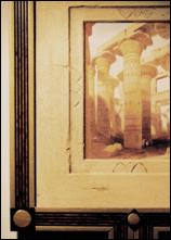 Photo 8
This is a good example of composite rhythm: the mat reflects the color, texture, and shapes from the columns in the art.
Rhythm cannot be added to an artistic or visual composition, it must be implicit in the process of creation and in the experience of the artist during that process. In a sentence, it cannot be added after the fact...like a dab of blue.
In framing, rhythm should become a principle that naturally finds its way into all successful designs. It aids in establishing balance, emphasis and ultimately the unity any design should be striving for. So finally next month, we look at the UNITY of the whole design in Part Twelve.
END
Copyright © 1994 Chris A Paschke
For more articles on mounting basics look under the mounting section in Articles by Subject.
Additional information on all types of mounting is found in:
The Mounting and Laminating Handbook, Second Edition, 2002,
The Mounting And Laminating Handbook, Third Edition, 2008 and
Creative Mounting, Wrapping, And Laminating, 2000 will teach you everything you need to know about getting the most from your dry mount equipment and materials as an innovative frame designer.
All books are available from Designs Ink Publishing through this website.
Chris A Paschke, CPF GCF
Designs Ink
Designs Ink Publishing
785 Tucker Road, Suite G-183
Tehachapi, CA 93561
P 661-821-2188
chris@designsinkart.com