 Photo 1
Japanese papercut stencils are a perfect example of two-dimensional pictorial space; limited to height and width but no depth.
Space is the distance around or between items used to unify or highlight an image. All physical things exist in space. While space defines as a measurable distance between pre-established points, 2-dimensional space only involves length and breadth, 3-dimensional space adds depth and 4-dimensional space adds time or motion. Visual design is actively concerned with three specific types of space; pictorial, illusionistic and actual.
Pictorial Space
Decorative spacial concepts, also known as pictorial space, involve 2-dimensional images or those in which a picture has height and width but no depth. Space then exists across a plane rather than in it. Japanese cut paper silhouettes (photo 1), stencils and flat woodblock prints are good examples of pure pictorial 2-dimensional space. They are totally self contained, flat and show no borders or depth, implied or otherwise.
 Photo 1
Japanese papercut stencils are a perfect example of two-dimensional pictorial space; limited to height and width but no depth.
Illusionistic Space
Plastic spacial concepts, also called illusionistic space are those dealing with 3-dimensional images. Period hunt prints and landscapes utilize a 2-dimensional pictorial concept in which the illusion of space has the quality of endlessness found in the natural environment. Most art for framing deals with illusionistic space as 2-D images which create a visual illusion of depth and space meant to give the feeling of 3-dimensionality.
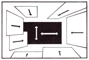
Subcategories of illusionistic space include shallow space, in which a 3-D concept is embraced but there is a total depth limitation (diagram 1), and infinite or deep space, in which images appear to continue on forever. A shadow box would often fall into the category of shallow or limited space. A picture frame acts as a window through which one sees an endless recession of dimensional images often creating the illusion of infinite space.
 Diagram 1
Shallow space features 3-dimensionality with a specific depth limitation. Shadowboxes best represent this type of illusionistic space.
Size, position, overlapping, and linear perspective all are artistic methods of achieving a visual illusion of depth, which is the establishment of creating one vertical plane behind another. Most often, the larger an image is in size the closer it appears to the viewing window. By establishing the horizon line as an eye level reference point, the farther down or lower in the picture window the nearer the item will appear, the higher in the widow the farther away (position or vertical location).
Egyptian art utilized pure overlapping to establish depth (photo 2). This method takes precedence over the above mentioned indicators of size and position. As framers we need to be aware of the types of depth so there remains a continuity in design between the art and the framing package.
 Photo 2
Egyptian art exemplifies the overlapping technique in illusionistic space by layering vertical planes to establish depth.
Linear perspective, established during the 15th Century, first utilized vanishing points to create the illusion of diminishing details and converging parallels as a depiction of space. Diminishing detail simply features sharpness up close with a loss of definition through hazy shapes, indistinct lines and grayed values for distance. Vanishing points are a mathematical system for creating a 3-D space on a 2-D surface, as exemplified by a set of disappearing railroad tracks.
The Western approach to linear perspective involves the closing of spaces as images fade into the distance, away from the viewer. The Oriental approach involves inverse perspective which establishes the viewer as the vanishing point, creating more spatial freedom or openness moving outward from the art. (diagram 1)
Actual Space
Pictorial space only implies space on a flat surface through positives and negatives but no depth. Illusionistic space creates the 3-D sense of space by adding depth through various artistic techniques. Actual space relates specifically to 3-D items where space is real and tangible. It concerns itself with artworks such as pottery, jewelry, sculpture and family keepsakes.
So how does all this relate to framing and when does it become a countable element? The very essence of framing establishes layers of glass, mats, fillets and spacers. Spacers are used to create the illusion of depth in a physical way, the reality of 3-dimensionality through actual space.
In Relation to Other Elements
A frame is generally rectangular in shape, its edges can be interpreted as lines, it exists in space, it has a relatively smooth texture, can be seen only in light values (intensity), and its color is variable. Often space appears to be more of an application than an actual tool because it often involves so many of the other basic elements, but it remains every bit as important.
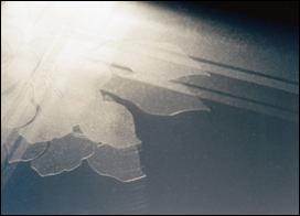
An area (actual 3-D space) is shaped into a room by the enclosing planes or walls, likewise, the area within a frame creates a specific 3-D space, but that is the given. A design must be taken one step further for space to become a countable element. The faux etched mirror uses two sets of FrameSpace (as spacers) to create an physical depth using actual space (photo 3).
 Photo 3
A mirror is used behind two layers of framing glass enhanced by laminated faux glass designs. FrameSpace is used to distance the layers from each other creating reflections of the top design in the mirror below as a sample of actual space.
Line directs the eye around the interior of a frame and as we have explored, all types of lines create individual spacial relationships. A ruling pen line as an example of 2-D pictorial space and would never be recognized as a space element. A v-groove (line), though truly a physically 3-D use of actual space also would still count only as a line element.
A surface marble paper strip (line) contrasts with a botanical print differently than a deep bevel wrap using the same marble paper would. The second example adds depth, contrast and potential shadows creating a use of intensity. Generally, the only time space will be recognized in framing is during the production of multiple opening mats, shadow boxes, extremes in accented border width or framed wall groupings. They all utilize space in a more dramatic way to achieve a particular design response or end result.
Wall Groupings
We are probably most aware of space when arranging wall groupings. The area or space in which objects or images exist is called positive space. Space may also be the distance, void or interval between things akin to moments of silence in music, a pause in speech, or the blank mat area between multiple openings. This is known as negative space. Positive and negative spaces are equally important in the layout, placement and visual unity of a design or grouping.
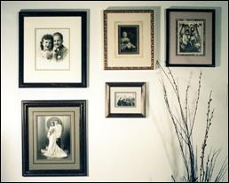
Horizontal, vertical or triangular placement of similarly framed artworks helps create a unity through symmetry when hanging. But, when arranging a grouping of family photographs and keepsakes involving variable frame sizes, styles and colors, the element of space reigns supreme (photo 4).
 Photo 4
The wall grouping uses space surrounding the frames. Too much space will allow the frames to feel unrelated, too little space would feel crowded. Common lines between the frames helps create continuity and unity.
The negative spaces between the frames should remain constant in order to establish a rhythm and pattern to the grouping. There should be at least one common line either horizontal or vertical between any two frames to work as a stabilizer and unifier. Offset any asymmetrical wall grouping with larger negative spaces and/or furniture to complete the presentation.
By concentrating on alignment and negative spaces between the frames in a grouping, visual unity is easily achieved. Nearly any combination of frame sizes, shapes, or subject may be clustered to contour to any wall space, remember, a blank wall is only a large negative space waiting for the art.
Elements and Factors
Space is the concluding segment in the discussion of the building blocks of design. The elements of line, color, texture, shape, intensity, and space are the ingredients with which the artist or designer works. The factors of scale, unity, emphasis, balance, and rhythm are the directions or recipe for combining them into an aesthetic and successful design. Together they form the principles.
END
Copyright © 1994 Chris A Paschke
For more articles on mounting basics look under the mounting section in Articles by Subject.
Additional information on all types of mounting is found in:
The Mounting and Laminating Handbook, Second Edition, 2002,
The Mounting And Laminating Handbook, Third Edition, 2008 and
Creative Mounting, Wrapping, And Laminating, 2000 will teach you everything you need to know about getting the most from your dry mount equipment and materials as an innovative frame designer.
All books are available from Designs Ink Publishing through this website.
Chris A Paschke, CPF GCF
Designs Ink
Designs Ink Publishing
785 Tucker Road, Suite G-183
Tehachapi, CA 93561
P 661-821-2188
chris@designsinkart.com