Paschke Online
Designs Ink Publishing Article Archive and Reference Library
Articles by Chris A. Paschke, CPF GCF
"The Design Process: Texture"
April 1994
Texture is the most tactile, or touch oriented, of the principles in the design process. It defines as the surface character of all materials determined by their actual physical structure. Everything surrounding us has (1) an internal, structural texture (grain within a wood moulding holding it together); (2) an external, tactile texture which is directly effected by the internal composition (glass is smooth, but engraved glass is rough to the touch); and (3) a visual texture or design manually applied to the surface.
Texture and pattern are intricately intertwined, a brick wall has a distinct pattern which we can also `feel' when touched. People often react to textures in psychological ways. This psychological reaction allows us to mentally "feel" without ever actually touching a given item. This establishes the difference between tactile and visual textures.
Tactile Texture
Actual alterations in a plane which may be felt when touched are tactile textures in the strictest sense of the word. Examples would be lava rock in nature or a suede mat (photo 1) in framing. They are more 3-dimensional and depend more on touch or the familiarity of previous contact to establish texture, most framing fabrics fall into this category.
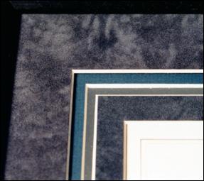 Photo 1
The textures of the suede top and fourth mats, teal second and silver third mats are all tactile textures—as in they could be felt if touched. The smooth white rag liner mat is also considered a texture since it is different from the others.
The elements identified in this design are line, color, and texture.
The tactile texture of a given surface may also be manually created from a smooth surface by initiating various techniques such as deep bevel wrapping the smooth surface and bevel with wrinkled rice papers (photo 2) or creating designer mats with various handmade papers either wrapped or surface mounted then cut into mats ("Exotic Papers", PFM October 1993).
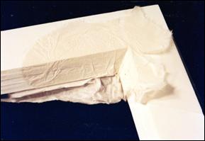 Photo 2
A 3-D tactile texture is being created here with a deep wrapped 5 layer foamboard mat wrapped with crinkled rice paper.
Tactile textures may also be visually textured. A pebbled matboard feels lumpy to the touch and has the appearance of being rough. Adversely, faux marbled matboards give us a visual sense of texture even when no tactile texture exists. It does however, remain an element of texture.
Visual Texture
Variations in light and dark on a smooth or unsmooth surface which are 2-dimensional in nature are 'visual' textures, such as a smooth piece of granite. The surface of the rock remains smooth to the touch but is visibly textured by the physical composition of the stone with flecks of color under its surface. Matboard examples would be a flannel or Millstone finish (photo 3) which remains rather smooth to the touch yet appears rougher. Visual textures are most common in framing design, if for no other reason than the inability to touch the inner parts of framed artwork.
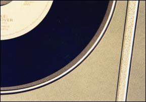 Photo 3
Examples of visual textures—though that are flat to the touch—include TruVue/Miller Flannel and Millstone.
Color, line and texture are represented here.
Texture Through Structure
Variations or inconsistencies in materials create texture through structure, a form of textural contrast. In a monotone (single colored) weaving or wall hanging, varying widths and thicknesses of threads used in the art would create a `tone on tone' or physical variance in it's texture without resorting to the use of color. Textural imagery, intrigue and interest are created simply by using all the same colors with different weights and/or fibers.
Shadow boxes would be an ideal candidate for this type of presentation. By using the same color family yet varying the surface textures for design interest, the framer would maintain concentration on the subject of the box and continue to control the use of the elements.
Another good example of limiting the use of color is when initiating texture as an element is by using a pattern to create texture with laminating films. In "Design: Line" I suggested films as contempo panels to create the illusion of line, using no new colors. Now take it one step further into an entire design on a mat, still introducing no new color (photo 4), though visual texture becomes very evident as a complete textural pattern.
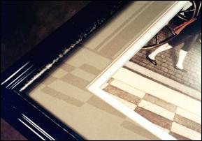 Photo 4
The creative patchwork design extending off onto the matboard is heatset Matte PrintGuard laminating film. The visual texture also creates a repetitious pattern also called an element called rhythm.
Texture Through Light
Using light to create texture often requires tactile textures to set the stage for highlights and shadows to be created into visual textures within a design. Stacked mouldings, fillets and spacers naturally create 3-dimensional spaces and reflections where 2-dimensional shadows are a result. Though this concept is generally reserved for architecture and interior design it could become an conscious use of visual texture as an element for presentations in deep acrylic boxes for very 3-D sculptures, masks and textiles.
Emotional Effects of Texture
There are two different ranges when considering textures, smooth to rough and soft to hard. Viewers react in an emotional way to colors, tints and shades as discussed in "Design: Color", they react equally to textures in a psychological or emotional way. Textures may stimulate feelings of elegance and class with smooth, polished marble pillars, or warmth and romance with soft, frilly lace.
Smooth textures are often unobtrusive, undemanding and may be understated enough to allow showcasing other elements as form, color and space without becoming an additionally counted element. Remember we must begin with a given and when considering texture, we begin with smooth. It is cool, tranquil and precise almost unfriendly if "hard", like a hot press watercolor paper.
Rough textures will attract attention, activate eye movement but can overshadow the use of form and color. They can often appear warmer and informal as fabric wrapped mats can contrast with a plain 4ply matboard (photo 5). Ogura, papyrus and bark papers are great textural examples to intrigue and stimulate one's visual texture.
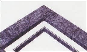 Photo 5
This is a sample of 3/16" foamboard window wrapped in a heat press with blue Ogura Japanese handmade paper using film adhesive. The middle ½" white 12-ply pin-striped tiered mat is sandwiched between another wrapped line mat.
A textural softness beckons to be touched or cuddled. It is friendly, cozy, appealing and inviting like a Victorian family portrait incorporating velvets and laces. Softness need not portray only a feminine or juvenile subject; always keep an open mind, for velvets may appear quite masculine and dramatic if the right color is selected.
A hard texture will evoke emotional reactions of strong, vigorous feeling often masculine in nature. By adding brilliance, such as with crystal, or polish as with the fine look of expensive marble to the concept of a hard texture the result could feel much more tactually and visually satisfying. Bare wood feels hard and rough, very natural and aggressive; but strength and elegance is achieved through hard, smooth, waxed and polished burls.
Texture as an Element
Intermixing textures to attempt to stimulate a viewer's emotional response to a framed artwork is rarely identified, though we subconsciously select materials on this basis all the time. Lace for weddings, flannel for babies and leather for men is used routinely to set a mood just as you do with color. Since texture is creatively used by artists and designers to gently visually stimulate or evoke a particular mood or feeling within a viewer we must also control our desire to overdo a good thing.
Textures are seen as mats, fabrics, mouldings AND the items being framed. If more than one color of the same textural pattern is selected to be used (blue and green flannel matboard) the elements of color and texture will both be counted, if however various textures of the same color are used (green flannel and green marble matboard) then only the element of texture will be counted.
If the items being framed are very busy with visual texture and color, it is far better to limit the total number of additional elements introduced into the framing design. Perhaps more neutral or like colors to enhance and support through a more monotone textural approach.
Textures can set a mood, reinforce a pattern, or emulate an era (photo 6). Both tactile and visual textures are used in framing, for there are many wonderful materials at our fingertips. Creative moulding designs, refinishing and retexturing mouldings are perfect examples of tactile textures working from the outside in. Always consider everything you do in a framing job, the whole of the presentation, not simply the matting. When it comes to texture, it all counts.
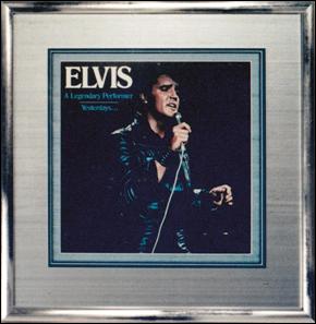 Photo 6
The record jacket is matted with the tactile texture of TruVue/Miller Silkamats in blue and silver. Larson-Juhl Hokito silver moulding shows visual texture. The elements of line, color, texture and represented here.
The more you learn about the elements of design the more you may feel you don't know, but subliminally it often all comes together. Placement, pattern, color, contrast, line...all begin to work together as you design with limitations in mind. Remember to control the urge to showcase everything at once, often the best designs work with the most subtle presentations, especially when introducing texture as a principle of your design.
END
Copyright © 1994 Chris A Paschke
For more articles on mounting basics look under the mounting section in Articles by Subject.
Additional information on all types of mounting is found in:
The Mounting and Laminating Handbook, Second Edition, 2002,
The Mounting And Laminating Handbook, Third Edition, 2008 and
Creative Mounting, Wrapping, And Laminating, 2000 will teach you everything you need to know about getting the most from your dry mount equipment and materials as an innovative frame designer.
All books are available from Designs Ink Publishing through this website.
Chris A Paschke, CPF GCF
Designs Ink
Designs Ink Publishing
840 Tucker Road, Suite H-190
Tehachapi, CA 93561
P 661-821-2188
chris@designsinkart.com