 Photo 1
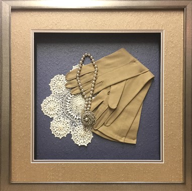
Pebble Beach adds understated character to photography, original artwork and shadow boxes.
When it comes to frame design, texture and color are two elements that are closely aligned. Color has already been addressed so now it's time for texture, which along with line, color, shape, space and intensity is one of the basic elements. It defines as the surface character of a material determined by its physical structure. Everything around us has an internal, structural texture—the grain within a wood moulding holding it together; an external, tactile texture directly affected by its internal composition—glass is smooth, but engraved glass is rough to the touch; and/or a visual texture which has no actual feel but appears as though it does as it is applied to the surface. People often react to textures in psychological ways, allowing us to mentally feel without ever actually having to touch an item.
Texture in Products
Both tactile and visual textures are plentiful in matboard. Obviously linen and suede matboards have both visual and tactile textures, as the textures may both be see and felt if touched. Museum rag board has a tooth that qualifies as a texture, just as clay coat foamboard is smooth and slick is also a texture. Use of these elements is powerful in framing, and today manufacturers strive to give framers numerous opportunities for the use of tactile and visual textures when enhancing art. "Crescent’s new Pebble Beach matboard collection combines two current trends in one. Featuring a subtle pebble texture and a touch of metallic shimmer, Pebble Beach adds understated character to photography, original artwork and shadow boxes", says Connie Cook, Crescent Cardboard. (photo 1)
Photo 1
Pebble Beach adds understated character to photography, original artwork and shadow boxes.
"Specialty Matboard has always been known in the industry for decorative, designer matboards; therefore, we are constantly looking at textures for inspiration. Natural and organic textures create classic fabrics and designs lending themselves to inspired framing accents," says Kevin Mitchell, Specialty Matboard.
Framerica has numerous visual textured mouldings including Assisi, antiqued, moonlit silver finish with black shading; Barnwood with authentic weather beaten finish; and Montauk finishes offer varied underlying aged wood with surface texture. Metallics continue to be trending, as we continue to see gold leaf everywhere this year, while softer metallics of pewter, copper, and bronze have also made an introduction. Framerica has a vast array of metallic and textural finishes—some tactile, some visual—with gold, silver, copper and numerous collections offering something for every scheme."We’re proud of Framerica’s new Vault collection. There is certainly something within the assortment for everyone but the common theme amongst Brass Stainless™, Gold Web™, Gilded Gold™, Gold Swirl™ and Burnished™ is that they have today’s tastes in mind." says Corinne Ferrara, Director of Marketing, Framerica.
Regardless of visual or tactile, texture is a powerful element and Larson-Juhl has always been there. LJ launched their powerful Carbon collection with its bold, sculptured, tactile texture along with foil and spray patina as a trending combination of metallic and texture this year. Their Luna collection is also a tactile metallic texture, concentrating more on the metallic, while Perimeter is a softer, visual texture. (photo 2)
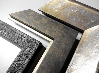 Photo 2
Luna Silver 586810 (R) is tactile texture, Perimeter Suede 697807 (Center) is visual texture, Carbon 452100 (L) is also tactile texture. All three also showcase touches of trendy metallics.
Selling Up Into Texture
The launch of beautiful new textural boards and fabrics is marvellous but these higher prices products need to be presented and sold during the design process. It is never the job of the framer to determine what a customer can afford, so do not hesitate to show more expensive boards, especially when the textures, colors or patterns are calling out for them.
Peterboro Matboard launched 35 new fabrics this year including Satina Linen, Heritage Weave and Crush. "A flat color field around some pieces can make the finished frame look boring and washed out. Often times, expensive line drawings are subtle and their importance could be enhanced by adding the texture of an elegant neutral silk or linen as a top mat. The addition of a fillet and neutral liner mat with a more ornate frame may also help the transition from the drawing to the elegance of the frame," says Alan Yaffe, Peterboro Matboards who continues, "It is up to the framer to know when and where to use fabric mats."
A treasured 5"x5" family heirloom was brought in for framing. Capitalizing on the handcrafted nature of the tatting use of fabric mats was the perfect choice for this small 7½" x 7½" Nurre Caxton Maya Black & Gold narrow frame. Mats were reverse cut to eliminate contrast bevel lines allowing the fabrics of linen and silk to better showcase. This small frame could have sold with basic mats and UV glass for around $150. but after the fabric mats, spacers and museum class priced our at $250. (photo 3/detail)
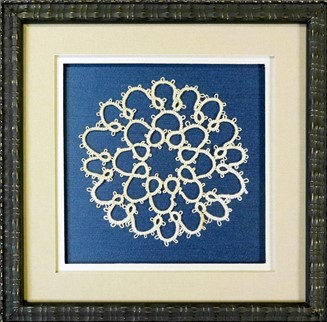 Photo 3
Reverse bevel cut double mat of Crescent English Taupe linen and Bainbridge Salt Grass silk spaced apart with 4-ply and 8-ply above Bainbridge Delft blue silk backing. Nurre Caxton Maya Black & Gold narrow moulding frame fitted with museum glass.
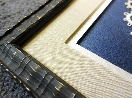 Photo 3 detail
Rhythm/Repetition
Rhythm is the underlying principle of the universe, like a heartbeat, breathing, or the cycle of the days into seasons. It is the use of measured accents, patterns, colors, space etc. to create a whole. If portions of the whole are visually reproduced in a rhythmic manner the design will often appear well thought out rather than accidental. Reintroducing similar patterns within different areas of a frame creates a unified feeling through rhythm, also called repetition.
Use of repetition and rhythm in design through literal copying and recreating—as a logo, symbol or tracing—could very easily crossover into copyright infringement which never successfully ties a design together. Be very respectful when creating a pattern to replicate. It is far safer to find a familiar rhythm from within and use that instead or a traced pattern. The human eye will always fill in the blanks and find the similarity.
Tiered Mats
Introducing repetition by use of suede or linen mats is easy, but sometimes the right color and texture matboard cannot commercially be found. Tiered mats—surface tiered, under tiered, pin-striped, bevel banded—are created using a technique of bonding layers together to create unique surfaces and bevel patterns using lightfast, acid free, fine art papers and rag boards to help fill the void when the perfect board is not available.
Surface tiered mats apply a new sheet of paper to the top surface of an existing matboard. This technique is invaluable for finding the perfect matching mat, as when framing original art on paper and the white, gray or black of the art paper just doesn't have a matching mat. Simply use a sheet of the same art paper as a surface tiered mat.
Under tiering is simply mounting sheets of art paper to the back of a 4 or 8-ply matboard. Bevel banding creates 2, 4, or 8-ply solid stripes of color within the bevel when the window mat is cut depending on the thicknesses of matboards selected. Pin-striping Is the addition of art paper layers between matboards to create spaced lines of contract color. Additional information and pricing tiered matting is available in Creative Mounting, Wrapping And Laminating available at PubCo or PPFA bookstores.
An antique family photo needed texture from within the photo to be replicated in the matboard for warmth and unity, which was achieved by surface mounting a sheet of Canson Mi-Teintes Moonstone, a flannel textured sand color paper to a black ragmat. The bevel banding with pin-striping was achieved by mounting two solid core 4-ply rag boards—black and sand—layered with one sheet cream and three sheets gray between them to create the bevel. The surface sheet of Moonstone was added to the package and the whole unit was mounted at once in a 200°F press. (photo 4)
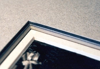 Photo 4
Tiered mat shows a double mat featuring three tiered mat styles in the single top mat. It is surface tiered, pin striped and bevel banded.
Innovative Moulding Color
Bella has a vast line of unusual, contemporary lines that easily showcases tactile vs. the visual textures. Vesuvio and Bramble have more dimensional texture to the frame whereas Hallifax and Lala have a visual textural pattern that is smoother to the touch.
During summer Bella launched their Parade line. Still dyed color with a gloss lacquer finish, but the bright colors are created on composite veneers applied in two stripes running transverse and on an angle which creates shades of color within the texture of the grain. "As for color, I would draw your attention to our custom acrylic Prisma line…being able to add color in various ways. You can also order Prisma frames painted in any color within the Benjamin-Moore paint catalog," says Nellie Seigel, Creative Director Bella Moulding. (photo 5)
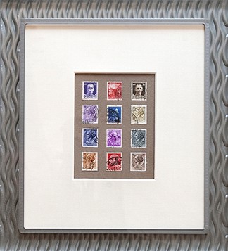 Photo 5
Prisma frames may be custom ordered painted in any color within the Benjamin-Moore paint catalog.
Stacked Molding
This traditional cibachrome came matted and backed with an 8-ply rag mat which they wanted to keep as is. Since the client does not favor standard black frames for collectible photos there was a challenge to work with the color casts of red-violet and textural, almost feathered, appearance of the snow. (photo 6) Since matting was not an option for the introduction of color it needed to be in the frame.
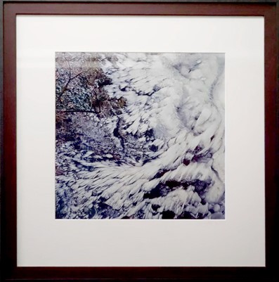 Photo 6
Stacked mouldings are not a new concept, but the combination of wood and metal perhaps should be considered more than it is.
Stacked mouldings are not a new concept, but the combination of wood and metal perhaps should be considered more than it is. By selecting a color wood liner the image could be easily tied to the outer stacked frame so Larson-Juhl Garrett Purple Hyacinth wood was the inner liner which was capped with Nielsen 117 Wrought Iron metal frame. The technique of repetition of a pattern from within the art reintroduced in the mat, fillet, liner or frame is called rhythm, which can be a very powerful element. Both the purple liner and the textured outer frame achieve use of rhythm helping create a visually unified design. (photo 7)
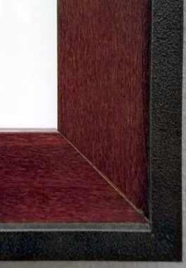 Photo 7
LJ Garrett Purple Hyacinth wood is a color liner capped with Nielsen Wrought Iron metal frame.
In Summary
In framing everything must be created for a reason and should always appear intentional. When using color it is important to relate, weave and balance selected colors. Warmth and coolness, subtlety and brashness, lightness and darkness are all potential applications and they must work together toward a unified whole. When using texture and/or rhythm it must play off of something from within the art itself referencing the similarity and reintroducing it while never running the risk of copyright infringement.
END
Copyright © 2018 Chris A Paschke
For more articles on mounting basics look under the mounting section in Articles by Subject.
Additional information on all types of mounting is found in:
The Mounting and Laminating Handbook, Second Edition, 2002,
The Mounting And Laminating Handbook, Third Edition, 2008 and
Creative Mounting, Wrapping, And Laminating, 2000 will teach you everything you need to know about getting the most from your dry mount equipment and materials as an innovative frame designer.
All books are available from Designs Ink Publishing through this website.
Chris A Paschke, CPF GCF
Designs Ink
Designs Ink Publishing
840 Tucker Road, Suite H-190
Tehachapi, CA 93561
P 661-821-2188
chris@designsinkart.com