 Photo 1
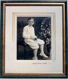
Mat Magic pigments created the soft panel design on crème museum rag.
As presented in "Calligraphy for Framers" Part 1, the expansion into calligraphic hand lettering could be almost a natural evolution. Ten years ago when I inherited my father's framing operation I fused it with my existing calligraphy design studio then expanded into yet an additional retail segment offering single sheet paper and specialty calligraphy supplies. This now constitutes my current calligraphic design and custom picture framing studio and gallery. I was often asked how these two diverse businesses could ever work together, yet as a calligrapher/designer what could be better than creating original commissioned works only to be able to ultimately control the creative presentation clear to the final framing.
As a framer it was my natural inclination to offer additional calligraphic accents in the form of everything from straight lettering of subtitles and dates to carved surnames and monogram initials. Without ever really trying, word spread and a creative calligraphic niche was thus filled by me.
Marketing
Sometimes having the ability to offer specialized services can also close a deal for you. Recently I bid on a large corporate job with a company conditioned into paying rock bottom prices for the base essentials, metal silver moulding, single mat, no frills. The decorator and I worked together to present a package where I was able to charge my regular designer prices for tiered matting, panel designing and quality wood moulding then I offered the customized accent calligraphic lettering at no charge to sweeten the offerings. I won the bid and the total time for the calligraphic additions for all 8 pieces was maybe ½ hour. The pieces were truly customized to match the new interiors and the client was thrilled.
Try to think outside the box. Present this new service at bridal shows on wedding portraits using names and dates, while also featuring your tiered matting skills and honeymoon "memory" shadow boxes.
Applications/wet Pigments
The examples illustrated here will only serve to stimulate and should be used as a springboard for your creative ideas and collaborations. Calligraphy works extremely well when integrated with the softness and subtleties of dry pigment panel designing as created with Conte' or Grumbacher stick pastels and Mat Magic powders (photo 1-1A). The sepia and green tones of the 1930s photo were reinforced in the pigment panel accented with carving lower left and offset with the Copperplate version of hand lettering lower right.
Photo 1
Mat Magic pigments created the soft panel design on crème museum rag.
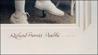 Photo 1A
Formal name written in opaque brown gouache using stylized Copperplate and pointed steel nib.
"Peggy Lou" was framed in a somewhat 1950s interpretive form with the calligraphy written as an interpretive formal italic, using a teal colored Windsor-Newton gouache mixture to match the teal tint in the textured backdrop of the original photo and hand tinted portrait (photo 2-2A).
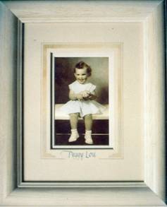 Photo 2
Heavy oak whitewash moulding, Double rag mats with spacer. Teal accents and lettering.
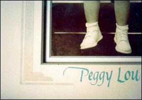 Photo 2A
Embosses lines, dry pigment and calligraphy.
Stenciling
For the 1928 original (photo 3-3A), "Arilyn" was cut into the 3M removable tape stencil when originally preparing to apply the dry pigments. Unlike the above samples where the wet pigment was loaded into the pen and actually written onto the mat board as the final step, these Roman letters were lightly pencil drawn onto the tape then cut and removed with a pointed X-Acto. Mat Magic was then applied to the panel as desired making certain to gently fade into the lettering.
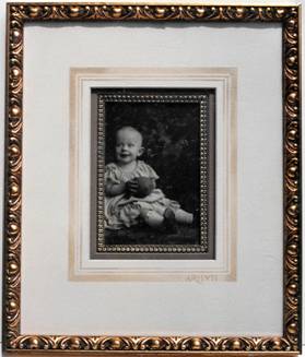 Photo 3
Name was pencil drawn onto the French mat stencil, cut out, colored with dry pigment.
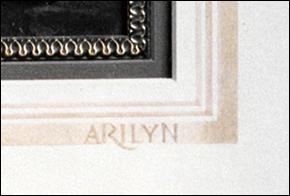 Photo 3A
Carving
Calligraphic lettering may be used in a number of other style='mso-spacerun:yes'> formats too. style='mso-spacerun:yes'> The next three examples all illustrate the integration of formal lettering through the use of carving into the mat board, as taught by Brian Wolf. The military photo again has a soft dry pigment panel this time enhanced by the carved Roman capitals R.F. PASCHKE in two different sizes (photo 4).
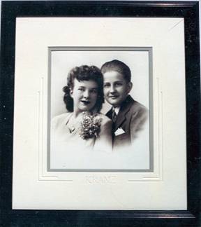 Photo 4
Lettering is a built-up Roman capital accented with art deco striping up the sides. Dark Whistler moulding replicates the carved v-grooves.
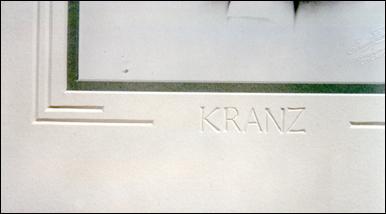 Photo 4A
The sister/brother portrait "KRANZ" illustrates modified built-up Roman capitals carved into warm white 4-ply museum rag board accented with an art deco striping directing down from the sides and highlighting the name center bottom (photo 5). The wedding invitation carving "Mark" (photo 6) is a style of lettering designed specifically to match the type set in the actual invitation so as not to compete with the letter slant, pen angle or other specific elements of the lettering style. Although this specific project was executed purely by the skill of understanding letterform there is an easy trick to duplicating the form.
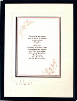 Photo 5
Simple embossed lines softly accent this wedding invitation.
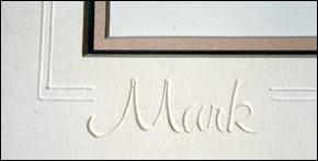 Photo 6
Carving matches font.
Enlarge the name on a copy machine until the desired size is achieved and even if there is some distortion the basic framework of the type will remain. Simply copy through onto tracing paper, graphite the back, align on the mat and trace over the original. The graphite on the reverse side will lightly transfer to the board for clean-up and carving.
Cutting Through it All
The ultimate in carving and enhancement is seen in "Spirit of St. Louis" (photo 7). The lettering style used on the mats echoes the lettering on the side of the original plane. The client decided to split the project into two pieces because of the overall size and weight of the chosen moulding which is a 2" solid oak. We decided to cut clear through the top mat and by adding spacers between the top and liner mats an interesting shadow design accented the lettering and created a dramatic look and dimension to the whole project.
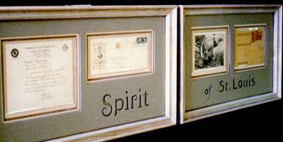 Photo 7
Lettering matches that on the plane. Letters were cit out and top mat was spaced away for depth and shadows.
Lettering Only
Coming full circle to the beginning of part one again, the last two examples illustrate the use of pure calligraphic lettering only to enhance the presentation. Multiple opening mats are a natural for suggesting and selling the addition of calligraphic lettering since they often showcase assorted photographs of vintage images. Not only can they often use a little explanation or a date, multiple opening projects may not always have a symmetrical layout due to the shape or number of images being used. Calligraphy then works as a design tool to integrate negative spaces, color and identification (photo 8).
 Photo 8
Title handwritten on top mat in gouache to match inner mat.
The most traditional form of using calligraphy is simply to accent or mirror a title or name to be covered by a mat on a poster. This could be a logical option to cutting a title opening, and the lettering color could be mixed to easily enhance or accent the end product...plus it looks great. The white border that would have shown didn't do much for the overall image and leaving the white around the entire poster allowed a small copyright notation to show, pointing up the fact it was a poster.
Achieving Profits
The key is to learn the tricks to expedite any process. Writing out the words on the mat fallout will check color match and spacing. Use a "center zero" ruler for locating center on both the test strip and the permanent mat, line up the sampler then copy the writing letter for letter exactly. Let it dry then erase all light pencil lines away with a soft vinyl, non-damaging eraser.
These are all examples of going beyond the basics and finding sales where they had not occurred to you before. Expanding your horizons to include the elements of calligraphy whether lettered with inks or mixed wet pigments or going beyond simple lettering to hand carved capitals and family surnames is yet another version of designing mastery. In order to achieve quality calligraphic form and confidence a certain mastery of any particular alphabet must be attained, or a professional calligraphic artist must be located, yet many of these concept as with the wedding invitation "Mark" the type set or lettering may be duplicated then painted or carved as desired.
Keep in mind, that it's far more profitable to create a simple, centered title in Dusty Rose gouache, that can be completed in 10 minutes and carries a charge of $15-$25, than for a tedius job requiring hours of hand carving.
The bottom line remains that any extra element you add to a design adds retail value and if that additional revenue also turns out to be stimulating creatively...so much the better! Now go brush the cobwebs off those nibs you received for Christmas back in 1985 and start the creative juices flowing. Calligraphy may not be mastered through osmosis, but after all isn't lettering something you already do everyday when you write out that job order?
END
Copyright © 1993 Chris A Paschke
For more articles on mounting basics look under the mounting section in Articles by Subject.
Additional information on all types of mounting is found in:
The Mounting and Laminating Handbook, Second Edition, 2002,
The Mounting And Laminating Handbook, Third Edition, 2008 and
Creative Mounting, Wrapping, And Laminating, 2000 will teach you everything you need to know about getting the most from your dry mount equipment and materials as an innovative frame designer.
All books are available from Designs Ink Publishing through this website.
Chris A Paschke, CPF GCF
Designs Ink
Designs Ink Publishing
840 Tucker Road, Suite H-190
Tehachapi, CA 93561
P 661-821-2188
chris@designsinkart.com