 Photo 1
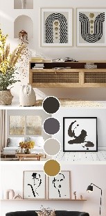
Wild Apple's "Art of Zen" trend board showcases art (top to bottom) by Moira Hershey, Courtney Prahl (L), Chris Paschke (R) and Anne Tavoletti.
Trends come and go, but sometimes they also bring a desire for new art, fresh colors and home interior changes. Along with the New Year come predictions for the most anticipated colors for the year from paint manufacturers, influenced by home decor markets such as High Point, Dallas, and Las Vegas Market. New style trends impact colors, which in turn influence art, which is created to enhance room stylings, which also results in new colors—making this a fully symbiotic relationship.
Trend Impacting Color
As we look for ways to soothe out the roughness surrounding us, Japandi lends trending, as a hybrid of Scandinavian and Japanese interiors; it combines relaxing, minimalist décor with a neutral palette and natural materials. This was first reported to us by Steve McKenzie in his trends recap back in September PFM when he introduced black, beiges, strong neutrals and natural materials as seen at market.
"In wall decor, Japandi is a mix of Nordic and Japanese aesthetics pairing the coziness and warmth of Scandinavian design with the elegance of Japanese design. Paring down to the essentials is fundamental in both influences, mixing Japanese minimalism with the warm neutrals of Scandinavian color palettes can prevent rooms from becoming too cold and formal," says Moira Hershey, Art Director and Senior Designer at Wild Apple. Their newest Art of Zen trend board features natural materials, minimalism, light wood and grey frames of botanicals and abstracts, ink and line drawings, and nature-inspired photography using neutrals with black and warm golden shades. (photo 1)
Photo 1
Wild Apple's "Art of Zen" trend board showcases art (top to bottom) by Moira Hershey, Courtney Prahl (L), Chris Paschke (R) and Anne Tavoletti.
Interior design begins with bringing nature indoors adding freshness and life to a space using greenery based decor such as palms, grasses, succulents and herbs to bring a reassuring, soothing energy to the home. "Color wise, all greens, especially grayed out forest and silver-green are very strong, black and white never left, so add browns and tans with all working together, these are key in interiors," says Larry Winn, CEO, Grand Image. An English cottage look called Cottage Core, is also trending adopting a muted green palette of foliage and white accented with rattan and pampas grass. The art for this is soft, washy minimalist branches of green tints with white mats and narrow natural frames.
Biophilia is the love for nature which is embraced by decorating living spaces with large living indoor plants, using tropical prints as an accent, and materials of natural origin, like wood, stone, bamboo, concrete or cork. Decorative accent materials include wicker, earthenware, stone coasters, textiles made of linen, silk or wool; and colors of Guacamole, terracotta, Art and Craft—Dunn Edward's COTY, and white as an accent pillow, pot or painting. (photo 2)
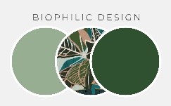 Photo 2
Biophilia is the love for nature embraced by the use of all greens in this 2022 design trend using large living indoor plants and tropical prints as accent, as with Wild Apple's Biophilic Design palette.
Color Impacting Style
Home decorators have embraced white for over ten years. White walls remain on-trend during 2022 as white is a macrotrend that gained huge appeal by many with Farmhouse and Minimalism styles. There are so many whites and white tints there are more than 500 whites to choose from. Often most used for basic wall color, white becomes the blank canvas and backdrop on which to create the decor for the rest of the room. This year the tendency will be towards warmer whites into creamy tints, as white will forever be around.
Beige is a classic and runs the gamut from off-white to a near brown, and although we have seen a lot of gray influenced beige in the past it is being pushed into a warmer neutral tint. Beige is grounding and goes extremely well with black, warm grey and warm white. Fitting right into the dominance of the year's earthy colors are textural fabrics like cotton, silk, wool, flax, linen, and burlap with colors ranging from white to tan, which will also impact framing choices.
Color Impacting Framing
Lighter colored woods will be much more prevalent, and likely make an impact on new release moulding collections. Picture Woods hardwood maple, City Grey and Country Grey, are rustic yet neutral, perfect for the Cottage trend. Superior Moulding has expanded their Alpine line with elegant wedge profiles for modern and contemporary imagery. Framerica's newest Black Terracotta has a fabulous surface texture.
Gold metallics continue to soften with more red based tones to better blend with warmer color palettes. Look for Crescent's Bainbridge Metallic Rice Paper mats. Metallic based moulding collections are also popular, such as Nielsen's float frame Profile 14. Bella Moulding's Chaucer, a rounded profile in gold leaf, silver leaf, and vintage champagne. Omega's Xavier collection shows warm finishes of gold, silver, pewter and dark pewter. And Michelangelo has expanded their 331 Series to include gold leaf, silver leaf, black, white, bronze, grey/brown and charcoal, which will also easily enhance wall decor for Japandi.
Trend Style + Color = Art
Artists who work with publishers are often assigned specific topics which are based on requests from clients, called mood boards, resulting from style and colors trends. Recent requests have featured abstracts and minimalism with earthy neutral tones with dried plants such as pampas grass, reed grass, bunny tail and bulrush; soft greens for Asian influenced grasses; and black and white line art as florals and figurative, and bold stoke abstractions. (photo 3)
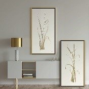 Photo 3
Moor Grass (top) and Lyme Grass (bottom) art by Paschke, created in single stroke sumi-e style, enhances a neutral pale grey-green room.
Textural trends—both tactile and visual—and natural fabrics have been impacting the creation of art. Jodi Brown, Lead Art Consultant at Grand Image stated, "Collage—whether physical or digital—provides a unique departure from traditionally realistic expressions. It straddles representation and abstraction, and continues to be a forward-looking trend with an emphasis on unique, diverse, and unexpected color applications."
Color trends impact every market though the commercial needs are slightly different than for residential applications. A new local hospital transformed their interior from sterile traditional colors to a richer, earthier, more soothing palette of muted green, plum, ochre and soft brown. "In light of current trends, we continue to look for inspirational imagery for our customers who supply corporate, hospitality and healthcare wall décor. Bringing the outdoors inside via photography has been a recent goal for us; this can range from panoramic vistas and coastal sunsets to intimate botanicals and abstracted water ripples," says Michael Ogura, CEO, Studio EL. Commercial spaces need to be calming, soothing, restful and healing in nature.
Paint COTY
Though Pantone has not yet released their color of the year 2022 (COTY) they have proposed palettes dominantly showcasing neutrals like Olive Branch, Green Lily, Sheepskin, Soybean, Perfectly Pale and Baby's Breath to Ultimate Gray. So it stands to reason the major paint manufacturers have noted and embraced the positivity of green and neutrals as the backdrop for walls, cabinets, and doors. The most important paint color trend for 2022 appears to be versions of grey-green, and the colors that love them. From Evergreen Fog to Olive Sprig to October Mist to Breezeway to Guacamole, versions of green abound and it's still all about neutrals. (photo 4)
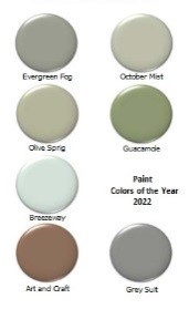 Photo 4
From Evergreen Fog to Grey Suit it's all about neutrals with the major paint manufacturers' colors of the year. Additional color research is available online.
Rather than creating palettes for specific trend styles all manufacturers tap into colors that have the feeling for the trends and might work well as a backdrop. Contrast accent colors this year include t Sherwin Williams’ Evergreen Fog is a versatile and calming, green-meets-grey hue, chameleon color with just a bit of blue. It's a simple but sophisticated organic neutral color that is part of the Sherwin-Williams’ 2022 Colormix Forecast METHOD palette.
Benjamin Moore's October Mist is a muted, mid-tone grey-green that is organic and natural. Evoking the silver-green stem of a flower, October Mist creates a canvas for other colors its understated tones allow for a light and airy neutral for walls, cabinets, and art.
Behr's Breezeway—the only pastel in the group—offers cool, light green shades of sea glass as a gentle, silvery-green that provides a sense of tranquility and peace, enhancing the coastal farmhouse trends of 2021 allowing for ocean scene art accents. It’s fresh, light, and optimistic, pairing with white, black, and weathered wood finishes.
Valspar's headlines their palette with Blanched Thyme—a cool, organic green that partners with warm wood tones—followed closely by Grey Suit—an elegant neutral grey with warm red undertones, and Fired Earth—a dark, warm gray shade that adds sophistication as an accent color.
PPG's Olive Sprig is a crisp, earthy grey-green aloe vera hue evoking tranquility and renewal. It is an elegant, versatile, adaptable color pairing well with gold, black and wood toned accents. Glidden's (PPG affiliate) yellow toned green Guacamole is much more an accent color as a spirited yet soothing green that would add organic energy to any space.
Dunn Edwards' Art and Craft is a warm, earthy brown tone that evokes feelings of stability and calm while allowing for a wide range of creativity with accent colors. It is warm and cozy, comfortable, calming and versatile timeless shade making Art and Craft a color that embodies both past and present.
All COTY share the desire for peace and serenity through the hugs of color. Adding accents of soft ochre, cantaloupe, contrasting greens, browns and warm metallics to any trend style makes it a personal space, and art and framing helps pull it all together.
END
Copyright © 2022 Chris A Paschke
For more articles on mounting basics look under the mounting section in Articles by Subject.
Additional information on all types of mounting is found in:
The Mounting and Laminating Handbook, Second Edition, 2002,
The Mounting And Laminating Handbook, Third Edition, 2008 and
Creative Mounting, Wrapping, And Laminating, 2000 will teach you everything you need to know about getting the most from your dry mount equipment and materials as an innovative frame designer.
All books are available from Designs Ink Publishing through this website.
Chris A Paschke, CPF GCF
Designs Ink
Designs Ink Publishing
840 Tucker Road, Suite H-190
Tehachapi, CA 93561
P 661-821-2188
chris@designsinkart.com