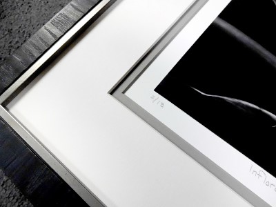
 Photo 1
Contemporary B&W film photo with textural frame, double mat, and spacer. Photo courtesy of Jim Tucker.
Bauhaus, was an art school in Germany from 1919 to 1933 that combined craftsmanship, architecture and fine arts. The Bauhaus style promoted the concept of all arts coming together and became one of the most influential movements in modern design, art, architecture, graphic design, interior design, industrial design, and typography. The design innovations commonly associated with Bauhaus are radically simplified forms, rationality, functionality, and the idea that mass-production can maintain individual artistic spirit.
Three of the concepts started at the Bauhaus—1) form follows function; 2) be imaginative but never let it detract from your message; and, 3) reduce your design to its most essential elements—are essentially where the framing concepts for B&W photography were born. This translates into photo frame design as: 1) select a frame that is strong enough to support the package, but small enough to blend; 2) be creative but always keep the photo dominant; and, 3) select a mat, glass and frame that does the job. Throughout history frame design for B&W photos has been a white mat and simple black stem frame based on the theory that stark non-design will never get in the way of the beauty of the photographic image, very Bauhaus.
Mounting Photos
Interest in archival preservation of photographic prints began in the 70's resulting from Henry Wilhelm's study of advanced aging of photographs and the effect of acids in mountboard and environmental pollutants. This resulted in a shift towards the universal acceptance of acid free—neutral pH—and unbuffered 100% ragboard for contemporary film photos. Then was the question of dry mounting, where study proved that hinge mounted prints deteriorated faster than dry mounted prints, as long as the tissue used was acid free. Thanks to Ansel Adams and the embracing of dry mounting as an integral part of photo preservation, presentation is now as important as the work itself; from print to mat it is all part of one complete finished image.
B&W Industry Standards
Like it or not there still remain standards for photo presentation in the art world. One of these is that photographs should be mounted and presented on white or cream mountboard, the window mat should be of the same color and quality, and when dry mounted the tissue should not stick out from under the print. Brushed metal frames—reeking of the 1960's—are often still preferred because they are narrow, not distracting from the image, and unlike wood don't out-gas and help protect from pollutants.
All that said, a white or black mat with a black frame is no longer gospel, and sticking to early design trends has become an individual choice rather than a concrete rule. Even purist collectors have begun to see the value in a frame with a little more style, texture or color variation over the basic black stem frame. But there may always remain galleries that will only accept the traditional B&W frame design format for photographic collectables and artist exhibitions.
Contemporary B&W Design
By the 1990's things began to change with contemporary photographs being dry mounted onto aluminum, unframed, and held by a French cleat to a gallery wall. By the early 2000's facemounting a sheet of acrylic to the front of the photo was all the rage embraced by many high profile photographers such as Andreas Gursky. Now once again the history of analog photography has shifted, this time into a digital age, allowing the framing of photography to become even more diverse.
A Hasselblad shot photo was developed, mounted, signed and numbered by the photographer who was preparing for a local show. He originally thought he wanted standard black and white traditional framing, but once we began discussing ways to draw the eye into the photo through line, texture, color and intensity he opted for a Petite II Ebony frame, and Antique White and Gray double rag mat with a 4-ply rag spacer between. Leaving the ½" white bottom mat visible allowed for number, title and signature to show. (Photo 1) He opted to move into the 21st century and embrace the now look of B&W.
 Photo 1
Contemporary B&W film photo with textural frame, double mat, and spacer. Photo courtesy of Jim Tucker.
Regardless of analog film or digital print, today we are freer to decide how the photograph's frame design will better enhance the image over merely encasing it, to better complete the meaning of the work as a total experience through presentation. Design can reference an earlier period of photography, emphasize the organic or inorganic forms, be made of wood or metal, and/or pick up textures and patterns found within the photo helping unify the photo with the frame as a collaborative effort.
The Gondola photo was reframed for a collector wishing for a more complete unified upscale presentation. Though the mats remain neutral and more traditional they allow the silver leaf scoop frame and gloss black fillet to pick up the details featuring elements of color, texture, rhythm (repetition), and intensity. (Photo 2-3)
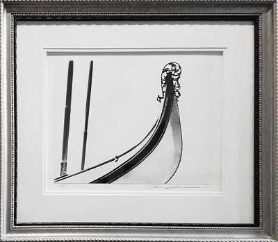 Photo 2
Reframed Gondola with period antique silver scoop frame, black fillet, double rag mat, and spacer.
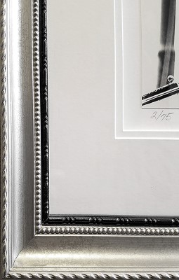 Photo 3
Gondola corner detail. Photo shown courtesy of Penny Tucker.
Bixby Bridge came in as a mounted, matted, signed photo for reframing. Because of the signature and mat, it was sink mounted to accommodate a wider top double mat which allowed enough space to expose a ½" bottom mat reveal. The Brimfield Mocha frame was the perfect shape to replicate the arch of the bridge unifying the new design. (Photo 4)
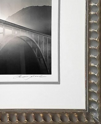 Photo 4
Bixby Bridge reframed and shown courtesy of Penny Tucker.
Then There Was Color
Color photos are a whole other issue, and for some reason less structured when it comes to framing. Until the 1960's, black and white photography dominated the photographic scene—even with Kodachrome (slides) from the 50's—but with the release of Kodacolor film things changed. When Kodacolor film and commercial photo finishing were introduced in 1963 small snapshots took over, and from there we see personal color darkrooms and larger art photos emerging. But it still wasn't until the 1980's when photography finally became accepted as a fine art.
Grand Canyon by Gwen Walker-Strahan is 1980's darkroom self-developed color image that had been dry mounted and matted with an off white v-grooved mat that was titled and signed. We completed the new framing by adding a 2¼" double rag mat (2" undertiered top and 2¼" pink bottom) with spacer beneath on top of the original mat that was sink mounted making the entire mat unit 4¼" wide and completed it with a ½" metal German Silver frame. Line, color, intensity and maybe proportion—because of the overall resulting mat width—are all featured design elements. (Photos 5-6)
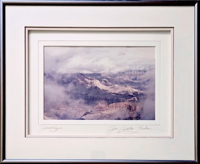 Photo 5
Reframed previously matted and signed Grand Canyon shown courtesy of Gwen Strahan.
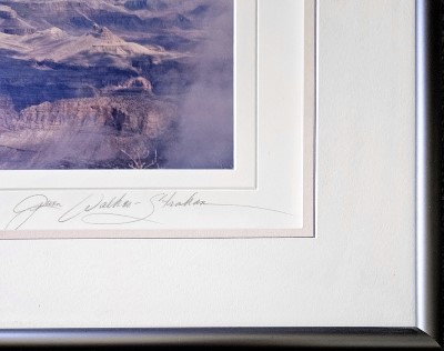 Photo 6
Grand Canyon detail shows original v-grooved signed, numbered mat that was topped with a double rag mat, spacer, and Nielsen bronze metal frame.
Digital Photos
Color inkjet prints are made from digital files created from digital photographs and are not considered preservation quality. There are three important factors that affect the life of a digital print: the quality of colorant (dye vs. pigment); the paper; and the display. Many products labeled as archival may not be up to the standard required for long term preservation, using 100% cotton rag matboard for window mats, and the primary backing board that the piece is mounted on. Coroplast™, Lineco archival corrugated board, 100% cotton honeycomb board, or Dibond® are all good options as the secondary backing support for full preservation. Then again not all digital photos require preservation framing.
Digital Design
Since digital prints are replicas from files there is more flexibility in framing today's photos. Many people believe that float, flat, flush, and plain mounting are all different words to describe the same mounting technique, but they are not actually the same and all are possible design techniques when working with digital photos over traditional film. Float mounting is the securing of a photo to a rigid substrate trimmed and placed within the opening of the window mat so that all of its edges are visible when viewing. This is a common choice when the edges of art are irregular, deckled, decorative, or when the photo has not been bled to the outermost edges of its borders. Dry mount float mounting is considered an invasive method, while preservation float mounting uses ragboard and starch hinging. Often the terms flat and plain mounting have been adopted when other adhesive techniques are used rather than hinges for float mounting. (Photo 7)
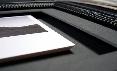 Photo 7
This digital photo print on a ³⁄₁₆" flush mount, reverse bevel cut at the edge of the print float mount attached to the backing.
Flat mounting and plain mounting are actually two different names for the same process. Flat mounting does not allow for a raised substrate as in float mounting. It means the image is mounted flatly against its decorative backing board or substrate. Flush mounting is a method of solidly bonding an image to a separate backing that is then trimmed to the edges of the art allowing the image and substrate to become the new art unit. In many of these techniques, edge trimming may be straight blunt cut, reverse bevel cut, or traditionally bevel cut, to create the finished look. (diagram 1)
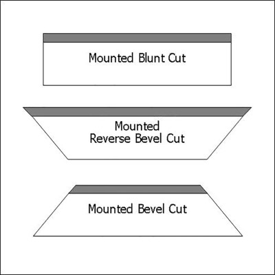 Diagram 1
Mounted photo to substrate may be cut blunt, reverse beveled or bevel cut for visual impact.
Flush mounted art edges are not covered by the window mat surrounding it, and the image appears to float. If a contrasting color substrate has been chosen as the edge trimmed pedestal, with a traditional bevel cut, the resulting border will accent the image. A white bevel against black edged art, a black bevel against white edges may be very effective to set off a photograph, just be careful about color ghosting of black substrates through a white image.
Final Shot
Fortunately in our state-of-the-art industry the handling, care, and framing of photography has come a long way from a single white mat with narrow black metal frame, allowing for design energy to flow more freely. But there will always remain the purists who have every right to their traditional opinions.
Additional Reading
Cotton, Charlotte, LACMA. "UnFramed-Ask a Curator," 2009. — https://unframed.lacma.org/2009/07/20/ask-a-curator-the-way-we-frame-now
Fischer, Monique, NEDCC, "Creating Long-Lasting Inkjet Prints," PDF, 2020. — https://www.nedcc.org/free-resources/preservation-leaflets/5.-photographs/5.4-creating-long-lasting-inkjet-prints
Focus Magazine, "Archival Evolution: Ansel Adams, Mounting Techniques, and The Pursuit of Preservation and Presentation in Photography", August 2023. — https://focusphotomag.com/2023/08/16/archival-evolution-ansel-adams-mounting-techniques-and-the-pursuit-of-preservation-and-presentation-in-photography/
Keefe, Laurence E., The Life of a Photograph. Stoneham: Butterworth Publishers, 1990.
Paschke, Chris A., PFM "B&W Photo Framing", October 2015. — https://www.designsinkart.com/library/DES-BWPhotoFraming201510.htm
Paschke, Chris A., PFM "Flush, Flat and Float Mounting", February 2005. — https://www.designsinkart.com/library/M-FlushFlatAndFloatMounting200502.htm
Wilhelm, Henry Gilmer, The Permanence and Care of Color Photographs. Grinnell: Preservation Publishing Co., 1993.
END
Copyright © 2024 Chris A Paschke
For more articles on mounting basics look under the mounting section in Articles by Subject.
Additional information on all types of mounting is found in:
The Mounting and Laminating Handbook, Second Edition, 2002,
The Mounting And Laminating Handbook, Third Edition, 2008 and
Creative Mounting, Wrapping, And Laminating, 2000 will teach you everything you need to know about getting the most from your dry mount equipment and materials as an innovative frame designer.
All books are available from Designs Ink Publishing through this website.
Chris A Paschke, CPF GCF
Designs Ink
Designs Ink Publishing
785 Tucker Road, Suite G-183
Tehachapi, CA 93561
P 661-821-2188
chris@designsinkart.com