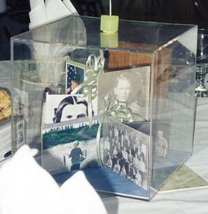
 Photo 1
Family photos and memorabilia were used to create wedding dioramas as table decorations. Each one represented a family name designating the table, so every part of each box was part of the whole story.
As framers we create an environment for artwork, photo or object. As designers we must work towards visually enhancing and showcasing the art, while never detracting or drawing the eye away from it. Design is a basic concept surrounding us in everything we touch, see and enjoy. As you learn more about focal point, emotional stimulus and designer control you will begin to recognize some of the freedoms and limitations you have as a designer and therein lies the secret to successful frame designs.
The process involves a project, a vision, and a plan, which in the end should have a unified appearance. (photo 1) The wedding diorama features family memorabilia rather than a single focal point, in this case so everyone at the round table could enjoy it.
 Photo 1
Family photos and memorabilia were used to create wedding dioramas as table decorations. Each one represented a family name designating the table, so every part of each box was part of the whole story.
Visual Design
There is a distinct difference between art and design. Art undergoes an aesthetic experience in which its primary purpose is as a form of communication, to arouse some sort of viewer response. Visual design, such as framing, also has an explicit purpose, one specifically required to relate to the art.
The relationship of art to design is the intimate result of a series of specific elements and factors governing the creation and development of both art and design. The elements of line, color, texture, shape, intensity, and space are the ingredients with which the artist or designer works. The factors of scale/proportion, emphasis, balance, rhythm, and unity are the directions for combining them in an aesthetic way. And all the elements and factors together are called the principles of frame design. So, visual design becomes the organization of materials and forms in such a way as to fulfill a specific purpose, and this purpose for framers would be enhancing and protecting artwork.
Elements of Frame Design
The elements are considered the psychological portion of a design and are what an artist, designer, or framer has total control over. They are interpretive and the desire to use them in a particular way often comes from within as subconscious knowledge, like knowing when a particular moulding and mat combination just looks right. This is why designs created for the same art image may drastically vary when it comes to the layout and execution of framing.
The individual elements mentioned above--line, color, texture, shape, intensity, space--are the building blocks used for creating a finished presentation. In framing these six elements are present in the appearance and visual feel of moulding, matboard, fabric, paint, pigment, decorative paper, deep bevels, fillets, glazing…and the art.
Factors of Frame Design
The factors are not a series of laws or mandatory rules, but rather guidelines developed to assist in completing a more harmonized or unified project. The factors are the mortar that holds the building blocks together and are integral because they are the physical organizers. Even if the perfect colors and textures have been selected to beautifully showcase a piece of art, if the balance or proportion is off, the design will not hold together, hence no unity.
Factors strongly relate to the facts defining a frame design such as artwork size, period, customer visualization, and perhaps even room placement or display. Most framers ask their customers what style or period of furniture they have or what color the walls are, which helps establish a starting point, but may not always result in a design match. If the framing is designed for the art--and not to match the sofa--it will fit anywhere.
Principles of Design
The principles of design are the sum of both the elements and factors. These principles are the same ones used by artists in the production of their artwork but they have been modified to translate into the world of picture framing. As an artist uses them to produce a masterpiece in pigment, so a framer will produce a masterpiece of frame design. In order for there to be a truly unified design the selected principles must all meld into one cohesive, well-planned and perfectly executed presentation. And although unity is considered a factor, it works best to say if all of the elements and factors are implemented correctly then unity shall be achieved.
And, it must also be stressed that although all of them will be identified and discussed individually—in the next installment of this article--no element or factor ever works alone, every principle must have a reason for being used, and use of all of them is ill-advised. A good guide is to hold use of notable elements and factors to no more than 3-5 principles in a design.
The Givens
In order to count principles, one must first understand the givens. These givens are the expected things within a frame and establishes a guide and starting point. These include an understated traditional rectangular frame; a single mat; a single rectangular opening in that mat; traditional even border widths; and an established color. Anything done to add to those givens then becomes a specific stimulation of an additional design principle.
By limiting the principles of 3-5 items the design remains stronger, tasteful and more likely to enhance the art and not overdo the design. When counting principles, remember that once counted an element shall not be counted each time it might be reintroduced, so if there are two colors of matting in the frame one will be considered the given, the second makes color counted as a used element, but if three or four colors are used in a multiple mat package, still color is only counted once. When too many things are happening within a frame, they become distracting and may draw the viewer's eye away from the specified artwork rather than into it, which creates a loss of emphasis.
Design for Competitions
In framing competitions there are two schools of thought when designing. Framing for the First, Second or Third place win showcases your design intent and execution talent, as well as your technical knowledge and ability. These designs do not tell a story, but cleanly enhance and protect the art. They may feel a little less flamboyant, but classy and beautiful nonetheless.
Framing for Popular Choice or Judges Award grabs a viewer’s attention often by telling a story, and may sacrifice the dignity of the art by including additional bells and whistles, which can detract the focus from that art. When someone brings in a crochet doily from their grandmother it would frame up as a beautiful textile. (photo 2, 3 detail) But if you ask them to bring in a photo, pattern, and crochet needles it becomes an interesting family heirloom shadowbox about Grandma. The first design enhances the art, which is never at question; the second only uses the original art as part of the story about Grandma, so the art has been altered. They are both perfect, but different.
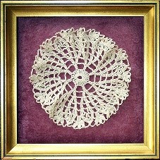 Photo 2
Small round scalloped hand crochet doily in an 8x8” antique gold cap shadowbox.
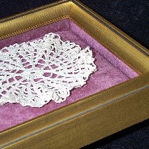 Photo 3 detail
Corner detail hand stitched to overstuffed padded backing and matching wrapped sides.
When the telling of a story visually losses the focus on the intended art, the frame design has failed, even when it may be loved by all who see it. The art must always remain distinct and identifiable. Both presentations may be prestigious, but they come at it frame different angles. When designing for framing competition think about what you are going after and make it your objective. Building a story around a doily will increase the sale and your customer will love the outcome, but perhaps that’s not the right approach when framing for competition.
Design Guidelines
There are concepts that have been abused for decades, like extending artwork onto mat borders, as was very popular in the 1970s with Bev Doolittle limited editions. A framer extending art decoration onto the mat is actually unethical and could either end up being copyright infringement and/or distracting the viewer from the art, both of which are wrong. Art is already a completed image and it is never up to a framer to expand on that. Only the artist is allowed to give permission or create extensions as part of the completed art, as noted in the expended horse’s tail onto the mat. (photo 4, 5 detail)
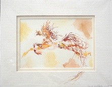 Photo 4
Original 2010 watercolor horse painting by Dakota Hokanson, double matted with mat decoration.
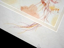 Photo 5 detail
Extended tail on lower right corner on top mat, signed by artist designating it as part of the art.
Never demonstrate every technique you know in a single frame. Trying to show off may impress a client but will not impress judges during competitions. It also often ends up using more than five principles, and make sure whatever principles you opt to use in a design must always have a reason for being there. A weak design is often the result of using too many elements, and clutter leads to overdesigning.
Even with the control of no more than five design principles, a potentially good design could still lose a competition or at least place lower on the scale if it is not also technically well executed. So, the perfect, award winning framing is not only unified, but is also impeccably completed.
END
Copyright © 2022 Chris A Paschke
For more articles on mounting basics look under the mounting section in Articles by Subject.
Additional information on all types of mounting is found in:
The Mounting and Laminating Handbook, Second Edition, 2002,
The Mounting And Laminating Handbook, Third Edition, 2008 and
Creative Mounting, Wrapping, And Laminating, 2000 will teach you everything you need to know about getting the most from your dry mount equipment and materials as an innovative frame designer.
All books are available from Designs Ink Publishing through this website.
Chris A Paschke, CPF GCF
Designs Ink
Designs Ink Publishing
785 Tucker Road, Suite G-183
Tehachapi, CA 93561
P 661-821-2188
chris@designsinkart.com