 Photo 1
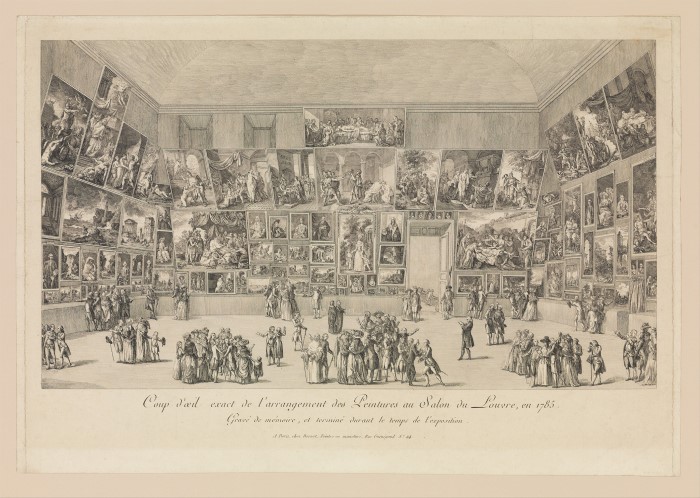
Etching Salon du Louvre, 1785.
Two or three large, same sized framed pieces lined up side-by-side on a wall does not constitute today's gallery wall...but technically it does. The concept of wall groupings in home decor has been around for decades, but today they are more correctly called "gallery walls." The difference between and a gallery wall and a wall grouping is more than a different term for the same thing. A gallery wall is a display of art imagery, whereas a wall grouping is a collective which may include flower arrangements, mirrors, instruments, and such.
Though they may feel like a contemporary design concept, gallery walls are not a new concept. Originally known as salon walls, these originated in 17th century France when art begun being displayed floor to ceiling in salons to accommodate as many pieces as possible for an exhibition. (photo 1) Yes, a gallery wall is an interior design application that becomes a harmonized unit representing something about the person living there, but should also respect the same design elements of good frame design...most specifically line, color, texture, space, emphasis, and balance in placement.
 Photo 1
Etching Salon du Louvre, 1785.
Guidelines
Numerous articles are on the internet about individual frame design approaches for groupings making them appear eclectic, haphazard, and sometimes designing to a given room, period and color scheme can be a luxury. Even the best designed series of framed pieces can still fall apart if the installation space, proportion, balance, and focal point are lacking for the necessary unity to make the wall cohesive. So the point is it's not just about the framing. Room colors, decorating style, and size of wall space are integral for the completed presentation, but are frequently uncontrollable by the framer. It's not only the individual pieces, or even how they relate to each other, but the actual placement of them on the wall.
Elements
Space is the distance around or between items to accent or unify the central image, both inside and outside a frame. The space between grouped pieces must give enough room for each piece to dominate its own small visual attention while still belonging to the rest of the group. Too much space between images, or negative voids for no real reason, can lose any required unity in the grouping, but the addition of the dried floral arrangement offsets the weight of the frames above, balancing the unit and filling the void. (photo 2)
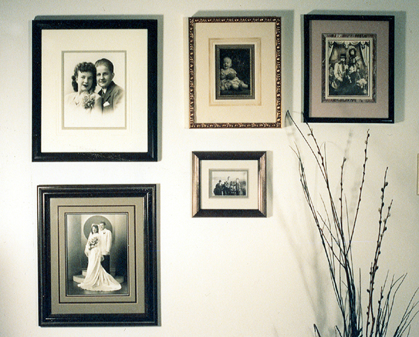 Photo 2
This common line layout of family portraiture is asymmetrically balanced by the dried arrangement lower right.
When there is a great deal of negative wall space surrounding a grouping—vertically or horizontally—the wider the spacing between the frames may be. The tighter the wall space, the closer the placement may be, because focal emphasis, is an important point when arranging a clustered unit. Designers and galleries are frequently combining furniture settings with framed art to create an entire mood. The placement of frames directly relates to the visual concentration or focal point within an entire presentation, and all items selected should relate to their surroundings. This is why hunt scenes work well in the library while florals are better in the bedroom.
Emphasis is also created by the visual direction of every piece in a group. Portraits should face into the center with the largest, boldest pieces generally working best when placed in the center with accompanying accent pieces working outward, enhancing it. (photo 3) The trombone is the most eye catching element in this wall grouping with the certificates and letter working outward in both directions from it. Since there is no common line use between the frames, balance becomes the dominant element, with the trombone as focal emphasis. This layout was arranged and installed by the client.
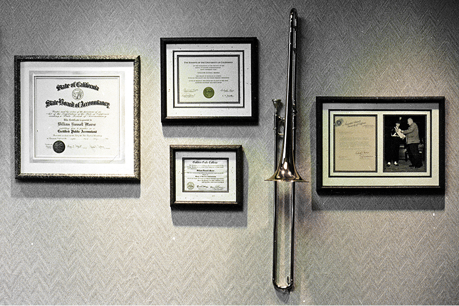 Photo 3
Balance is the dominant element with the trombone as focal emphasis. Layout hung by client.
Proportion, Balance, Shape
Proportion deals with the ratios and relationships of one part to another. Within a frame this would be the actual art vs. the outer dimensions of mat and frame in relation to it. Within a grouping it becomes the amount of space between the items as well as the group's relationship to the entire wall space. Balance is the symmetry—or asymmetry—creating a feeling of equality of weight or attention within a group, from one side to the other of a central balance point.
The relationship of shape to its surroundings has an impact on a successful design. The shape itself is considered a positive area when considered as an element. The shape surrounding it is considered the negative area. These are most commonly known as positive and negative space, yet they are indeed created by the presence of shapes. Negative shapes are equally as important as the shapes creating the positives. If frames are too close together on a wall—or openings in a multi-opening mat—the negative shapes will be too weak to properly balance the images, and the controlled tension becomes too intense and uncomfortable. (diagram 1) Shapes placed too widely apart lose relationship to the other frames or openings resulting in a poor design.
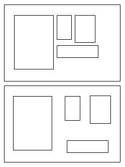 Diagram 1
(top) Openings placed too closely create visual tension, while those placed too far apart feel unrelated. Too much negative space is always distracting unless accompanied by lettering or other filler.
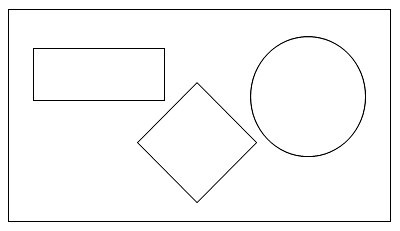 Diagram 2
A circle, diamond, and rectangle together leave vast areas of voided space that may attract attention away from the art.
Often the proper use of shapes in relation to placement and the creation of positive vs. negative space are intuitive. There are no set rules for how far apart openings must be placed, or how many framed pieces work on a specific wall. Placing curves next to straight lines in a multiple opening composition or gallery wall may create too much negative space through poor shape placement. A rectangle, diamond, and circle together leave vast areas of voided space that attracts attention away from the art and the negative becomes a focal point. (diagram 2) Odd shapes used in a gallery wall are difficult to visually balance. (photo 4) The photo sample places two framed certificate—off left—that although are part of the wall, are set slightly apart from the actual grouping. And since they are heavier and bolder in design tend to counterbalance the right side of common line layout.
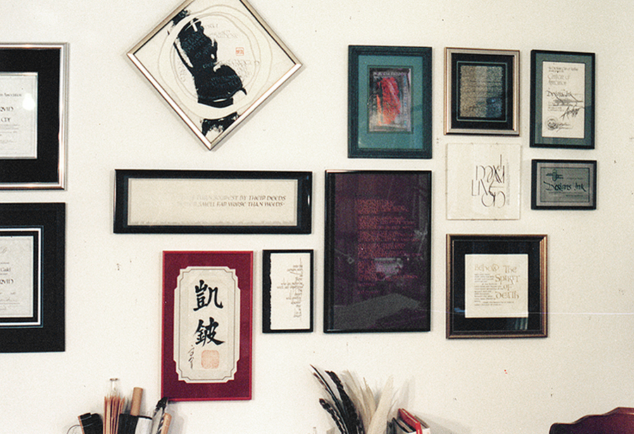 Photo 4
My gallery wall showcasing CPF and GCF certificates (left), and Common Line layout of calligraphy and frame design samples (right).
Common Line Unity
The easiest way to establish unity in composition and layout is through use of a common line. Begin from an imaginary horizontal top line placing the top of the frame along it. This should be the actual edge of the top of the frame not the visual top line or outermost dominant portion of the moulding. Then expand the placement in other directions by finding new vertical and horizontal common lines as needed to accommodate new additions. Attempt to maintain the same established space between all the frames for continuity.
The diagonal frame at the top of photo 4 breaks the common horizontal top line, but is counter-balanced by the additional negative space at its bottom. All other pieces are placed off of a common line from a proceeding frame. In other words, every piece somehow aligns itself to another piece along one of its edges. This layout could continue to expand limited only by the wall space. The sizes, frames, matting and colors are all different, but unity has been established through common line, the theme of calligraphy, contemporary framing style, and spacing between the frames.
Wall Layouts
There are many formats for creating unity in a selected layout. Salon layout is a floor to ceiling arrangement of artwork in frames of various sizes and frames. Perimeter layout creates a rectangular unit of assorted frames that fit into the exterior border, by sometimes allowing for variable spacing between the frames. Grid layout showcases identically sized and styled frames, symmetrically aligned across the top, bottom, and both sides of the arrangement. Stair layout creates a pattern to fit the rise of steps or a landing wall, when used on a staircase, but could also be used to create or offset other room diagonals. Corner layout—one of the most popular recent trends—occurs where two walls come together and may be inner or outer corners, on the ground floor, or up a staircase. Column layout is simply vertically stacked line of almost any number, perfect for narrow spaces. Top-Aligned layout uses the same even top horizontal while allowing different levels at the bottom. Grounded layout is a bottom aligned horizontal featuring different levels at the top. And Flipped layout where the same two sized frames are alternated top to bottom across the wall. (photos 5-12)
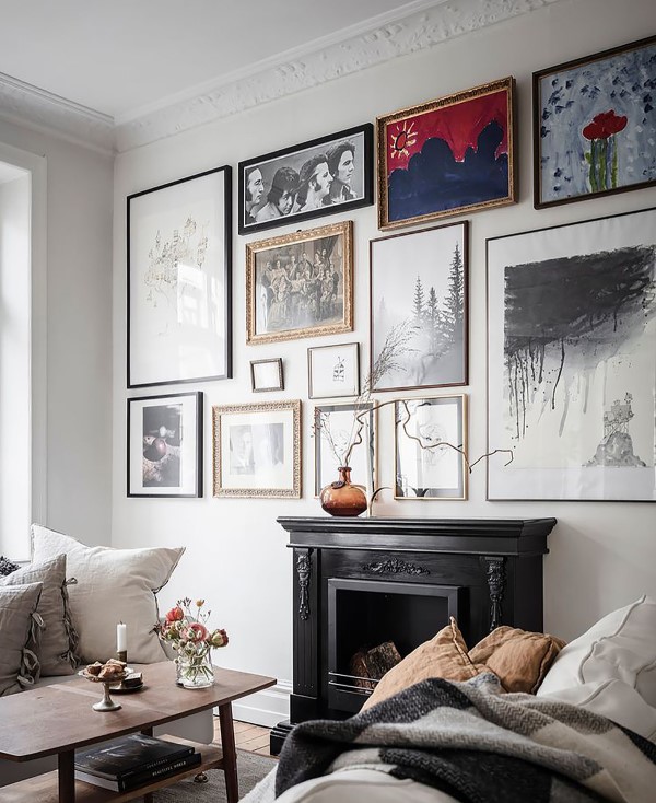 Photo 5
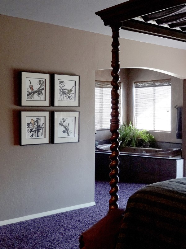 Photo 6
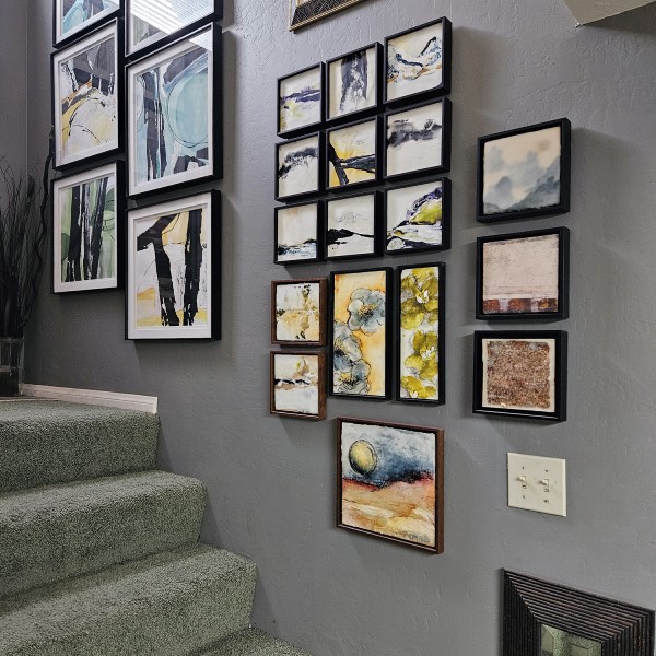 Photo 7
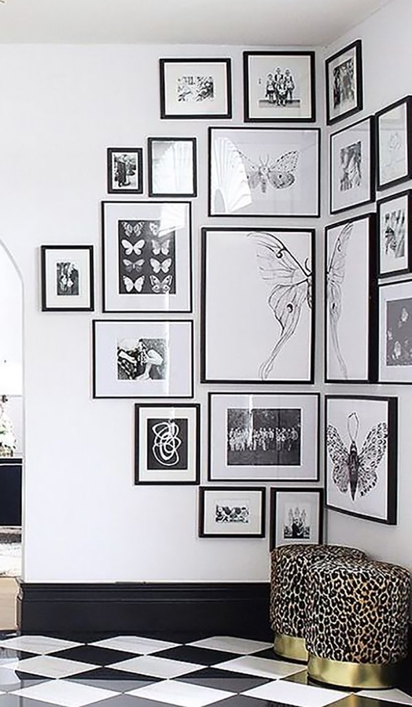 Photo 8
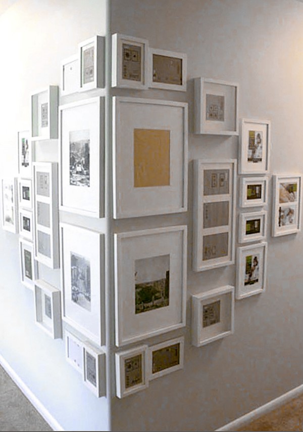 Photo 9
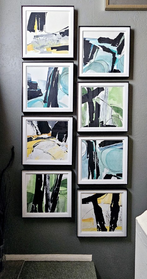 Photo 10
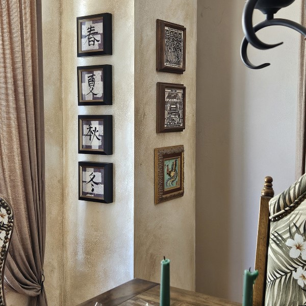 Photo 11
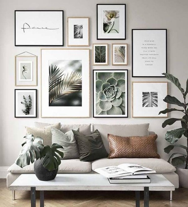 Photo 12
Not all Layouts are Created Equal
Wall layouts vary greatly in presentation. The important thing is to create a cohesive pattern for the layout that enhances the art and the room. Be careful when designing a gallery wall with a client, as they can easily become too crowded with no emphasis, or focal point. The layout suggestions above are just a starting point, but are no means all that is available, and a wall grouping is an entirely different discussion.
The internet is full of blogs and design sites that do not embrace any of the design elements when showcasing how to hang a wall. Like a well-designed frame, a gallery wall requires some form of continuity, like theme, frame color, frame size, image size, or placement—and although eclectic design and maximalism may still be trends—a messy wall display, is just messy and haphazard. And like good frame design, perhaps all gallery wall pieces should be there for a reason.
END
Copyright © 2024 Chris A Paschke
For more articles on mounting basics look under the mounting section in Articles by Subject.
Additional information on all types of mounting is found in:
The Mounting and Laminating Handbook, Second Edition, 2002,
The Mounting And Laminating Handbook, Third Edition, 2008 and
Creative Mounting, Wrapping, And Laminating, 2000 will teach you everything you need to know about getting the most from your dry mount equipment and materials as an innovative frame designer.
All books are available from Designs Ink Publishing through this website.
Chris A Paschke, CPF GCF
Designs Ink
Designs Ink Publishing
785 Tucker Road, Suite G-183
Tehachapi, CA 93561
P 661-821-2188
chris@designsinkart.com