 Photo 1
Since August is our "gilding issue" I thought it appropriate to expound upon gold from a color and expanded mat design point of view. Gilding is often thought of only in the realm of framing design and creation which limits not only your total understanding of the precious metal, but profit potential also.
In "Making Gold Leaf Behave" (January 1991, PFM), Bill Adair talks about metals being alloyed with gold to create various hues in 24K leafing sheets. In fact, "all that glitters is not gold" may readily sum up the concept of color variations when speaking of gold in general. Whether pure (24K) leaf gold; pure shell gold tablets; gold metal leaf (which literally contains no gold at all); or the prepared wet pigments of bottled, tubed or stick gold inks; the color variations and applications can vary greatly.
As a creative framing designer it is imperative for you to understand the color variations available when dealing with gold, both wet and dry pigment, for by juxtaposing two golds of different incompatible hues or bases side by side the design could be drastically altered, or simply one of the golds could appear a totally different color.
Wet Pigment Hues
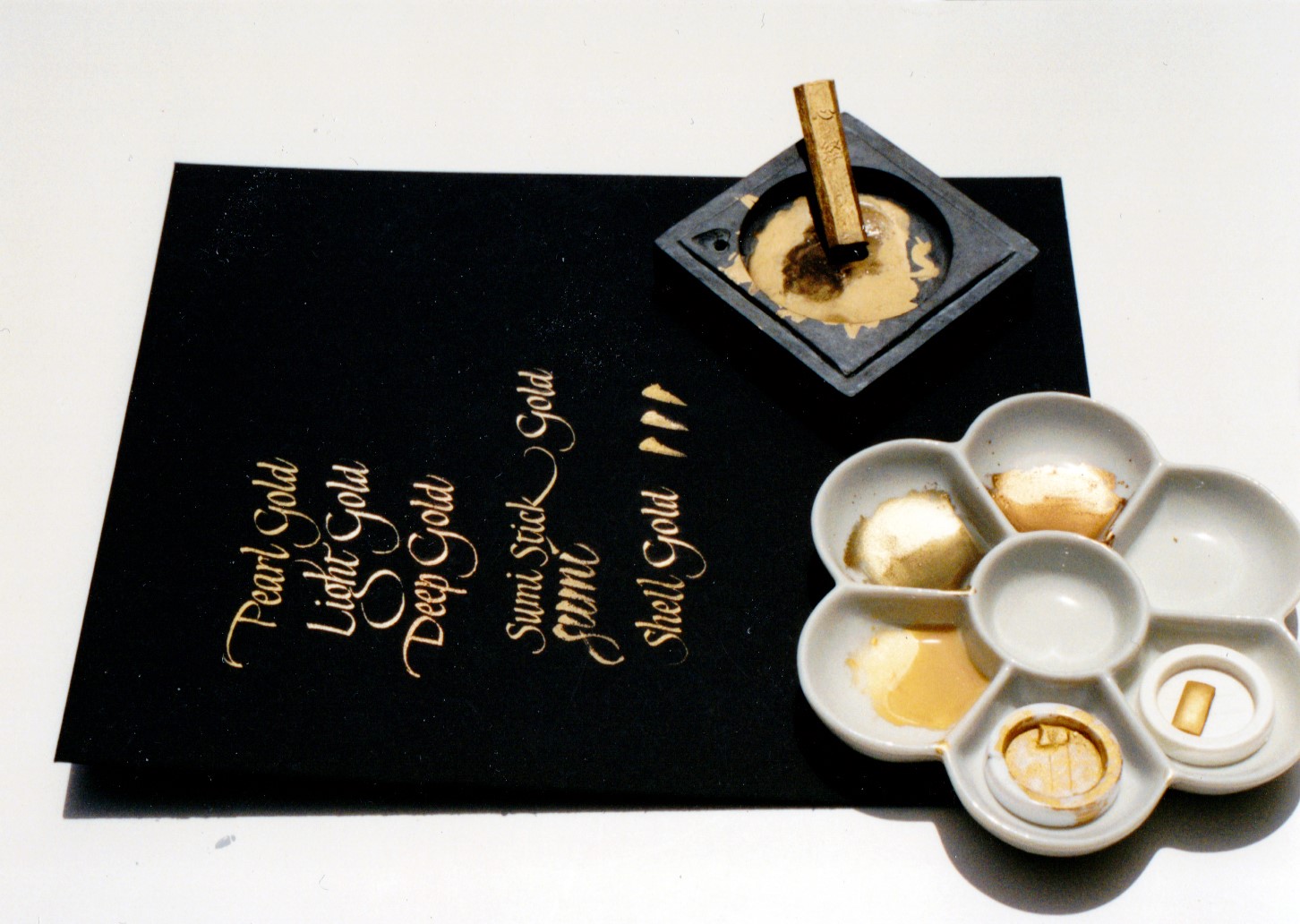
The wet pigment gold lettering on the black museum rag board illustrates a series of metallic gouaches (Talens, Holbein and Winsor & Newton), gold sumi ink stick and pure shell gold all written with a 1mm dip pen nib. Notice the color variations of the golds. (photo 1)
Photo 1
Metallic pigments are often created by beginning with a primary base color (red/yellow/blue) then adding metallic powders or mica to create their actual color tonality. Warm based golds include the yellow based Pearl gold; red/orange based Deep gold; red based Sumi stick gold and Shell gold, though some have a great more base pigment which alters their actual end color. (photo 2) Cool golds include blue/green based Light gold, as well as most bronzes. Pigment intensities in the base gold can actually make a metallic appear to be more of a color than a metallic, as Bronze appears almost brown.
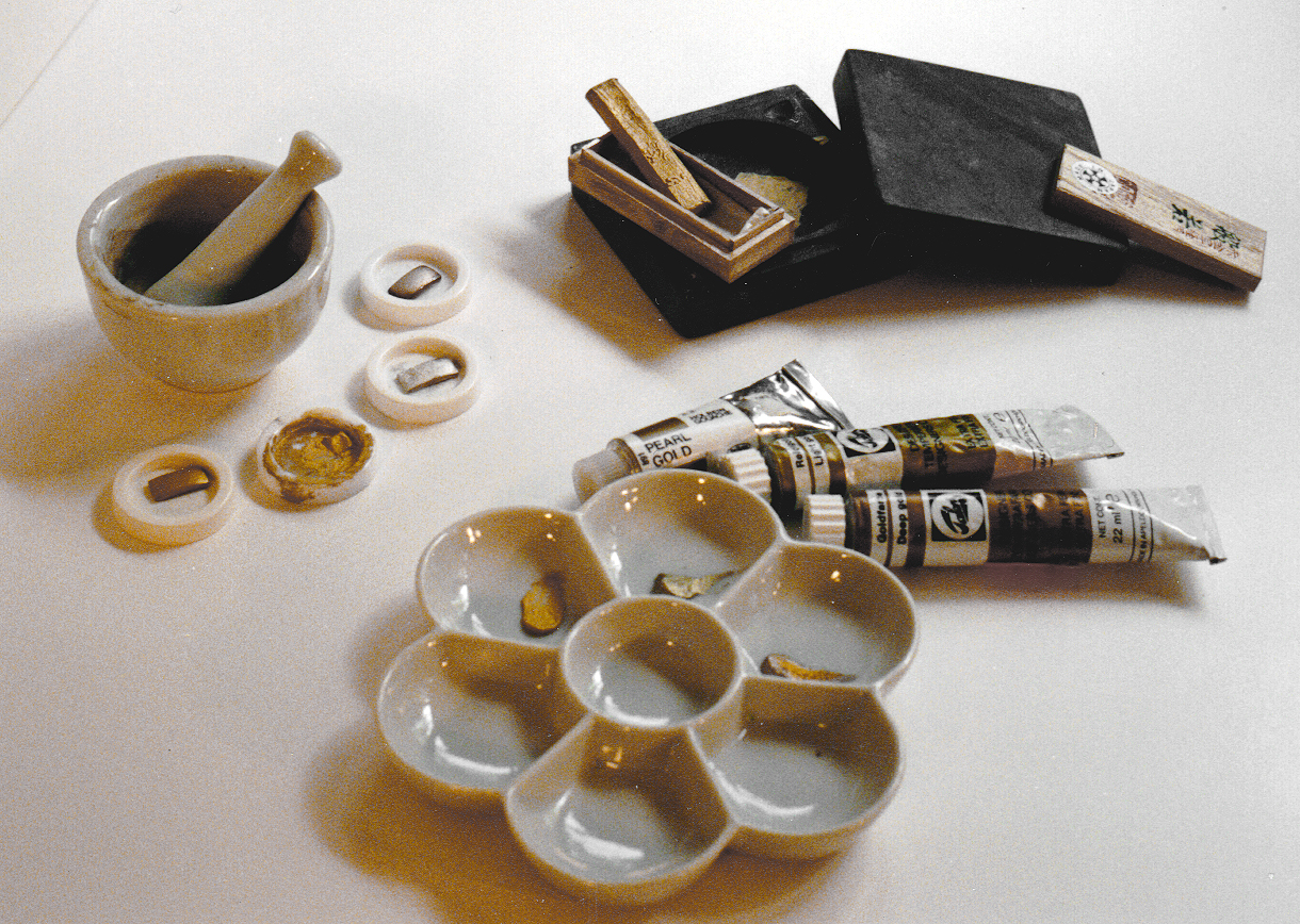 Photo 2
Types of pigment gold include (clockwise from upper left) mortar and pestle with shell gold and silver tablets; Sumi gold stick ink with ink stone for grinding; and tube gouache in a china dish for mixing.
Gold compatibility is vitally important when it comes to selecting a gold moulding, fillet or metallic mat board to compliment any framing project. Any matted certificate with a gold seal of monoprint with metallic accents must be in color harmony with the selected framing materials. If a hand lettered or ruling pen gouache accent line of deep gold is used at the mat opening for a certificate with a bold yellow gold embossed notary seal, the lettering will likely appear more orange than gold. (photo 3)
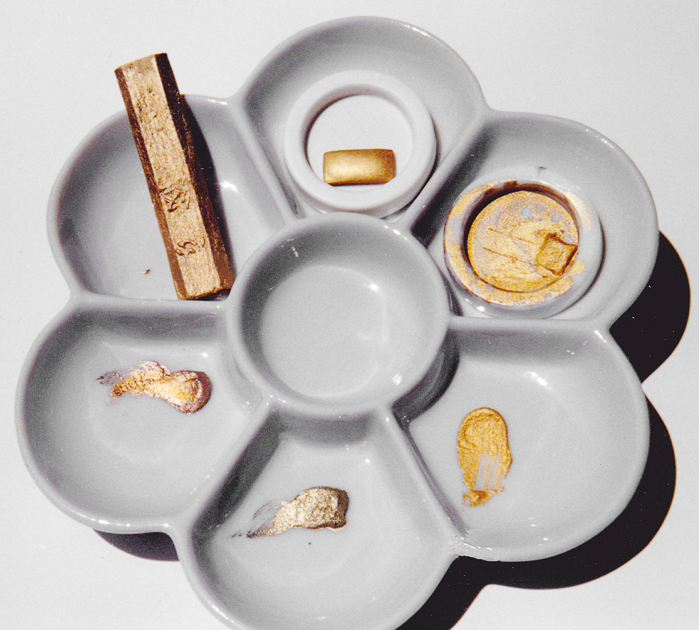 Photo 3
Clockwise: Sumi gold stick ink, shell gold tablet (new), shell gold tablet with distilled water, Pearl gold gouaches, Light gold gouache, Deep gold gouache.
Use a white ceramic dish and distilled water for mixing for clean, clear colors and clean dish after use. Plastic trays absorb color and alter color view. Distilled water prevents contamination of high mineral water systems which may impact colorfastness.
Cool based or pigmented light gold notoriously appears green rather than gold at all when put in opposition with a warm based gold. Simply because gold is called gold may not make it ideally compatible to every other pigmented gold available.
The actual metal or mica powder particles that create the reflection, image and shine of metallic wet pigment vary a great deal depending upon the media and brand of wet pigment selected. Experimentation with various media will allow you the knowledge to make superlative judgement calls when it comes to the proper media and equipment to best execute the proposed design. Since heavy metallic particles settle rapidly, gold inks are slower and more difficult to use. Constant stirring is required to maintain particle suspension during application. Remember this when charging for any specialized hand lettering on mats, for if it takes longer to apply and requires greater skill than black ink...it's worth more money!
Mica powder is a fine silver powder which is often the key ingredient in many metallic gouaches and inks, and is what creates the pearlized sparkle. It may also be purchased in dry bulk and added directly into wet pigment colors for that extra pizazz, and income.
Hand Lettering
For hand lettering onto mats, a great deal of fine line control is required for connecting hairlines and flourishes, so smooth and constant ink flow is imperative. Pre-mixed bottled inks are often too thick to use directly from the bottle and therefore often require thinning with distilled water to ensure smooth ink flow. Metallic particles will settle out as previously mentioned while the lettering is being attempted, so constant stirring is required.
Gouache is generally quite smooth, consistent and works extremely well for lettering. The pearl, light, deep, pale and bronze samples shown are all tube gouache pigments (see "Gouache", March `92 PFM), which are designed to be thinned with distilled water as an ink or opaque watercolor for lettering and for ruling pen lines. The general consistency of gouache also maintains better particle suspension, though mixing is still necessary.
Sumi ink sticks need to be ground and prepared with distilled water in an ink stone for pen or brush use They too have a high karat quality and may be thinned for use with brush or nib. Shell gold is a pure tablet of 24K gold most economically used with a pointed brush, though a dip pen may also be used. The price varies with the gold market, but it currently sells for around $70 per tablet. Two silver tablets are also shown for reference. Note the slightly tarnished edges of the unused tab indicating the pure silver content. Current market price for these pure silver tablets is about $22.
Lines and Surface Designs
There are a great many metallic inks on the market including: Pelikan, Winsor & Newton, Luma Pearlescent and Dahle Mat Magic fillet paints and inks. The heaviness mentioned earlier in these mediums makes them difficult to achieve a decent flow through a nib for lettering, but makes them ideal for ruling pen lines, painting patterns and designs.
Many of the bottled metallic pigments have a great deal of mica in them making them almost more pearlescent than metallic. Good examples of these are Luma Inks and Dahle Mat Magic gold fillet paints and inks. They are more translucent and don't cover dark surfaces as well as the heavier metallic pigments, nor can they be burnished to increase the shine.
Large textural panel designing with wet pigments ("Sandstone Panel", December 1991 PFM) won't require smooth flow because of the nature of pigment application. Metallic intensity (pearescence vs. metallic powder) and base color compatibility must be a consideration though.
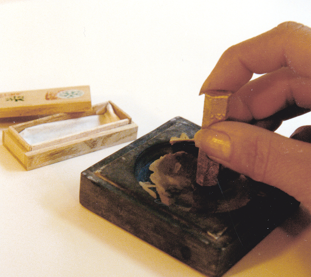 Photo 4
Apply distilled water to center of the ink stone and begin slow grinding of the stick in a circular motion. Consistency is controlled by water and grinding.
Burnishing
Burnishing the dried metallic pigments, for both lettering and accent designs, will often intensify the shine. An agate burnisher (photo 4) may be used to polish and refine the somewhat grainy appearance of the dried pigments to a higher gloss. (photo 5) Burnishing is best achieved on a hard smooth surface, although the toothed writing surface of museum rag board is excellent for inks and gouaches, the surface gives way under the pressure of burnishing and care should be taken not to dent the board surface too aggressively.
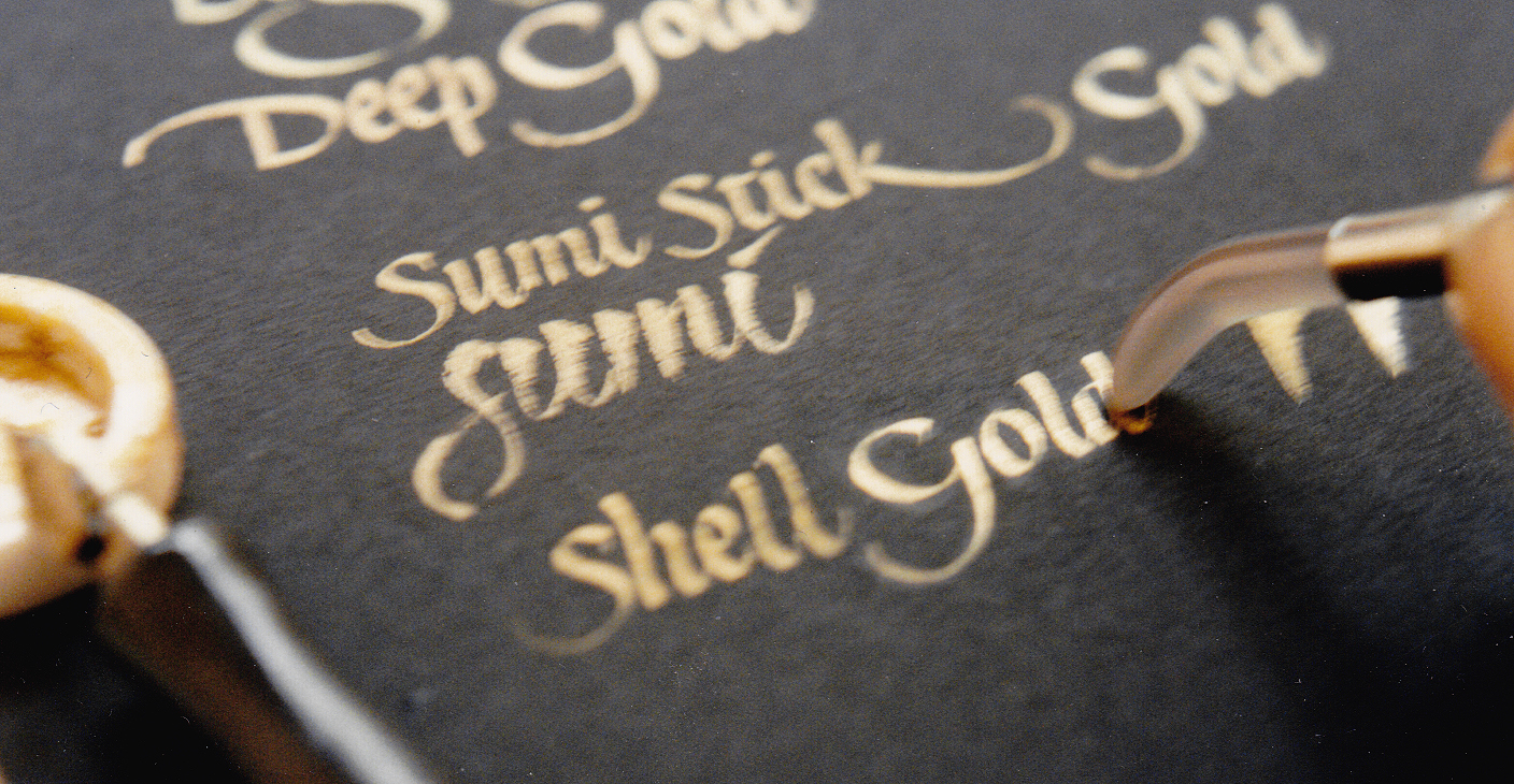 Photo 5
An agate burnisher is used to buff and polish gold and gouache to a higher gloss. Unburnished shell gold may have a grainy appearance.
Burnishing on dark surfaces will also put shiny marks on the soft matte/vellum surface of the board which can be removed with a soft white, non-abrasive vinyl drafting eraser. A pencil-type allows you to see where you are erasing, don't aggressively run over the gold. (photo 6)
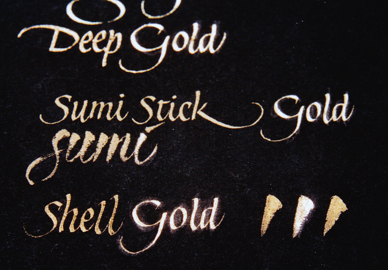 Photo 6
Note the shine of the word "gold" as well as the center brush stroke lower right after burnishing. Be careful not to dent the board and remember that 90% of burnish and pencil marks may be lifted with a black nonabrasive vinyl erasure.
Through color and product awareness, expanded uses of gold can showcase your design abilities and increase profit potential. Samples of headlines, names, dates and titles written beneath mat openings will encourage additional sales, but never forget to make those design suggestions too. "All that glitters is not gold" is consistently reinforced by those glittering additional cash sales from a keen color eye and a true understanding of gold.
END
Copyright © 1992 Chris A Paschke
For more articles on mounting basics look under the mounting section in Articles by Subject.
Additional information on all types of mounting is found in:
The Mounting and Laminating Handbook, Second Edition, 2002,
The Mounting And Laminating Handbook, Third Edition, 2008 and
Creative Mounting, Wrapping, And Laminating, 2000 will teach you everything you need to know about getting the most from your dry mount equipment and materials as an innovative frame designer.
All books are available from Designs Ink Publishing through this website.
Chris A Paschke, CPF GCF
Designs Ink
Designs Ink Publishing
840 Tucker Road, Suite H-190
Tehachapi, CA 93561
P 661-821-2188
chris@designsinkart.com