 Photo 1
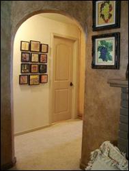
Clustered in a hallway with center vertical four horizontal row common line. Encaustics — and hallway — courtesy of Gwen Walker Strahan, Redding CA.
The area in which objects or images exist is called positive space. Space may also be the distance, void or interval between things such as moments of silence in music, a pause in speech, or the blank area between frames in a wall group. This is known as negative space. Positive and negative spaces are equally important in the layout, placement and visual unity of a grouping. Horizontal or vertical placement of identically framed panels creates unity through symmetry (photo 1). But, when arranging a group of themed pieces involving various frame sizes, styles and colors, the element of space becomes extremely important and reigns supreme.
 Photo 1
Clustered in a hallway with center vertical four horizontal row common line. Encaustics — and hallway — courtesy of Gwen Walker Strahan, Redding CA.
Common Line
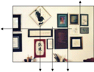
Negative spaces between frames should remain relatively consistent in order to establish a rhythm and pattern to a wall group, and there should be at least one common line—horizontal, vertical or centered—between any two frames to work as a stabilizer and unifier (photo 2). For common top—or bottom—line, begin from an imaginary horizontal and align each frame edge along it. All other frames should have a common line connection with another frame in the group.
 Photo 2
Use of common line will tie all pieces in a group together.
Expand the group in other directions by finding new vertical and horizontal common lines as needed to accommodate the new additions, while maintaining the same established space between all frames for continuity. By working from a horizontal common line at the top with all other pieces in the group, the arrangement allows for growth of additional pieces without rearranging them. The diagonal placed frame at the top breaks the common horizontal top line in the photo, but has a common center line with the two below it. This group began with only the two certificates far left, which have remained set apart for added emphasis.
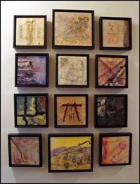
The encaustic grouping by IEA member Gwen Walker Strahan has a center vertical common line, which was hung first (photo 3). The horizontal rows where then created by placing the float frames 1½" apart. There are ten 6x6" float frames and two rectangular panels placed center vertical row to stabilize and ground the group. Additional pieces may be traded out or added to the grouping as long as they grow from a common line.
 Photo 3
Begin placement with a center common line. Then build off that right and left.
Unity
Unity is easily achieved when hanging a series of 4-6-8-10 or more using same frame, mat colors and sizes, as in photo 3. Any arrangement using a common theme—such as encaustic, calligraphy or family photos—or same style contemporary float frames, and common line will naturally create unity. Another way to solidify group unity is by spacing, as mentioned at the beginning of this column. Frames placed close together—off common line—unify a group, while those placed too far apart may feel unrelated (diagram 1).
 Diagram 1
Frames may be close, but too far apart may be fatal.
Unity may be established through common theme, contemporary framing style, and/or consistent spacing between frames. By concentrating on alignment and negative spaces between the frames, visual unity is easily achieved. Nearly any combination of frame sizes, shapes, or subject may be clustered to contour to any wall space, and remember, a blank wall is only a large negative space waiting for art.
END
Copyright © 2012 Chris A Paschke
For more articles on mounting basics look under the mounting section in Articles by Subject.
There is a special section in the library for all past IEA Framing Matters articles from Wax-On!
Additional information on all types of mounting is found in:
The Mounting and Laminating Handbook, Second Edition, 2002,
The Mounting And Laminating Handbook, Third Edition, 2008 and
Creative Mounting, Wrapping, And Laminating, 2000 will teach you everything you need to know about getting the most from your dry mount equipment and materials as an innovative frame designer.
All books are available from Designs Ink Publishing through this website.
Chris A Paschke, CPF GCF
Designs Ink
Designs Ink Publishing
785 Tucker Road, Suite G-183
Tehachapi, CA 93561
P 661-821-2188
chris@designsinkart.com